

National Treasures is one of the longest running super high end products in the football hobby, now going on its 6th year. Even though Exquisite has been in football since 2005, the last NFL licensed set was released in 2009. Similarly, in 2010, Topps answered with its own Five Star football, a product that has replaced Exquisite as the only high end set to offer a checklist of 100% on card signatures. Even though National Treasures has offered rookie hard signed content since 2007, it has never before offered on card non-rookie content, thus putting it well below expectations for a set that costs as much as NT does.
Previous Years of the Set:
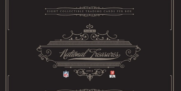
Today, we got a long awaited preview for 2012 National Treasures, and for the most part, it shows a drastic improvement over a horrible offering and set content in 2011. I know that isnt saying much, but its definitely a start. On the other hand, the design is still miles below where 2010-2012 Five Star has shown to be. Panini has long tried to establish NT as a direct competitor to Exquisite when it was licensed, and has since gone head to head with Five Star. So far, National Treasures has proven to be a top competitor in terms of value of the rookie autographs it achieves on the secondary market, but in recent years, that is all it has been. Stickers have hurt the product’s image, and the lack of focus for producing high end looking cards has damaged that even further
. Five Star and even the unlicensed Exquisite have shown to be far above NT consistently, and this is where Panini needs to pick it up.
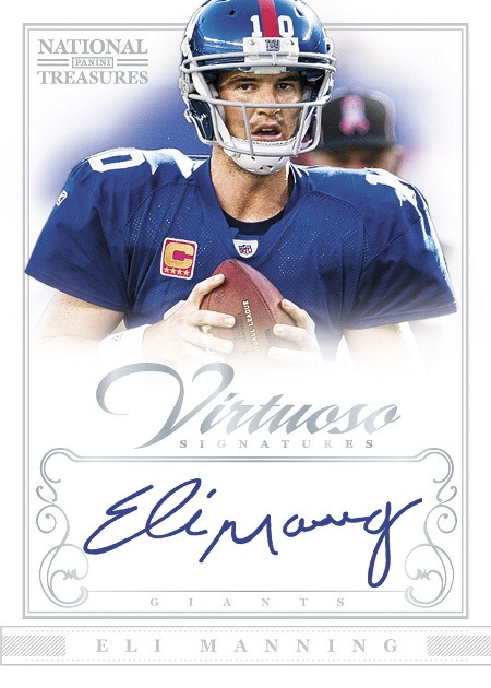
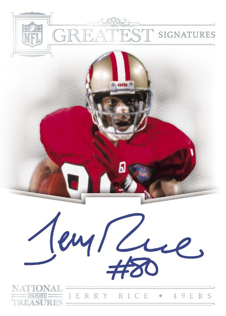
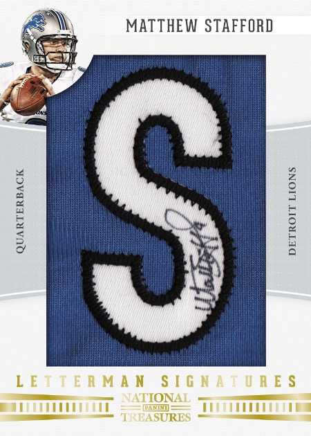
For the most part, outside of the Rookie Patch Autos, I think there is a lot of improvement – especially in the disgusting base card design from 2011. Additionally, the introduction of a subset worth of hard signed non-rookie autos has taken steps in the right direction. Even though Panini is about 3 years late to the party in terms of booklet cards in National Treasures, those cards look absolutely amazing too. The only issue is that these cards are so rare, that they might not have an impact on the appeal this set should have with high end chasers like myself.
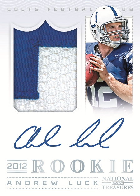
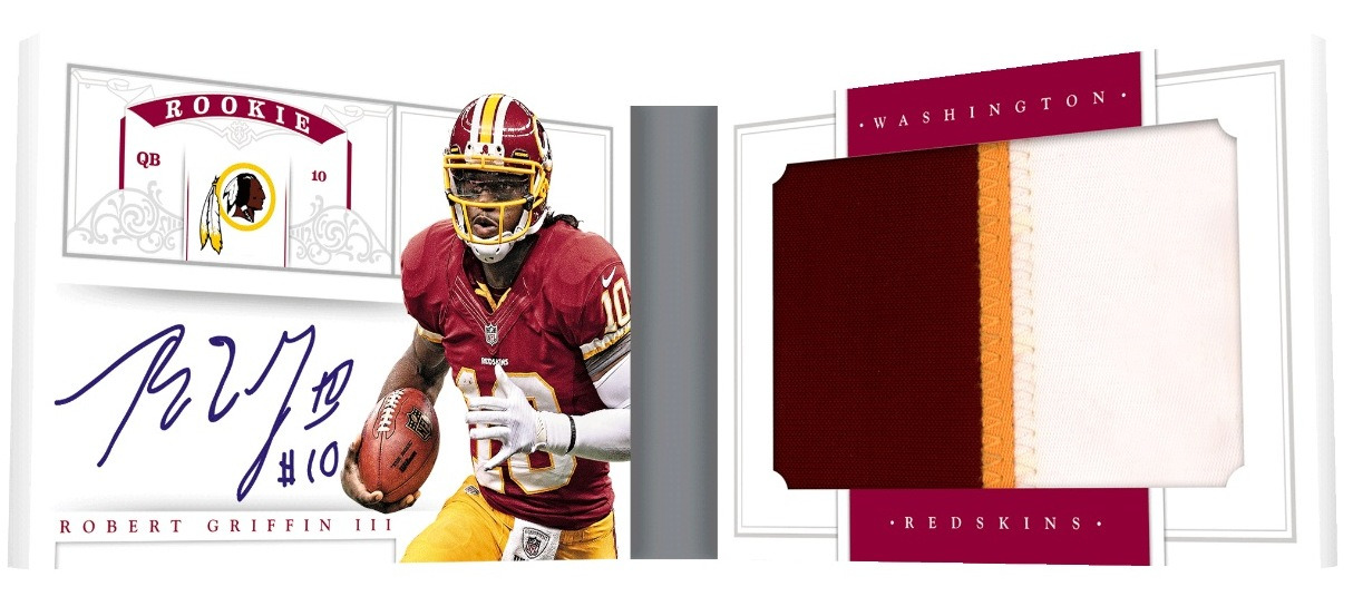
In all seriousness, my biggest gripe with this whole preview is the base rookie patch auto design, as I feel that going BACK to vertical design presents humongous issues with the design of Panini’s biggest card of the year. Not only did they (again) resort to trapping the player photo in a compartment on the side of the card, but they did it in a way that is detrimental to the visual appeal. Even though they rightfully used a white background dominated layout, their decision making was horribly flawed. This card is the face of the franchise, so to speak, and in my opinion, it is the weakest card in the preview. That is not a good thing.
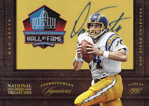
Piling onto failure in the rookie patch autos, we have further assurance that programs from lower end sets are making an unwelcome appearance AGAIN in NT. This has been a major problem for the last three or four years, and I honestly have no idea why the Dan Fouts card was created. Aside from the fact that I HATE HATE HATE these stupid manu-patch autos, the use of this type of card is both stupid and mis-representing of the theme of the overall product. These cards should be forever dismissed from all sets, but to have them in the biggest product on the calendar is just a piss poor idea. Super High End sets should be super unique, and should showcase the best of the best cards of the year, not the trash from other products.
National Treasures will never live up to the Exquisite sets of old as long as Panini is committed to producing sets the way they do. It wont match Five Star either, and though the cards might be worth more due to patch size, that means little to me. These cards have finally started to move in the right direction, but a DRASTIC re-imagining of Panini’s approach needs to be done. Its not even a question anymore, especially considering how far ahead BOTH Topps and Upper Deck are in this arena.
I left this response in a couple other forums. All I know is that I am torn between NT and Topps Five Star for 2012. With a rookie crop like this, EVERYONE should be thinking the same thing, and Everyone (at least, MANY MORE people than last year) should be thinking about buying at least 1 box of high-end product as an investment in my opinion. Sure, NT took the bacon last year, but I am willing to bet that Topps has learned from it’s mistakes……… actually, I don’t have to bet…..look at the 2012 Five Star designs!! Freaky Awesome looking cards. I am really hoping there will not be a repeat of last year, where 2 VERY similar cards are compared and listed for sale on Ebay …..only to see the the NT card fetch 200% (at least!!!) more than the five star. Perhaps rightfully so, I mean, I thought the NT cards WERE more attractive in 2011. I thought the FS card design last yeard was fine, but LET’S SEE SOME COLOR IN THE PATCHES AT LEAST!!! Come on Topps!!I don’t know about you, but if I would have bought five star last year I would have been disappointed to say the least!!! I think five star is gonna rock it this year (at least I hope so)! Another good note keep in mind even AFTER this year is this…..There is still room for improvement!!!! There are so many things a company can do with a card with today’s technology….only scratching the surface so far….seriously! I’m sure you will agree that a company who is going to charge $450+/- for a PACK (because that’s what it is) of football cards should really do some serious R/D to find out what is most important in a football card/set to serious high-end collectors! I’m sorry, I just didn’t see it last year. Speaking personally, If I am going to pay that much for a box (pack) of sports cards (which I have no problem doing if I really like the product), I need to be absolutely blown away by everything from card design(especially inserts) to odds to content, etc. Sorry, I just didn’t see it last year. Here’s hoping for a change! Thanks for reading!
Im not sure why people are so concerned with color in the patches. The jerseys are barely used enough to be considered “worn”, let alone event worn. I just want a pretty looking card. Who cares how many colors? I dont.