
When it comes to nostalgia, there are certain things that work exceptionally well, like bringing back iconic cards and making them into a newer style set, and then there are things that dont. Crown Royale was a brand that Panini resurrected from the back reaches of the nostalgic part of the hobby, and over the last few years, it has usually been nothing short of a disaster. Not only are the card usually some of the most ugly examples from the entire year
, but they are usually released as an afterthought to the end of the football calendar.
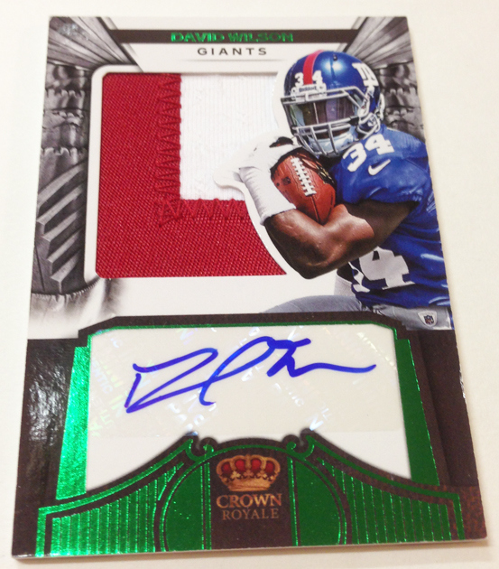
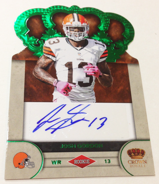
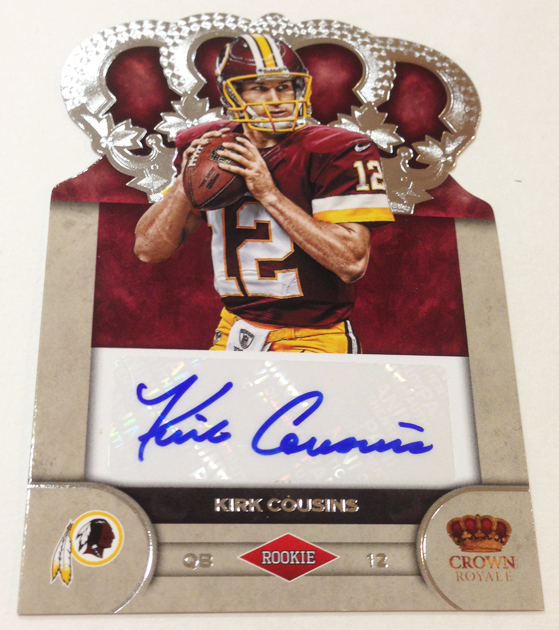
There has been one saving grace to this set, both of the previous years it has been done. The rookie patch die cut autos have been nothing short of exquisite, some of my favorite Panini cards each time they have been done. They are the first football rookie cards to really embrace the CORRECT use of a die cut, placing the player over the swatch and autograph below. They are AWESOME.
Check out some of the best of the best from 2010 and 2011:
2010 Panini Crown Royale Ryan Matthews Silhouette Patch Auto
2010 Panini Crown Royale Dez Bryant Silhouette Patch Auto
2011 Panini Crown Royale Jake Locker Silhouette Patch Auto
2011 Panini Crown Royale Julio Jones Silhouette Patch Auto
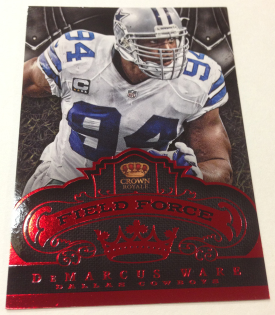
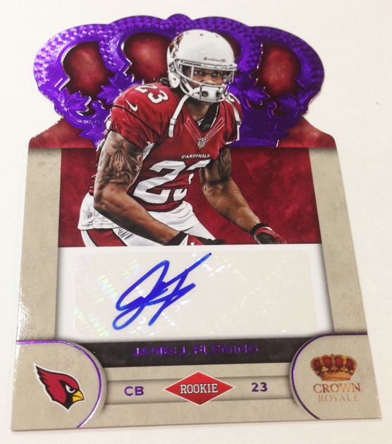
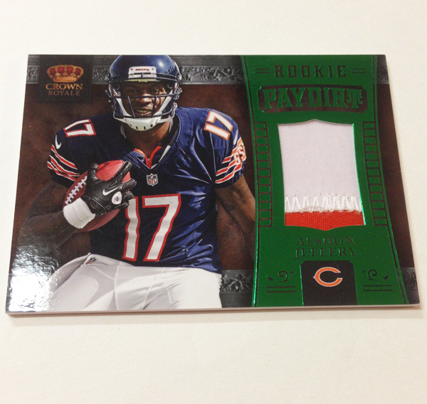
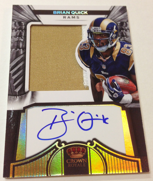
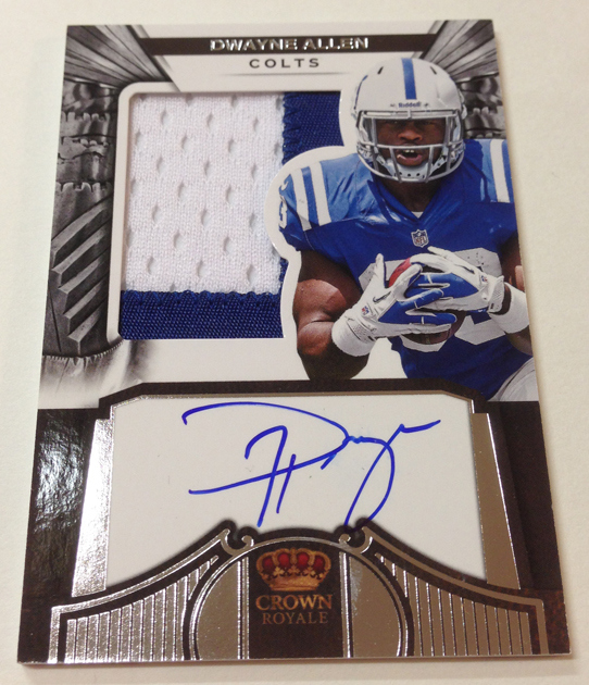
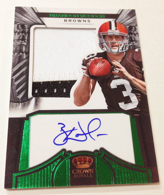
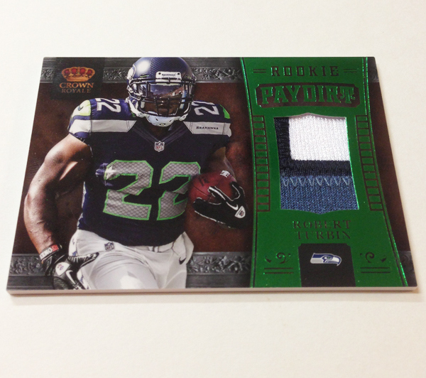
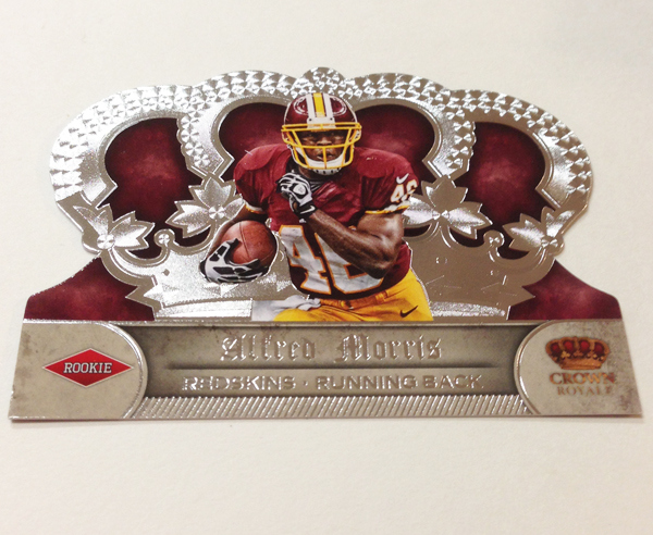
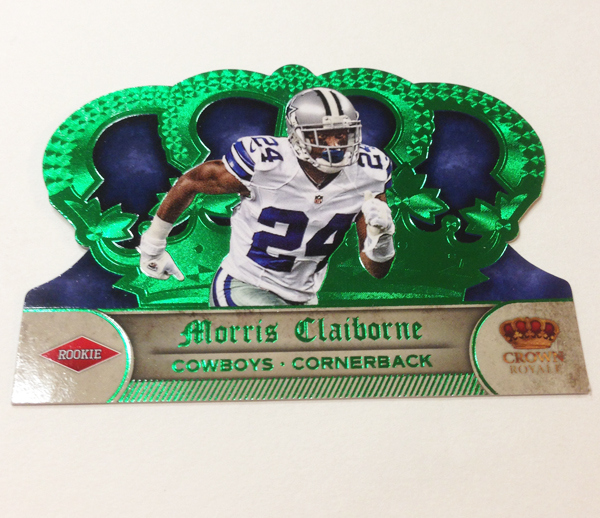
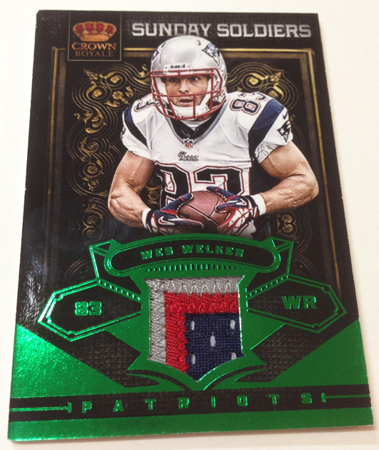
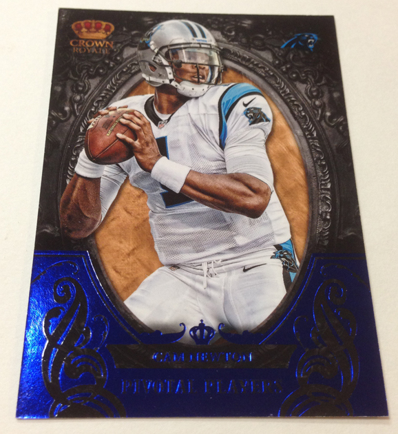
Outside of these cards, there are few redeeming parts of Crown Royale, especially with the continued invasion of the big white boxes behind every sticker used. This year, there is not a single card that even looks close to being well designed, with more white boxes all over the place – including on my favorite cards. The rookie silhouettes have been bastardized by poor composition and hideous autograph placement, on top of the fact that the theme of the set has changed drastically from the success of the previous two years.
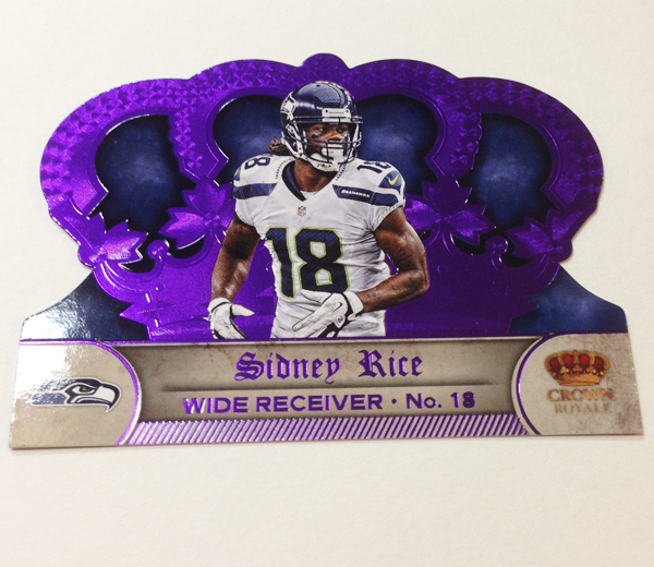
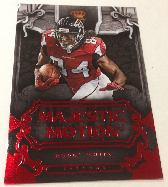
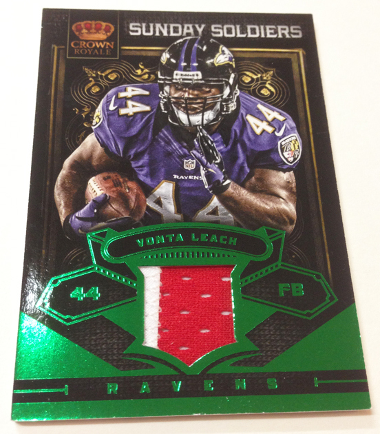
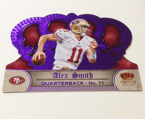
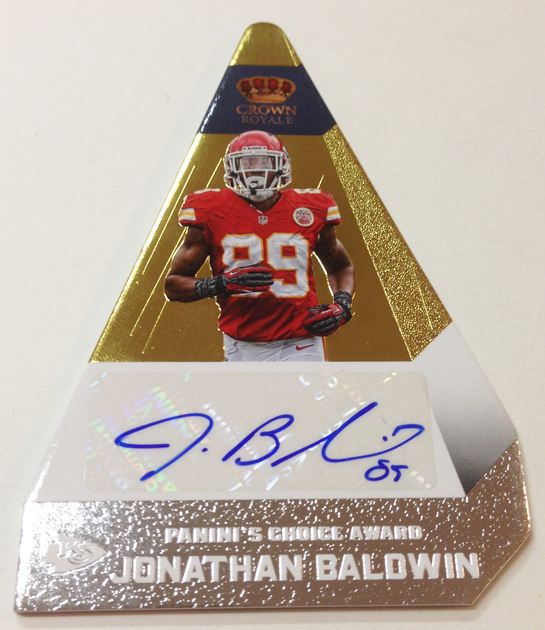
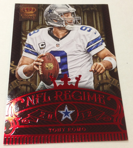
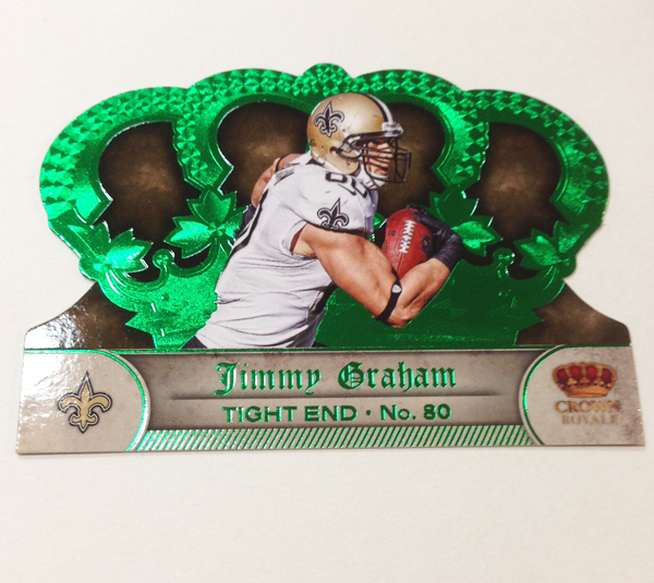
That isnt even the worst of it, as there is a new enemy all over this product, that we first were introduced to in 2011 National Treasures – colored foil layering. Im not talking about silver and gold that usually goes with EVERYTHING, but the brightest of red, green, and even PURPLE that clashes with just about every player subject its paired with. On a lot of these cards, I have trouble focusing my eyes on the content of the design because the foil is so ridiculous, and that is NOT a good thing.
Overall, this bout of Crown Royale should have been shelved all together. After a product like Topps Strata, which makes the most out of some of the best design work of the year, this is the complete opposite. If anyone buys a box of this, I pity your wallet. Its going to be that bad.
Just dont know what to say:

I’ve always like the Crown Royale set. I know it’s simply a matter of opinion but I think the colors in the set are amazing, it brings more than just your standard card and the colors they use aren’t some clearcoat refractor variation; they are nice bright vibrant colors. Also in the 2011 product each case guaranteed at LEAST 4 top tier autos, not many products you can find that do that. Also for 70 or bucks a box with a 1 in 3 chance of getting a top tier auto it’s a good bang for your buck. I think you missed the mark on this one.
The color foil are okay but not that great to make it a significant reason for us to buy a box of Crowne Royale. Like you already mentioned, I find the HUGE white box for the autograph to be placed on a HUGE turn-off. I absolutely hate how Panini routinely places sticker auto’s in every single brand they produce. The only thing Panini has it going for them is veteran player auto’s even though they are sticker auto’s.
I too am a big fan of Crown Royale. Not every card hits the mark, but I like the overall theme of the set and the intricate background designs. I know the “two dollar jersey card” is a big complaint but Topps is the same way. To be honest, I’d rather have a jersey card of an established pro like you find in Crown Royale than an event used jersey of a no-name rookie like Topps puts into most of their sets.
On the subject of the “big white box”, I think that time is going to tell whether you are right or not. Personally, I think your bias against Panini has blinded you to some of the upside. The white box makes the auto stand out on the card and, in my opinion, will hold up for years. To me, the point of an auto card is that the auto is the #1 aspect of the card so a design that makes that aspect stand out is a benefit to the overall card. I hate sticker autos, whether they are slapped on a big white box or not. But, when you compare Panini to Topps’ products, you have to compare it to whether the on card autos on Chrome will hold up over time and the fact that the on card autos don’t really stand out a whole lot in Chrome. I just think there are some good aspects to the “white box” design.
With all the 80s clothes coming back its only natural a crap company like panini would fall into the retro trap.
This bright color foil take me back to the late 80s early 90s when every one and everything had cards in it and they actually sold. It fun to think back to how much Bazooka and Post cereal I ate just to get the cards they put in the boxes
Remember how exciting it was when we thought an insert numbered to 10000 was considered rare?
Do die cuts and this cheap looking bright color foil even have a place in the hobby with all the real time tech abilities we have today.
Its a shame because I am making the 2011 Crown Rookie auto set based on the design and on card autos….
Looks like Xmas ornaments
I was reading this to get an of what the product is like and you don’t seem to be a fan , but when you tout starta, I think you lose some credibility. Average product at best.also yeah stickers aren’t great but topps has a bunch… Even on the higher end stuff.