
Okay everyone, Im confused.
Here is why.
For their last two products, Panini released Prominence and Momentum back to back, and much to my disgust, I have to say they are the ugliest post-draft releases this year. Each of the cards is uglier than the next, showcasing a serious lack of design and theme coupled with a horrible configuration and price point. Each time I continue to see new auctions posted I have to scoff at whomever thought they were worthy of release.
Here are some of the worst of the worst:
2012 Panini Momentum Cam Newton Souvenir Signatures Auto
2012 Panini Prominence Andrew Luck Plastic Helmet Auto
2012 Panini Prominence Justin Blackmon Jumbo Patch Auto
2012 Panini Prominence Alfred Morris Auto
2012 Panini Momentum Trent Richardson Triple Jersey Auto
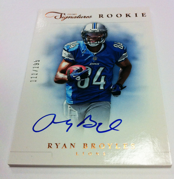
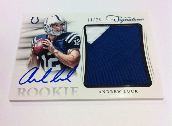
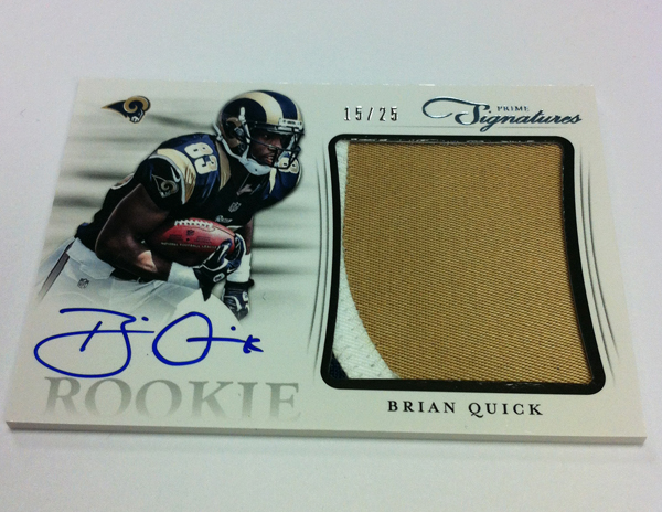
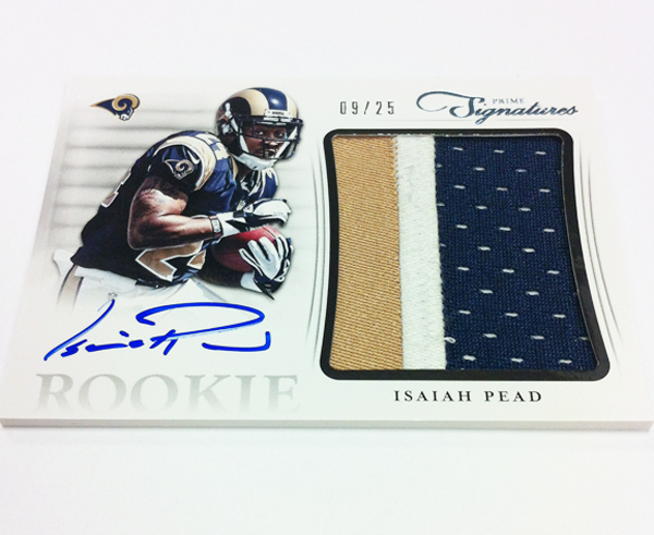
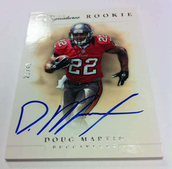
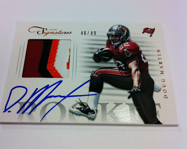
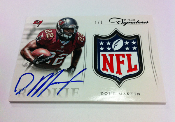
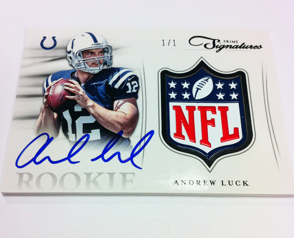
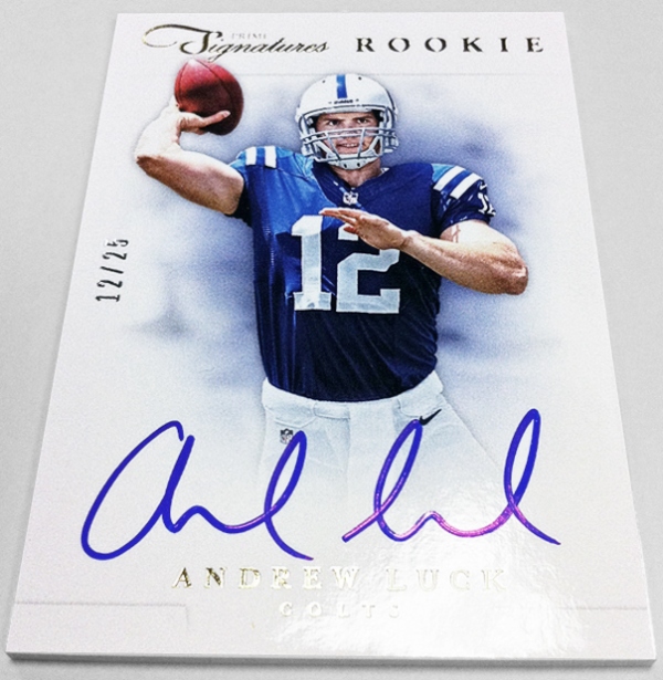
Then, as Panini posted on their blog today, we have a set like Prime Signatures. From the previews, this is an 2009 Upper Deck level release, with on card autos on cards that are sleek and pretty on the eyes. White backgrounds, full bleed pictures, and minimalist approaches are always welcome in my book, and Prime Signatures is doing it VERY well. I will say that the base design hasnt changed at all this year, and that would usually not make me happy. However, like Inception over 2011 and 2012 didnt change, the old design is a concept worth repeating. I really liked it last year, and if it werent for a ridiculously horrible box configuration I would have bought a bunch of it. Regardless, it is done so well, that I have to believe there are two design teams now at Panini, because there is a huge gap between products that is quite obvious to me.
On one hand, there is the original design team, which is handcuffed by the notion that the past is actually worth preserving. This old gaurd is responsible for absolute donkey crap like Momentum and Prominence, and other upcoming sets that make me gag in disapproval. These ones are the Panini products I have come to know and hate. Its right up their alley.
The other design team started working on the Prestige base design, and has started to realize that the design elements cultivated by Upper Deck and Topps most recently are much more visually appealing. Because visual appeal contributes to product quality, better looking cards is good for business. Prime Signatures is definitely in that boat. I also realize this could be the work of outside vendors, and due to cost of having it done this way, they might not be able to afford a team like this for every product. They should make the investment in my opinion.
If there is only one team, and the same exact people are responsible for both, they need to sever the dual personalities and focus on the elements that make Prime Signatures so awesome looking. Ditch the elements that Panini has made their disgusting calling card over the last decade and embrace the future of card design. Ever wonder why Panini’s products sit on shelves for years after the first month? Its because they dont look anything like this:
Pingback: Around the Carding Blogosphere for September 28, 2012 : The Baseball Card Store | Hairline Crease