This year, one of the most storied sets in all of football turns 20 years old. Obviously this really isnt THAT long of a span considering how some of the other sets from Topps have been around since the 50s, yet it is one of the oldest “modern era” sets around. With all of this taken into consideration, Panini needed to come back strong after what, in my opinion, was one of the worst Contenders sets ever. That is saying a lot, considering that 2009 might have been the ugliest autograph cards ever produced. However, like Topps Chrome, this product has relatively had the same configuration with minor tweaks during its long run, and that is a testament to its collectability.
Here is a look back at some of the designs from the previous few years:
2011 Contenders – This was a horrid design, mostly because of the trapped player and autograph. The team color backgrounds didnt do much for these cards, which havent seen the usual value a ticket auto usually holds.
2010 Contenders – Probably my favorite of all time, even with the foil. Its a simple design that focuses on all the right things. Absolutely love this year.
2009 Contenders – As mentioned above, this was one of the worst. The giant 102 point text covering the player looks ridiculous, so much so that the autograph is lost. Bubbly autos on the foil were also a major issue for this year.
2008 Contenders – If the giant text was gone, this would have been a much better look, but like 2009, the set’s visual appeal is lost.
2007 Contenders – This was also a great design, even though the stickers take away from the overall potential. It was a good look with the top and bottom border, and little interference with the player photo and auto.
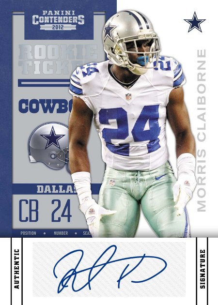
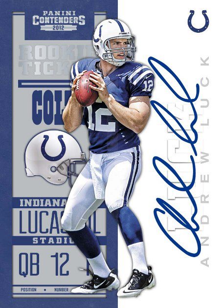
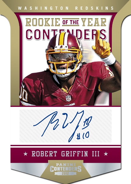
In a day that many look forward to, Panini released the design for the 2012 20th Anniversary edition, which had its huge highlights and some considerable fumbles as well. As I have said a number of times for the 2012 slate, its as if Panini has two design teams on staff, and after hearing some remarks by industry insiders, it might just be that the good stuff has come from an outside firm, and the usual crap has been kept in house. That being said, I didnt expect to see both at work in one product, as the base and ticket on card auto design is crazy awesome, and the rest of the set is about as hideous as it gets. Not only that, but with the throwback to the 1998 iconic ticket design in place, I would have expected that Panini could handle the rest of the cards. Obviously not.
Lets start with my favorite part, which I feel might be the best of the last few years. The vertical ticket design is back, and modeled after Peyton Manning’s famous card, so that should have no problem being sweet. The auto space running up the side looks surprisingly great, and overall, this card is a complete win. I think that it is new enough that it still seems like its own set, but has the same soul that we all loved back when autographs first made their appearance in a Contenders set.
As for every other card, including the ticket autos with stickers instead of hard signed autos, I would say this is an F+ design at best. Each of the cards is dominated by huge white boxes, which do nothing but disrupt the design on each of the examples they are built into. Its beyond terrible, as many of the cards are light enough to prevent the need for a giant white box to make the auto stand out. My biggest gripe is with the Morris Claiborne card, as all Panini needed to do was slap the sticker on the same exact layout of the Luck preview card. Instead, they cut the player off at the leg for a needless addition of the big white box.
I would have loved to see ticket reprints from across the years, with hard signed examples from this year’s rookies on previously successful designs. However, after reviewing some of the recent ones, that might not be the best idea. In my opinion, the 2010 design is one of the best since the auto explosion, with this year’s design right there as well. With last year’s tickets being the first to be printed on regular stock in years, one can only hope that continues this year too.
Contenders isnt going to go away, despite the best effort of Panini’s awful design team. I will say, regardless, this ticket is one for the ages, just like the way the draft class is turning out to be too.