
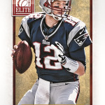
For some reason, Panini decided they were going to preview Elite today, something that kind of confuses me. It might be that the industry summit is coming up, and the set will come out anyways, but Im not sure. Like 2012 Prestige, 2012 Elite was a complete upgrade, over what might have been the worst design in Elite history
the previous year. That’s saying alot considering the Elite design once had a lightning storm going on in the background
. This year’s design definitely has a different look to it, which isnt a bad thing, it just makes me worried.
Each company has their parallel product, where a box can be saved by non-hit cards and colored parallels through the base set. Elite is that product for Panini, and I am curious to see if they are moving more towards what Topps does with altering border colors. This design is nice, not spectacular, but it is a HUGE improvement over what they previewed for 2013 prestige. It will grow on me.
My biggest curiosity is how they will present the autograph on these cards, as they were not previewed in the solicitation. With Panini’s history of murdering card design with big white boxes behind their stickers, Im worried.
One of my favorite Panini cards last year were the acetate Rookie Inscriptions that were signed on card at the premiere. They WERE my favorite Panini cards of the year, as the acetate made them pop
. This year, not so much. The horizontal design leaves less room for the player to sign, which was one of the main reasons the cards were so successful last year. Breaking up the player photo with the tiny signature box is also quite distracting from the overall composition of the card.
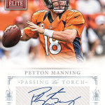
My favorite card of the preview is the Passing the Torch autos, which needed a design boost over the rehashed and failed 2012 tribute version. The worst part of this card is that they present a conundrum that no collector should ever be faced with. There is no reason to ever have a double sided card. Ever. With how many booklet cards exist these days, there is no reason to ever need this again. Not only does it prevent it from ever being displayed completely, but its annoying to figure out. How much better would these cards have done as a booklet?
So far, with Topps making a splash with their first two previews of the year, Panini is struggling to keep up.


Like the look of the Brady base card but if rookies in college unis not interested.
Agree about the 2 sided autos but I dont really like book cards either. Cant I pass the torch without being attached in some way?
Also enough with the die dutting