
When it comes to Panini’s football calendar, there are two products that always generate a huge buzz leading into the release. The first is National Treasures, of which we got a big preview of earlier this week. The second is Contenders
, which is due out next Friday after the holiday. Even though Panini’s hype surrounding on card autographs in sets like Black and NT has been relatively warranted, few parts of Contenders are living up to previous years
.
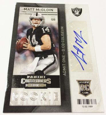
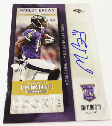
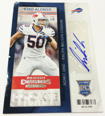
Even though the ticket design is something I like, without a strong class behind it, the cards will likely be lost in the shuffle. The true best pulls from Contenders will likely be the first or second autographs of the year for guys like Matt McGloin, Kiko Alonso, Zac Stacy, and Marlon Brown, who have all gone relatively AWOL from checklists up until this point.
All that being said there are some really fucking ugly cards in this set, some of which I cannot fathom as to why they were allowed to be produced.
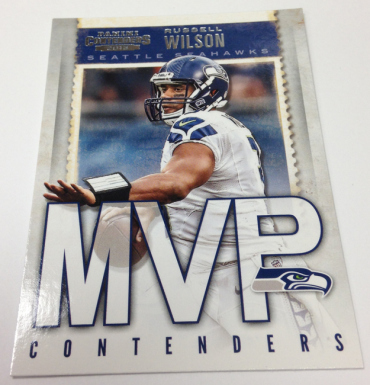
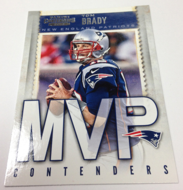
MVP Contenders
This has been a subset of the product for years, but as we have seen with Panini’s design team, they love ENORMOUS text
. This card is out of control, with the text taking up over 50% of the card surface. Seriously, if I ever visit Panini HQ in Texas, I expect the name on the building to take up the whole front side. Its almost like they don’t want to take the time to design out a card, so they use text as a filler. Both ugly and LAZY.
Here is how they looked last year: 2012 MVP Contenders Die Cut
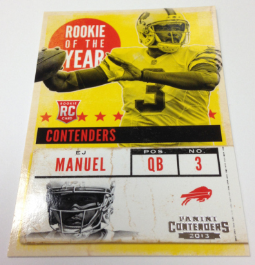
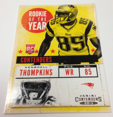
ROY Contenders
Again, another subset in the product for years, but that doesn’t excuse this torturous color scheme. Who chose this bright yellow? Its borderline day glow, and might light up a dark room if left on a table. The layout is horrible, the design is even worse, but that color is ridiculous.
Here is the way they looked last year: Ryan Tannehill ROY Contenders Die Cut Auto /10
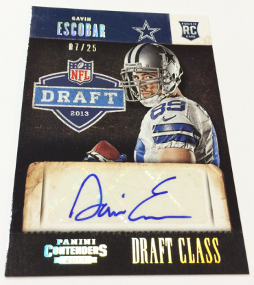
Draft Class Autos
These cards have been an idea that I find quite interesting, although it presents a problem when 90% of the rookies drafted don’t make it to the impact echelon in the NFL. I guess Panini wanted to eliminate some of this risk, opting for single autos instead. As bad as the first two cards I mentioned are, this Escobar might be the worst card of the entire preview. Not sure what that big stone slab is in the middle of the card, but it could not look more out of place. I know its supposed to be like the big white box to make the sticker visible, but as said before, DESIGN THE CARD DIFFERENTLY so it isn’t needed. Add in that goofy ass picture popping out from behind the box, and this is laughable. YUCK.
Here is how they looked last year: 2012 Contenders Draft Class Auto Michael Floyd / Ryan Lindley
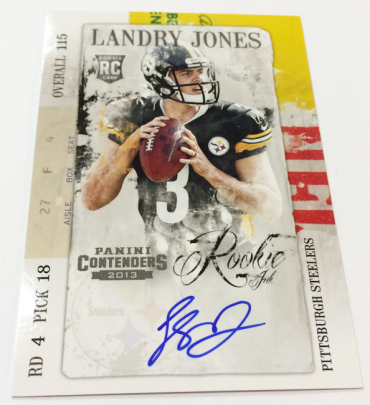
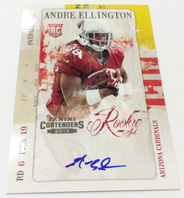
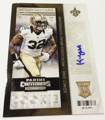
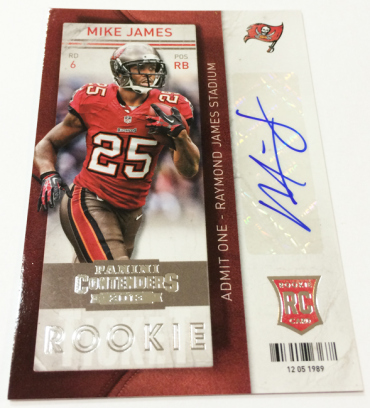
Contenders’ product strategy relies on deep cuts, just like an old Zepplin album. Without a strong class at the front, the appeal is going to be diminished without a doubt. That doesn’t mean the product wont sell thanks to loyal set collectors, yet the potential for growth may not be there. Its too bad, because I think the tickets are some of the best homegrown ones we have seen as of late. 2012 was a 1998 retro design
, so Panini doesn’t get credit. The 2013 tickets look tremendous.
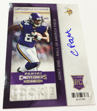
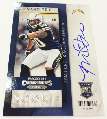
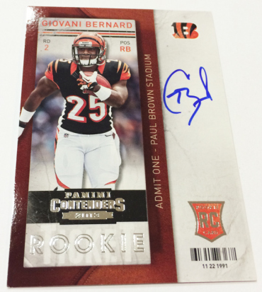
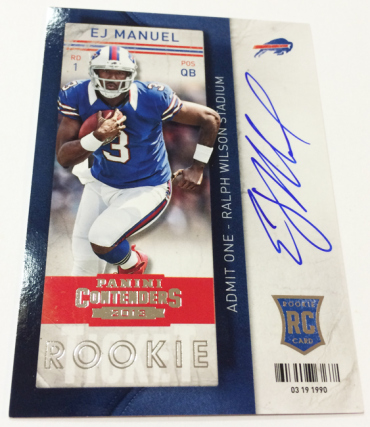
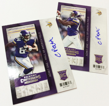
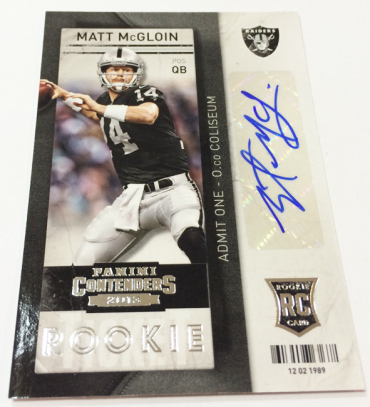
The rookie tickets have the “RC” logo on them.. why do they need the word ROOKIE on them as well… and what is the UPC code on the front for??
Take the word rookie off, drop the contenders logo the the bottom of the card. Team logo top left, rc logo top right, center the player, extend his legs to the bottom and fade out slightly for the auto in the spot where the contenders logo used to be..
I like the rookie ink but they could be improved by removing the words Rookie Ink, move the contenders logo to the upper right going vertically up the card….