
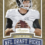
Ladies and Gentlemen, here it is – the beginning of 2013 football cards, and it doesnt look pretty.
We got our first look at 2013 Prestige over the weekend, and it looks like Panini is rolling out the lackluster design to match the seemingly lackluster draft class. To tell you the truth, im really disappointed, because I honestly believe that 2012 Prestige is the best design the brand has ever seen, and was easily one of my favorite Panini products of the year. Because they pushed it back to have pictures and relics from the Rookie Premiere in May, the set went from completely forgettable to one that should have been a pre-season force to be reckoned with.
Here are some cards from the 2012 set – you can see what I mean:
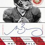
2012 Prestige Andrew Luck Auto /299
2012 Prestige Russell Wilson Auto /499
2012 Prestige Trent Richardson Patch Auto /99
2012 Prestige Clay Mathews Auto /10 – even the Veterans had base autos!
2012 Prestige Robert Griffin III Draft Ticket Auto – Went from hideous in 2011 to not terrible in 2012!
After seeing the 2013 design, I am pretty sure that all the progress made in 2012 is an afterthought with this ridiculous design.
Not only is the design on the level of a layout and composition disaster, the 250 point text that says “ROOKIE” in all caps is beyond stupid looking. I understand that photographs from the premiere will be used, but hopefully some of this trash is taken out of the way this card looks. The autographs look a little bit better, but overall, its 100% worse than 2012.
The best part of 2012 was that many of the design simplicity rolled into the inserts and subsets as well as the base, which is all but forgotten here. I wish that Panini would learn from their successes as well as their mistakes, but we frequently see them rehash awful ideas
and trash the good ones.
2013 Prestige should be the first post-premiere product of the year, and should lead off with a big splash. Instead of a big splash, this is just big text. The Andrew Luck is the nicest card of the preview, but that isnt saying much. The on card draft passport card or whatever the hell they are calling them these days, might be as ugly as the NFL Nation subset from Gridiron Gear, and that is saying a lot.
I hope this isnt a sign of terrible things to come, but with Panini its always a sign of terrible things to come. All I have to say is that Elite better be freaking groundbreaking to make up for this visual train wreck.


I have to with disagree a bit with you, in regards to 2012 Prestige being the best design, though it does come in 2nd. IMHO, I really liked the 2008 set when it was Playoff Prestige. The 2008 set simply offered it’s annual 10 short printed rookies, including, that years #1 overall pick, Card #201 Jake Long, being extremely short printed and only found in retail packs. Last I saw it was selling anywhere from $150-$200 range. Though the rookies were featured in their college uniforms, which was Prestige’s MO for 10-12 years, the card had a very nice overall look, including the inserted sub-sets. I see that in 2013 Prestige will feature its’ first Rookie Logo, much like Topps does for its’ flagship product, which as gone through various changes from 2006-2012. I really don’t see Prestige keeping the 250pt ROOKIE due to the RC logo they have brought in for the 2013 release. However, anything is possible with Panini and thier products. Basically I will most likely but my usual 5-10 packs and wait for Topps Chrome.