
My hatred for Prizm is well documented. WELLLL documented. Not only do I hate the design, but I hate a lot of the main draws that people claim as the reason to buy. Most of the parts of Prizm are done more effectively in Topps Chrome, which is the product many of these cards are based off of. As I have said before, if you are going to blatantly copy an idea, at least do it well.
Here is the history of my hatred:
2012 Prizm Trent Richardson Auto RC /99 – Check out how much of the card is obscured with needless and ugly design elements.
2013 Prizm Oscar Taveras Auto Rc – It honestly looks like the player is jumping through a window.
2013 Prizm Mike Trout Gold Refractor Insert – the inserts are some of the most poorly named and poorly designed ideas I have ever seen.
2012 Prizm Scotty Pippen Gold Refractor /10 – The only reason this is so popular is because of basketball, where collectors are so starved for Chrome they will take anything they can get.
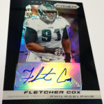
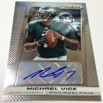
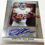
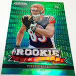
As shown above, instead of amazing execution, we get 100% sticker autographs where Chrome features lots of on card elements. We also get colored refractors in the product, which is done the exact same way as Chrome
, but the colors and patterns are fucking hideous. That isnt even the worst part though, and that is what is so funny to me.
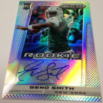
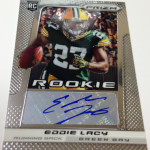
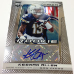
When you look at the way the autographs are done, its a big box of plain silver that cuts off the design completely. In Chrome, the autographs have always fit in seamlessly with the design, even when they are stickers. In Prizm, they have been more of a horrendous distraction than anything
. If Panini added in a faded out area where the sticker can be applied, instead of a flat box, it might not be as bad. Yet, we see that Panini still hasnt figured out a way to make their cheap knockoff into a legitimate and worthy opponent.
I am consistently stupified by the poor decision making Panini uses with so many of their home grown brands. Prizm is the worst of the worst in a lot of cases. Chrome is beloved in the hobby, and there is obvious ways to cash in on that legacy. Instead we are left with shit disguised as crap, and that is never good.
I do agree with about 90 % of your statements, but there are a few of these I do like. I cant explain it, but i do. I dont think id pay good money to open a box of these, but I do believe Ill pick up a few singles on Ebay.
Totally agree. The only sport where Prizm belongs is NBA, and that is because there is no Topps Chrome for NBA. Prizm Baseball just plain sucks. The players look like they just stepped out of Dick’s Sporting Goods with warm-up gear on. Absolutely terrible.