
I am not a fan of Prizm. I literally cannot stand it.
Aside from my absolute HATRED of the name, I am of the group of people that feel the 2012 set was basically Diet Chrome, with inferior design, poor execution and a boring approach. I dont disagree that Panini was missing out on the use of Chromium stock prior to 2012, but their attempts have been laughable at best. From 2010 through 2013, the Topps Chrome design has been the best it has ever been. Prizm, at best, is a cheap knockoff, whose existence only serves as a testament to how skilled Topps has become at producing their set
.
Base Design
Before I saw the design for 2013, I was curious to see if Panini had finally found a way to bring Prizm up to the level we see every year from their competitors. Then I opened the preview and saw the fucking trash that Panini is trying to pass off as 2013 Prizm. I do like that they added more area for the photo, but the parallelogram approach does nothing for the look of the set.
Last year:
2012 Prizm Base Design – Rookies
2012 Prizm Base Design – Non Rookies
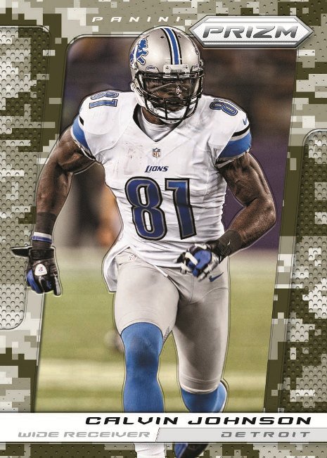
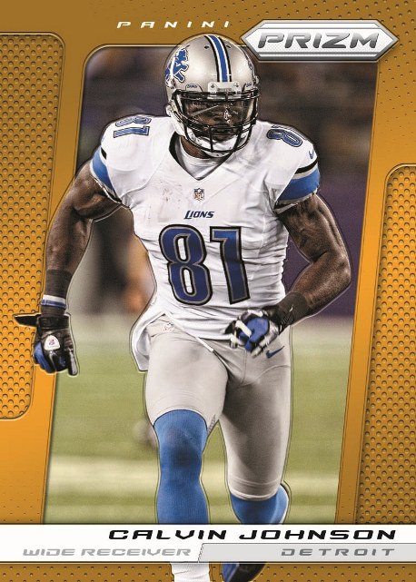
This year:
 ,
,
Parallel Design
Not only does this shit blatantly rip off the parallel structure that Topps has made their selling point, but it bites the creative ideas as well. Although they may have added more parallels over 2012 it just makes everything worse. Topps debuted a camo bordered card in 2012
, and is using the digi-camo design for their cards in 2013. Panini felt the need to use it as well. I honestly have no idea why they thought this was okay.
Last year:
2012 Prizm Parallel Design – Red Die Cut
2012 Prizm Parallel Design – Gold
This year:
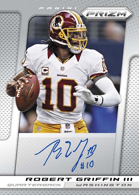
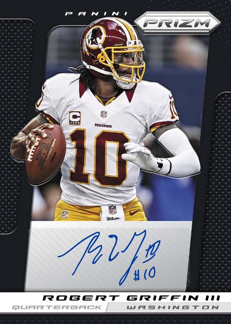
Autographs
The worst part of this preview continues to be Panini’s inability to use a gradient fade to lighten areas where signatures will go, instead opting for an ugly box. In Chrome, Topps has always used frosted areas to provide a place where an autograph can be highlighted, but Panini has disregarded this appealing and successful design. This big ugly box has been a staple of their cards, and continues to be an aesthetic eyesore on every card that uses the technique. Im not sure when they will learn.
Last year:
2012 Prizm Autograph Design – Rookies
2012 Prizm Autograph Design – Non Rookies
This year:
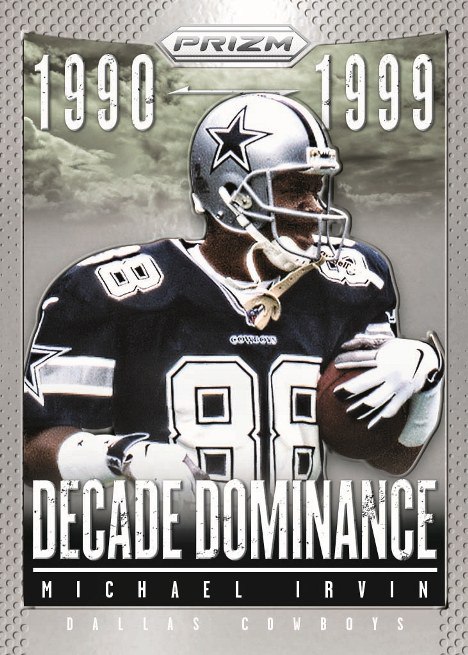
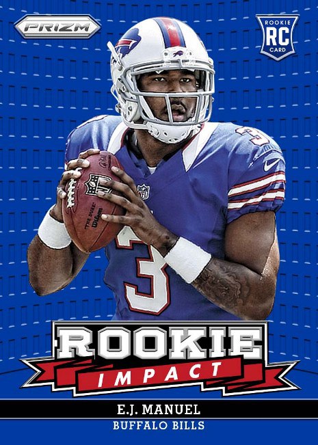
Inserts and Add Ons
This is the only part of the set that doesnt look that bad, although the rookie impact is pretty awful. I think the decade dominance cards look good, but these will honestly be the most forgotten part of the set.
Last year:
2012 Prizm Insert Design – Rookie Impact
2012 Prizm Insert Design – Decade Dominance
This year:

Because of a success in basketball, where there is no Chrome, collectors have inexplicably assigned similar value to Prizm in football, which I find to be disgustingly stupid. I would be okay with it had Panini actually put some work into the design of this set, instead of (poorly) ripping off the people that do it right. Since they decided laziness is a better approach, they get the horns.
Prizm football for some reason does not look as good as Baseball
Brutal…..I love it!
This stuff is garbage. Don’t like Panini’s stuff and don’t collect a single set of theirs. To be honest, Leaf Metal looks 3x as good as this stuff.
Awww, how cute. Somebody thought 2005 Topps Paradigm was a great design! Cookie and pink slip for another lame-ass designer.