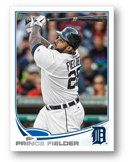
Every year, the release of the new base Topps design is always a long awaited event. Not only does it set the tone for baseball for the rest of the year, but it also signals the ramp up for the next card season. Over the last few years, Topps has had some big successes in design (2010 and 2011) and some enormous failures (2008). However, this year is proving to be one that I find to be one of the best, not one of the worst.
First, a retrospective over the last few year’s designs:
Without further adieu, here is the new design for 2013 Topps Baseball:
After seeing that there is a new focus to separate the baseball and football designs, I think it gave a considerable license to generate a baseball design that was more complementary to the actual game. I love the border being framed by the shape of the diamond, and the home plate at the bottom left is a cool touch. Additionally, adding in the team logo and not a word is always welcome, as I think logos are vastly underused. Not only that, but it still leaves room for colored refractor borders for Chrome, and doesnt damage the overall heart of the card.
Topps has been stepping up the game on card design, and I definitely believe this is right up that alley.


This reminds me of a sleeker, more modern version of the 1994 design. I like it.
That is a VERY cool design. Love the diamond incorporated into the lower area of the card.
Exceptional design. It really pops out at you and I agree that differentiating between baseball and football design-wise was a very smart decision. Makes me wish I collected baseball a bit more. Here’s hoping that the football design for 2013 will be just as cool.
Not a bad design, but nothing special. I think for me it will depend on whether or not the border color changes for each team.
That said, the one thing I absolutely hate, and which keeps me from buying this product year after year, is the use of silver foil for player names. The silver foil is hard on the eyes, difficult to read, and adds nothing to the design.
Consider how much better the players names would look if they were also in team colors, and therefore much easier to read.