
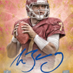
When Topps first previewed Inception back in 2011, I was floored by their ability to get on card autos for players that had not yet gone to the premiere in their NFL uniforms. The cards just looked like they were on a different level than any other pre-rookie premiere product. They had really used their design team to retouch pics in a way that made them believable and beautiful. In 2012, Inception came back with a few tweaks and additions
, but we saw that the formula was still relatively the same
. This year, there are more small changes to improve upon this successful program, and I think this might be the best year yet, at least in terms of look and theme.
Let me say, I rarely like when a design is rehashed over and over again. But, collectors LOVE continuity like nobody’s business. It also doesnt hurt when the product looks great the first time around.
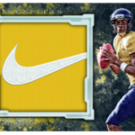
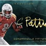
For 2013 inception, the product’s biggest change has to be in the patch autographs. Even though to someone just coming on board, it will look similar to previous years, the increased photo size and diecutting of the window break up the design in a much more dynamic way. Last year, the swatch window looked out of place with no border around it, but this year, that is taken care of.
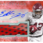
Topps also seems to have listened in terms of having players sign non card material, a practice I have LAMBASTED them for in previous years of this product. Now, they are having the players sign one side of a book on card, while the swatch looks to be unsigned on the other side. Signed swatches usually are a complete disaster
, as we saw in 2011 and 2012, and I hope this is the end for that medium.
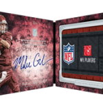
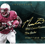
Lastly, I love that Topps is adding inscriptions to this product, as I believe there is always an opportunity to add this type of content, at least when the players are a captive audience at the premiere. Lets just hope the pen problems of 2012 dont resurface, and thesharp signatures of the 2011 cards
2011 cards are back and better than ever.
As for the rest of the cards, its very similar to previous years. My only LARGE concern for this product is that the rookie class is horribly weak. WIth confirmation coming that Inception will be 100% rookie based again, that isnt a good thing for a higher end one pack product.
I think this is going to be a winner for a third year in a row, as Inception has quickly become one of my favorites each year.
I really enjoy Topps Inception. When it first came out, I was pumped. I purchased one box and pulled a 1/1 jumbo patch of DeMarco Murray. Loved the design last year in comparison to 2011 and I did not think the design was too similar. This year seems great as well. Only beef I have had with this set is the “00” numbers on the jerseys and the airbrushing for the NFL uniforms. For the Nick Toon base autograph card, Topps forgot to change the color of his glove. The glove color is red. Thought that was funny. For whatever reason, the chipping doesn’t bug me too much; adds character to the card IMO but that would be great if they could fix that issue. I also noticed that Topps is doing Bowman Inception baseball for the first time… pretty cool.