Two big previews today, one from Topps and one from Panini. Both represent very important sets in Strata and Prestige, but only one truly lived up to the potential set by banner years for both products in 2012.
Panini Prestige
On frequent occasions, I have talked about how much I loved 2012 Prestige. Not only was it a post-premiere set for the first time ever, but the base design was incredible. It was followed up strongly by Elite, and I thought that Panini had finally started to turn things around. I went out and bought a number of boxes and cards when it was released and many of those cards are still in my possession.
2012 Prestige Trent Richardson Auto
2012 Prestige Robert Griffin III Insert On Card Auto
2012 Prestige Russell Wilson Auto Patch
This year, the design took a huge step back, as I have mentioned before. Panini’s obsession with needlessly ENORMOUS text has taken hold, as these cards are about as ridiculous as it gets. Rather than putting the player front and center as the subject of the card, Panini wanted to showcase their cool rookie logo and GIANT font in a more prominent position. Not sure why, but its a common theme this year. Similarly, the shots chosen for the rookies happen to have some really odd facial expressions, as they felt it was necessary to really get up close with the photos. The result is completely horrible, and I am disappointed by the lack of execution that we saw last year.


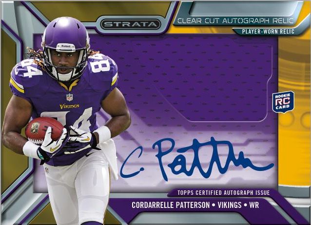
Topps Strata
I named Strata the best new set of the year last year, and for good reason. Topps’ resourceful use of acetate and on card autographs really made for a stunning presentation. The clear cut auto relics turned out to be one of the best rookie designs of the year, and I am not shy in talking about how much I loved collecting these cards.
2012 Topps Strata Andrew Luck Clear Cut Auto Patch
2012 Topps Strata Doug Martin Shadow Box Auto Jersey
2012 Topps Strata Doug Martin Shadow Box Rivet Patch Auto
Thanks to twitter, we got a sneak peak at the new version for 2013, and I think they made some upgrades that improve the design significantly. The theme is basically the same, with an hard signed acetate overlay on top of a jumbo swatch. It looks like they will be frosting the window to make the signature easier to see, and a more jagged cut in the swatch window is definitely much more cool looking.
I believe that Strata will be on par to impress as much, if not more than last year’s set, and this is only the beginning. Although the base design looks a lot like 2005 Finest from first glance, there are a lot of reasons to be excited for the other surprises in store.