
Every year I have touted my immense hatred for a brand that continues to be one of the more polarizing in the industry. Topps Triple Threads has easily been my least favorite product on Topps’ calendar, and because it spreads to all the major sports they own, its like a thorn in my side every year.
The combination of bright rainbow foil, horrible design with tiny player pictures, and the infamous die cut sayings and stupid phrases, has made Triple Threads into the bane of my year. Lets face it, Triple Threads needed a face lift after cards like this:
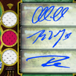
2008 Triple Threads XXIV Booklet
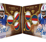
2010 Triple Threads Eli Manning / Peyton Manning Dual Auto Book
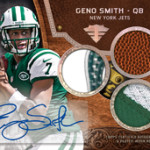
2008 Topps Triple Threads Ray Rice Tri Jersey Auto
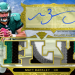
2011 Topps Triple Threads Colin Kaepernick Triple Jersey
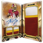
This year, Triple Threads has been re-branded, and although some of the product still bares the putrid soul of its predecessor, a lot of it showcases a new look and a new feel which I actually really like. The base RC autos are no longer the normal situation we have seen in football every year since 2007, but instead a steampunk meets sports card look. Its great. No die cuts, no foil, better design.
Topps also has added a new element to the product called “trapped acetate,” where the players will be signing what looks to be a Shadow box style design. It looks really cool, and I hope it turns out as well as it did last year.
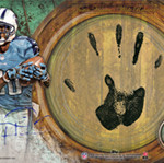
We also see that the hand stamps are back, which I find cool as oversized elements that add to the appeal of this product. Last year, they turned out to be some of the most awesome new examples of what is possible when companies think outside the pack. I am glad they are back. Additionally, the pigskin booklets are also making a comeback which I think are incredible. Last year, I loved the idea a lot, even though I hated the design
, and now that everything is up to par, I will be on board.
Of course, we are going to get the normal Triple Threads junk as well, but I dont think it will serve as much of the main composition of the product. At least I hope it wont. It also looks from the preview that the hideous foil stock will be replaced, much to my delight, with a focus on delivering more high end looking examples. I also see that the pack configuration has been updated to include more content, which is something we needed YEARS ago.
Topps hasnt quite made a fan out of me, but this about as close as they are going to get.


Kinda looks like whatever designs were leftover from Valor were implemented here. Regardless, it was time for a change and anything different is refreshing. RUT!