
I think its funny to compare these all side by side. They are almost direct copies, but Im actually good with copying as long as you do it well. So, the question becomes, who did it better – Upper Deck or Panini? You might be surprised as to who I side with!
2006 Ultimate Collection vs 2014 Immaculate:

I like the immaculate version except for the fact that the player looks so confined in the top part of the card. Upper Deck found a way to make the player seem more whole, although the cropped shield looks really weird.
2007 Exquisite vs 2014 Immaculate:
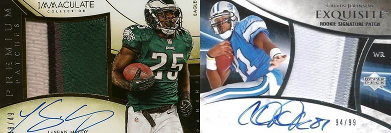
Again, Immaculate’s look good with the player extending down to the bottom of the card. Upper Deck did better with the swatch making the window fit right in line with the design. Almost a variation, but the whiter look is more high end to me.
Exquisite Notable Nameplates vs 2014 Immaculate:

I like both, but the Immaculate designs are nice take on this design. The Upper Deck version is a bit nicer in the way the full card looks, but the weird picture border is off putting on the Exquisite card.
2009 Exquisite vs 2014 Immaculate:

I like the Exquisite better because they didnt separate the signature area with that horrendous bar of gold. But save that, Immaculate looks nicer. UD with the cropped shields again!
2009 Ultimate Collection vs 2014 Immaculate

I like the Immaculate better. Pretty simple here. The gold foil works nicer, and though its a sticker, that’s not what I am judging here. Both should have avoided the separated area for the signature, but Panini’s looks nicer.
Immaculate has some nice cards, and I think everyone is going to have different opinions. Like I mentioned before, if you are going to rip something off, at least do it well.