
I love days like today. Not only do we get to see some tremendous looking cards from an upcoming release, but we also get to see the design for 2014 Topps Football. Yesterday I previewed 2014 Leaf Metal that will be out later this month, but this is much more important to me. Ill start with the more important preview of the two.
2014 Topps Football
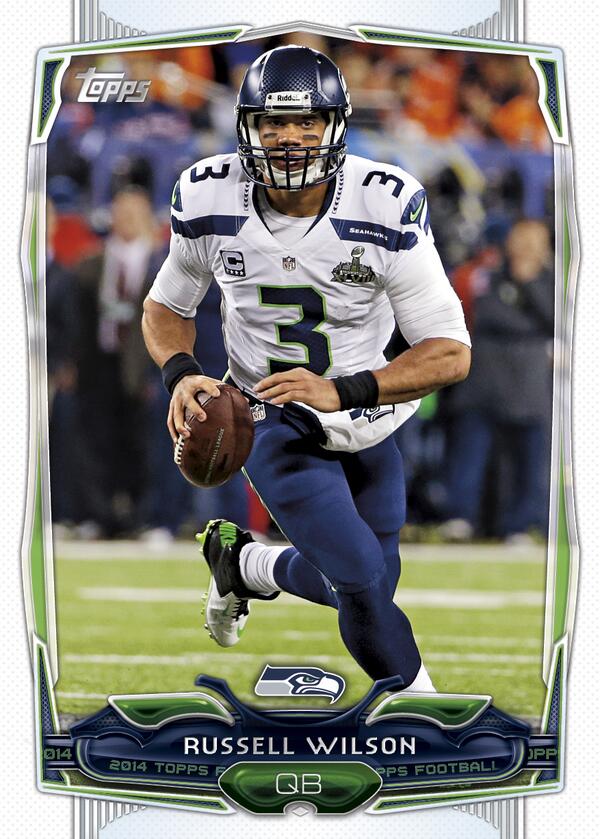
Each year for the last 3, the football design has been allowed to break from baseball. That is a VERY good thing, as the baseball design is usually quite conservative and designed for use in that sport. Football is allowed a lot more flexibility, and it shows. This year’s design looks to be a large improvement over the already strong 2013 look, even though it gets a bit more action on the card overlays. I get a very NYC Times Square vibe off it, and it looks pretty damn good in the process. My only complaint is the stock ticker that says “2014 Topps Football” scrolling across the name plate, but I think it will eventually be a minor issue. Looks like another very good year for Topps football.
Here is the 2012 design – best in a long time:
2012 Topps Andrew Luck RC BGS 9.5
2012 Topps Russell Wilson RC BGS 9.5
Here is the 2013 design – good but not as good as 2012:
2013 Topps Eddie Lacy RC Variation
Here is the 2014 design – more design elements, but really cool:
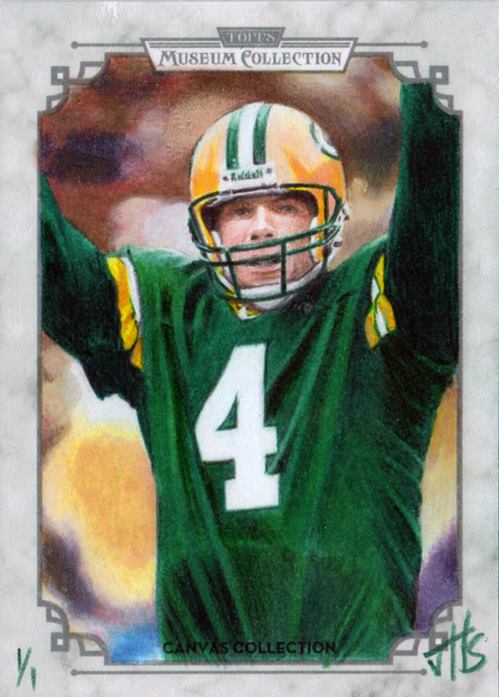
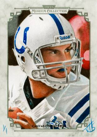
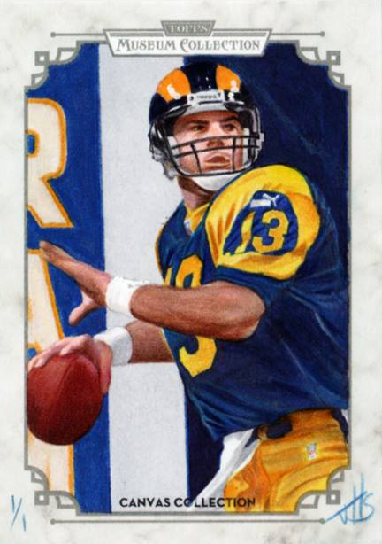
2013 Topps Museum Collection
This product is out later this month, and like its baseball predecessor is going to be employing some sketch and art cards as part of the release. I absolutely love sports are, and by every angle here, these are some really nice ones. These are the actual proofs that will be inserted into the packs as 1/1s
, but there will be reproductions created and inserted at a higher rate.
I think this is the level of quality that we should get with every artistic production, and we definitely got that AT TIMES with Leaf Masterworks. Topps uses a lot more high quality work in their products, and the results can be pretty stunning
. Would love to see some of these autographed.
Check these out:


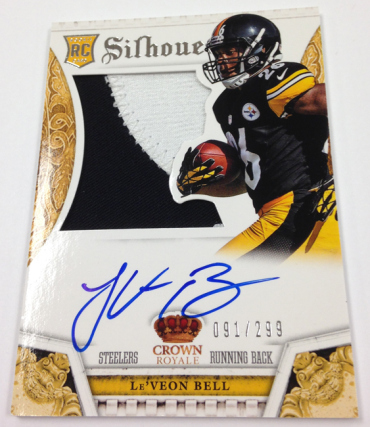
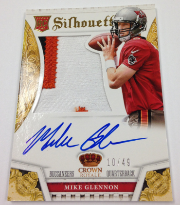
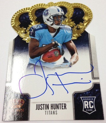
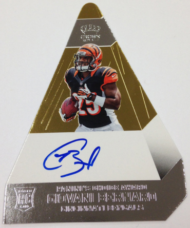
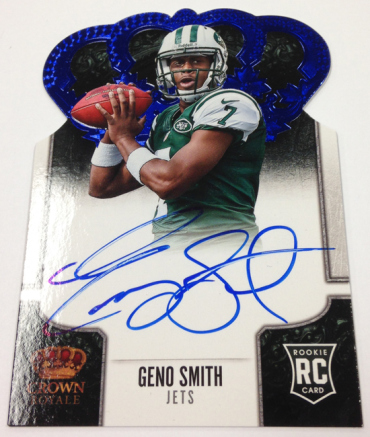
2013 Panini Crown Royale
I thought this product was a complete fucking disaster last year, damaging the appeal of one of the best cards Panini makes. The silhouettes were horrid during a strong class
, and I was worried about 2013 with a weak class. In 2011, they were Panini’s card of the year
, and took a visual nose dive at the wrong time. This year is back on track and then some, as not only are the Silhouettes looking as good as they have in years, but the base cards also look good for the first time ever (check these out from previous years
). Of course, we still get the hideously ugly and stupid “Panini’s Choice” cards – which should be destroyed out of principle
. Good god they are ugly. Other than that, pretty awesome.


I think we are going to have a very strong close to 2013, and from the three 2014 products we have already seen, things are looking better than we have seen for a long time.