You know, prior to 2014, I actually didnt mind the concept of Playbook, even with its absolutely stupid configuration. 2012 Playbook was good enough that I actually bought a few boxes chasing down the big hits, and the cards looked pretty good when you remove the typical Panini trash that wasnt the booklet cards. That's not saying there werent par for the course type of worthlessness, but it was offset by nice stuff other places in the set. In 2014, things went completely south
, and only got worse in 2015. So bad that they started putting stickers on the main box hits instead of hard signed acetate scraps. If you think about it, they literally took a sticker replacement and added a sticker to it. Acetate scraps are signed prior to the card’s creation, which is why playbook can avoid sticker usage, and then to see them go that direction is fucking perfect. Just pure Panini.
Check out some of the nicer cards from this set over the years:
2011 Playbook AJ Green Booklet Auto Patch RC
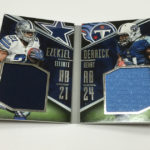
2013 Playbook Down and Dirty Julio Jones Booklet Dual Patch
2012 Playbook Andrew Luck Booklet Auto Patch RC
Now look at what it has become as of a few years ago:
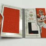
2015 Playbook Jarvis Landry Booklet Sticker Auto Patch
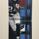
2015 Playbook Randall Cobb Relic Auto
This year’s playbook is right down the same path, with so many poorly designed and concieved cards, that it almost seems like a joke. Its like Panini is trolling us, just to see how low they can put the bar. At some point, even their most staunch supporters will nope the fuck out of every product they put out, and then all will be revealed. We should have already gotten to that point with Gala, Spectra and Unparalleled, but for whatever reason that didnt happen.
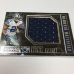
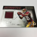
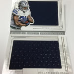
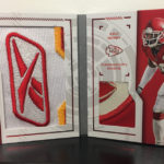
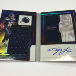
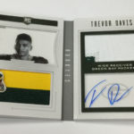
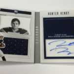
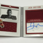
The worst part about 2016 Playbook is the terrible look to the main box hits, which are so fucking boring that even the players look bored in those horrendous head shots they are using on the left side. They literally arent even trying anymore.
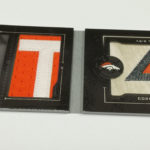
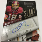
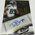
Then, you see Slant Signatures. This is where things get downright comical. Panini decided it would dad joke the hell out of a set by putting the stickers on a slant and calling it “Slant Signatures” to refer to the way the card was designed. I cant make this up. I wish I was. At what point are you so strapped for ideas that you design a card like this, only hoping that people hear the implied “see what I did there?!?” type of garbage that makes this whole product as shitty as ever.
Right now, Im so busy that I havent had as much time to keep up with the site as I had wanted, but hot damn, I needed to roast this turd of a box before it ate me alive. This was the first time since eBay bucks started that I didnt accumulate any from buying physical football cards, and seeing set after set where Panini just squats and squeezes one out should be a clue as to why that is the case.
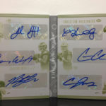
Only Panini folks, only Panini indeed. Check out the damage.