
Lately, I feel like a kid in a candy shop, as every day we are getting some awesome looking previews from one of the card companies. Over the last few days, its been great preview material for both, and today we really hit the mother lode. Not only did we get to see the 2013 version of the Strata Signature relics to match yesterday, but we also got to see some updates to the Father’s Day promotion from Panini. Both were great.
2013 Topps Strata
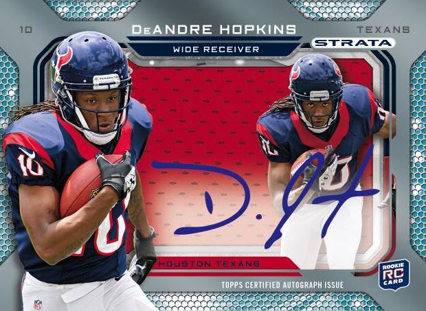
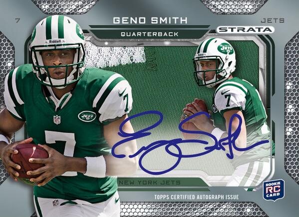
Although Topps was definitely not the originator of the Shadow Box card, they have definitely perfected it. Since 2008, Upper Deck has made these style of cards into a common and welcome theme in their products, but the Strata versions from last year were the best I have seen. I know its a matter of opinion in most cases, but the layers on the Topps card with the swatch background is a GREAT idea. With Upper Deck, its about the depth and the picture layers
, with Topps its the depth, the picture layers, and also the swatch. Upper Deck definitely has the edge in checklist though, I mean who doesnt want an Iron Man Shadowbox
?
2012 Strata Signature – Base Version
2012 Strata Signature – Patch Version
2012 Strata Signature – Rivet Version
I think the added embellishments on the the 2013 Strata Signature are welcome as it adds some oomph where it lacked some last year. The concept is rather similar, but I dont think you need to fix something that is about as far from broken as you can get. My one request is to expand the checklist outside of just rookies, and I hope that the Topps team heeds my feedback. My only complaint is that the team name is on the card twice, which is a bit annoying. Even though they are on different layers, it doesnt seem necessary. Other than that, they look as awesome as ever.
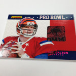
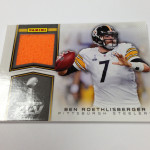
2013 Panini Father’s Day
I have always supported Panini’s mass giveaway events, even though it seems like its a large ploy to sell through their crappy under performing boxes boxes. I believe they have made enough improvement year over year to show that they actually are starting to invest a lot of time into these cards. Although I think some of the cards are a downgrade, there are a lot of reasons to buy the products to get the packs. Even if you dont want the packs, you can sell them for a bunch of money.
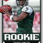
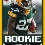
Last year, the Father’s day rookies were the first ACTUAL cards of rookie premiere photography in use. It beat Prestige by a few weeks, which was not expected. The cards were really well done
, and I actually bought a few of them. The swatch and auto cards were again popular
, and I think that this giveaway is a perfect vehicle for them.
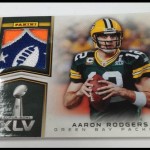
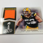
This year, the base cards are a bit weaker in the design, and the obsession with giant text returns. Im not sure when Panini will get it through their skulls that we dont need the word “ROOKIE” on every rookie card. They arent horrible, but they could be A LOT better. My favorites are definitely the Super Bowl cards for the umpteenth year in a row, as the design is absolutely wonderful.
I have a beef with bringing back Studio. In fact, I hated Studio as a kid, mainly because it was such a goofy and lame idea. For some reason, people liked seeing their favorite stars depicted in this sort of manner
. I think it needed to stay on the cutting room floor. Obviously, just because I feel that way, Panini brought it back around. Personally, the softer side of things should be left to Martha Stewart, not sports.
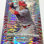
As for the Prizm (still hate this name), adding more of these cards will bring value to these packs that wasnt there before, and I think its a good addition for the long run.


I like the idea of Studio, though more as an insert set than a base set. If a company puts out a 10-card insert that has star players, that’s kind of an interesting concept. If it’s a full-blown 200 or 400 card set, then not so much.
The shadowboxes look phenomenal, I’ve never seen those before. So for the Pead one is it three separate cards put together? I also think Studio as always been kind of a goof idea, it will be interesting what kind of reception it gets once the cards come out.
Pingback: Around the Carding Blogosphere for May 31, 2013 : The Baseball Card Store | Hairline Crease