A Comment On What Makes A Hard Signed Card

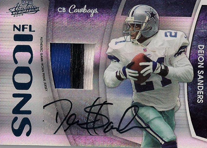
To me, on card signatures have the rare ability to make a bad product better. They add a whole extra element of a set that becomes immediately more collectible because the signatures are not applied by someone other than the players themselves. There is much more room for the player to sign, provides space for creativity in the signature, and most importantly, looks better than a label without a doubt. Upper Deck has long been the company that has moved completely towards on card signatures with more than a handful of products done completely without labels. SP Authentic, Exquisite, Ultimate, Heroes, Black, Philadelphia, Draft, and others have all featured signatures that are hard signed without gimmicky ways of trying to fit into that category. For these sets, the autographs are signed onto the card itself, not some cloth manu-patch piece that is pre-built and signed at the rookie premiere or something. Granted, not all of the sets are done completely with good examples, and there are ones that use horrible half-gimmicks for their “on card” autos, but there sure are a lot that are done the right way.

Recently I read an interview with Panini where they got on the subject of on card autos versus stickers. They were talking about how with the Basketball products they were going to try to get as many on card signed parts to their sets as possible. They touted that they were already focusing on providing collectors with on card signatures and used Prestige as an example. Here is what I am referring to (the bold is mine):

“Panini came in and listened to collectors, as you can see by the increase in on-card autographs starting with Prestige. We feel that our wide array of non-sticker autographs helps give our products that added value, but our goal is to incorporate as many on-card autographs into our programs as we can, without passing that cost onto the collector. “
I will say that Panini has made a small effort to “increase” the amount of non-sticker autos in their products, but there is FAAAAAAAAR from a “wide array.” The manu-patch autos that Panini is counting as hard signed have been included in not one, not two, but three different products. These are not on card signatures in any way to me. Aside from being stupid, gimmicky, and ugly, they are a cop out in the hard signed realm of this business. Upper Deck and Topps both used manu-patches similar to these, but Upper Deck has far surpassed any on card offering in other aspects, thus giving them the opportunity to do so. Topps does not hide their love for labels, and does not try to blow smoke up our asses in saying that they are giving up on theirs. I hate their labels, but at least there is no bullshit on what to expect.
Panini does not have any focus at all on the hard signed elements of their products, and when they do try to break the mold, you either get this, or something like this. So, it means that when Panini does get around to actually getting on card stuff in their sets, they are awful at it. They either use horrible pens that bubble and look shitty, or they use paint pens that chip, smear and look amateurish. Then, to say you have a “wide array” of on card offerings is total and utter crap.
Bottom line, an on card signature is a signature signed on the card. Its not on a manu-patch, its not on a letter, its on the fucking card. Even if there is a set filled with redemptions, its still on card signatures that we know and love. Perpetrating some half assed attempt at trying to pass off shit as gold is not going to make anyone happy. Regardless of this stupid marketing ploy, hard signed autos need to be the rule rather than the exception, regardless of company, redemptions or no redemptions. I will wait for quality, I will not put up with rushed crap.

A Comment On Donruss Certified

After seeing that Brett Favre is going to have his first Viking “auto” in Certified on Panini’s webpage, I want to say a few things about the set preview they posted. Certified is next on the calendar, I believe, and is another in the mid end set line up that Donruss releases every year. Threads, Certified, Limited, Gridiron Gear, they all usually blend together.

First, I am actually surprised that Favre’s auto card looks pretty good. Aside from the horrid foil board that its printed on, and the fact that it looks EXACTLY like last year’s set, its not bad. The problem is that its just too easy to slap a sticker on the card and call it his first Viking auto. When you are almost 100% stickers in your sets, its kind of a cop out to claim that you are first. You could have put him in a Twins uniform and called it his first Minnesota auto. That sticker sort of invalidates the claim. Besides, it wont be about quality as the card will probably go for hundreds, despite the Playoff hologram background on the Donruss sticker, and that it will most likely only have 5 copies.
Second, the preview shows some pretty cool looking cards from the set, which made me feel weirdly anxious. Of course, these are all some of the best hits of the product, so I will withold total judgement until I see the rest.
The dual swatch freshmen fabric cards look great this year, surprisingly. They went back to the horizontal stack rather than the vertical stack, and it works SOOOOO much better. I may actually want a few of these, even though the rainbow foil is completely distracting.
The fabric of the game autos look good as well, but again, these are rare ass fucking cards, maybe limited to 5 or 25 copies at the most. The swatches are even in the right place, yet, I am very scared as to what the normal, non-auto versions look like.
The triple and quad swatch freshmen fabric cards are just as bad as they were last year, floating swatches and all. The quads are almost too busy to comprehend, and they break the design borders, unlike the duals which look cool. The souvenir stamps also look as bad as they usually do, mainly because that stray swatch looks extremely out of place. Although the rookies finally found a way to fit their signatures into the window below the stamps in these cases, others wont be so lucky.
Lastly, these Immortals cards are ridiculously awful. Yes they feature swatches and autos in some rare cases, but the player is being chased by huge obscuring text and out of place windows and stickers. Just a poor design and a poor decision to try to stuff all those things onto the cards.
Overall, I am still VERY apprehensive about this set. If these cards are the best of the best, and they just spike my awesometer to a normal expected level, what will the rest be like?

Its Funny Because Its True…

The fact of the matter is that Kobe is only one brick in the wall that needs to be built for Panini to actually have the success they need to counteract the license money they spent already. Per many industry people, they grossly overpaid for the ability to produce NBA cards, then spent absurd money to sign Blake Griffin and company, followed by throwing more money at Kobe, when they still have no Jordan, LeBron or others.
Design is also going to be a huge factor, there is no question in my mind. With UD being the overwhelming fan favorite, to go from the best looking sets of the card year, to the ones that look like the unholy abominations they create in a lab somewhere for football, is not going to go over very well. Basically, Panini is not going to compete, especially with UD most likely continuing their basketball production. Even if they get Jordan or LeBron some how some way, I would still see collectors going away than continuing to buy the Panini junk. Think of it this way, if Mercedes left the market and all that was left is Kia, people would still go buy old Mercedes for their luxury cars rather than switching to a inferior brand.
Dont get me wrong, there will be some who will embrace the change, but not the collectors that UD hinged their continued success on. Basketball is a different animal, with the majority of the collectors focusing on super high end rather than the base stuff and mid end like the other sports. This is only further evidenced by the fact that even at 800+ dollars a box, 09-10 Exquisite sold out in 3 hours, even though 08-09 Exquisite was less than two months old. Without Jordan, LeBron, Garnett, and the other UD exclusives, Panini has lost the ability to duplicate that cash flow to subsidize the brand. They can pump out shit like Prestige and Limited all they want, but its not going to make up for their inability to cater to the existing install base.
Personally, I feel bad that Basketball collectors will now have to settle for this:
Instead of this:
Thanks to Mario for the UD poster.

Product Review: 2009 Playoff Absolute Memorabilia Football

Ok, I have waited to post this review to see if there was anything that could really redeem this set in my eyes, and so far there has been very little to do so. I saw a few boxes broken with pretty horrible results (unlike Beckett who had some great results, as usual) and I just cant find a reason why this set was done the way it was.

Design/Creativity

Aside from the rehashed RPM design and stale concept of the entire set, the actual design of the rest of the product’s ridiculous number of subsets is horrible. Starting with the Tools of the Trade all the way through the War Room stuff, it all just screams typical Panini crap design. In addition to an awful look, each card features weirdly cut swatch windows and the ugliest of gaudy raibow fucking foilboard.

Since the RPMs are the focus of this set, Ill start there. The design is pretty much the same it has been since 2003 or whenever. It hasn’t really changed other than the fact that they now have as many parallels as Beckett has conflicts of interest in their magazine. Yeah, that many. You have the regular “NFL”, a diecut of the NFC or AFC, their number, a jumbo jersey, a jumbo patch, a brand logo, a nfl shield, a jumbo jersey auto, a jumbo patch auto, a brand logo auto, and a shield auto, among others. The stupid thing is that so many of these parallels feature swatches that intrude into the player’s photo, thus making the card pretty pointless and fugly. In addition, they used stickers for everything, so the black autos (some of which still feature college number inscriptions) don’t really work well on reflective board and dark colors. Also, the fact that almost EVERY parallel features those stupid and needless football swatches, makes me want to scream. I don’t care about some football that a player played catch with for two throws. It has less connection than including a napkin they wiped their hands on during lunch. DITCH IT.

Moving into the subsets, Panini has pretty much outlawed square swatches in their design, as if that would solve the problem of them placing them in horrible places on the cards. Unlike the other companies, however, instead of making symmetrical borders to the windows, they pretty much just cut them out like a five year old with their first pair of scissors. Then, when you think about the crazy lines on the card that Panini has been known for, and you can see where asymmetrical swatch windows would look ridiculous. Those swatch windows are often placed where they break the line borders on the cards, making it seem like they were not factored in when the card was designed. This is pretty common with Panini products, because they parallel every one of their cards to fucking hell. First they create the base card, parallel that 10 times, then add in a swatch, then add in an auto. Its all very backwards, and leads to an awkwardly balanced card.

The only redeeming part of the entire thing may have been the Absolute patches. These cards look good because they arent paralleled (big shock). They feature jumbo patches, placed correctly, and usually with multiple breaks in a huge window. It fits well, and makes me wonder why the set wasn’t done more like these cards. These cards will be prime for the patch fakers to exploit, but they look like they may be the only part of this set that actually had some thought put into it.

Rating =

Autograph Cards

The autograph cards in this set pretty much fit in with the rest of the crap that is featured ad nauseum in Absolute. They are rarely well done, and not one of them is on card. The stickers arent focused on like Topps’ bordered boxes, but they are hard to miss on the rainbow foil board.

I would say that the Canton absolutes (a horrible conceived concept of a subset) is the best looking of all of them, but im not sure why they didn’t focus more on getting design filled with cards that could actually go well with the stickers.

The RPM autos are numbered to 299 and have five billion parallels, so the effect of pulling one is getting to be a lot less than it used to be. Then when you see some of the players STILL having stickers with their college number on it and you start to get even more frustrated. When you look at the jumbo swatch autos, its clear that there is just too much on the card to begin with, especially with the inclusion of the stupid football swatch in the corner.

Rating =

Relic Cards

Holy fuck, I don’t even know where to start.

The thing that most pissed me off were these pro-bowl tools of the trade cards, and it bothers me what people are saying in response to their addition to the product. First, none, yes none, of the pro bowl swatches are game used. They are all from an event that was held at the event. The same will be true for triple threads and everything else. These swatches will be a focus of a few more sets this year, which makes me throw up in my mouth when I think about it. Panini has singlehandedly taken a nice pull out of the set and turned it into a joke. The cards look stupid, and I cant even think as to why people are so excited over them. At least with the rookies, there is no choice, but with the vets, there is a choice. Event used crap should only be used when there isnt anything else, and to try to slip one through the five hole and make people believe these are real is junk.

Then, I saw the rest of the cards. I tried to find a relic card that wasn’t bad, and aside from the absolute patch set mentioned above, there is absolutely nothing. Most of the time, 3 out of 4 hits in your box will be a relic card, and you should see what some of them look like. None of them look like they were designed with a swatch in mind.

Lastly, enough with die cutting weird crap into the cards. Jersey numbers are one thing, but when you start diecutting the name of the fucking conference they play in, you are walking a thin line between shit like Sterling and Triple Threads and normal junk. Maybe this is just a signal to stop with the plain swatch cards.

Rating =

Value To The Collector

People freaking love this set because they are blinded by the swatches and autos they can pull. In reality, there arent many strong points in terms of memorabl
e parts of the set, so everything kind of blends together. That means that there are no cards that really are worth buying these boxes for, and the value of the whole comes down considerably. The Auto’ed RPMs will hold value until Limited and the like, but once those come out, it will be tough to get much for any of them.

The boxes will cost more than average products, and its rare that you will make your money back. Because the set is so over dilluted with poorly designed jerseys and stuff, it will be tough to find boxes that will make you feel good about the purchase you just made. As with any product like this, its always better to buy the singles than to spend 120 dollars and buy this.

Rating =

Overall Impressions

To me, its pretty sad what Absolute has become. It used to be something that was a fresh start to the products with rookie material in it, now its just ugly, boring, and poorly conceived. Even the Tools of the Trade cards have sunk to a below bottom standard, and that makes me angry. Im hoping that eventually Panini gets the point and realizes what they are doing has put them at the bottom of the barrel for design in football.

Average Rating =

2009 Product Leaderboard (SO FAR)

1. Topps Chrome (4/5 GELLMANS)
2(t). Upper Deck Football (3/5 GELLMANS)
2(t). UD Philadelphia (3/5 GELLMANS)
2(t). Topps Football (3/5 GELLMANS)
2(t). UD Icons (3/5 GELLMANS)
2(t). UD Heroes (3/5 GELLMANS)
2(t). UD Draft Edition (3/5 GELLMANS)
8(t). Playoff Absolute Memorabilia (2/5 GELLMANS)
8(t). Bowman Sterling Football (2/5 GELLMANS)
8(t). Donruss Threads (2/5 GELLMANS)
8(t). Donruss Classics (2/5 GELLMANS)
8(t). Donruss Elite (2/5 GELLMANS)
8(t). Playoff Prestige (2/5 GELLMANS)
8(t). Bowman Draft Picks (2/5 GELLMANS)
15. Score Inscriptions (1/5 GELLMANS)
16. Leaf Rookies and Stars (0/5 GELLMANS – NR)

My Collecting Commandments And Absolute Damnation

The first Absolute Football case break has been posted on blowout, and I think this may be the first year where I wont even buy a single or pack even. To borrow from Mario, the set pretty much breaks all of my commandments of card design, especially in the content of the set. Ill go over a few of them here in the context of the pictures posted by the user.

Thou Shalt Not Use Rainbow Foil Board

I talked earlier on how awful the use of rainbow foil and mirror board has become. Absolute is ENTIRELY printed on it. Every card. Every single fucking card. The cards look ridiculous in a bad way, almost making the practice of “collecting a rainbow” a new thing entirely. The condition of the cards out of the packs are obviously going to be the same as last year, something that everyone thought was a huge drawback to this set.

Thou Shalt Not Obscure The Player On The Card

There is no worse practice in cards than when a player is hidden by needless additions to a card. In this set, there are MANY examples of players being more than 50% disrupted by a swatch window. I really couldn’t care less about having a ginormous swatch on a card, as design will always be more important. When that mammoth swatch covers up the player, I would rather run my hand through a wood chipper than pay my money to get one of them. In 2005, DLP managed to put together a great set in the tools of the trade giant swatch set, and NONE of the swatches were intrusive on the actual subject’s picture.

Thou Shalt Not Use Event Used Football Swatches

Its one thing to use a swatch of a football from the rookie premiere that was tossed around for two throws before going in a bucket (10 per player!), but to force it into the design of the card when its not needed, deserves even more lightning from the heavens in smitten anger. Donini is weirdly obsessed with including these swatches of football into as many products as it can, despite the fact that they have less connection to the player than a jersey worn around for 30 seconds. Its really unfortunate.

Thou Shalt Not Break Line Borders With Swatch Windows

If you are going to put die cuts and oddly shaped swatch windows into a product, you have to fit it seemlessly into the design. That means creating the borders to fit the placement, not just plopping them willy nilly whereever you want. Take a look at the line borders of the cards featuring swatches, and not just the edges of the cards. Each line could be considered a border, and when you have swatches that break those lines, it looks amateurish and poorly conceived. A line should never be broken by a swatch window, unless it makes sense in the context of the design. This set is ripe with cards that break every last word of this commandment.

Thou Shalt Not Overuse Parallels In ANY Product

Although Tracy Hack-ler thinks that Donruss never uses many parallels in their products, they are known industry wide for the practice of paralleling their cards to hell. Absolute is a testament to that fact, with the set featuring humongous numbers of needless parallels of each card. Like many Donruss products, each card has a series of parallels of the non-hit base card, a jersey parallel, a patch parallel, an auto parallel, and an auto jersey parallel, and an auto patch parallel. That means there could be in upwards of ten parallels for every subset in the product (this is the DLP standard). Tools of the trade takes it to a whole new level, with a good percentage of the cards featuring more than 20 parallels, including a parallel series without a swatch. That is just absurd in every way.

Thou Shalt Not Lie About All Star Game Jerseys

If you remember, Topps has used their flagship product and Triple Threads in baseball to showcase all star game swatches, when really they are just jerseys used in a topps event with the players. All star game jerseys are extremely hard to come by, as many players want to keep them as a memento of the game, therefore making them sought after items by jersey collectors. This year, Absolute has an entire fucking subset of tools of the trade dedicated to the “jerseys,” when really they seem to be not even close to being game worn. The cards also say “event worn” leading us to believe these were just slipped on and off at the pro bowl just like the rookies at the premiere.

(This one breaks more than one commandment!)
Thou Shalt Use Bright Backgrounds With Sticker Autos

Since Panini RARELY uses on card autos, Absolute is 100% sticker autos. The problem is that many of the stickers are slapped onto cards that feature blocks of dark colors. The rookie premiere materials cards are a focus of this set, and many of the team colors are featured in some way in weirdly designed line blasts. These awful looking blocks of color created by the line blasts cross the places where the stickers go. Because teams like the Vikings and others use darker colors, those rookies autos are interrupted. At least it still looks better than Topps using bordered boxes for theirs.

Its really too bad that Absolute has made it to a point of parody, as it used to be a favorite set of mine. I bought one solitary single last year, was disappointed and gave up on the set altogether. This year im not even going to waste my time. What a waste.