Topps Continues To Suck Horribly At High End

I cannot believe I am seeing people bust boxes of Topps Tribute. It could be one of the most yawn worthy products I have seen since the last time it came out. Yes, I know, people love the original because it was one of the first products to really go after the market for older player swatch and signature cards. As of now, in todays market, this concept has been done to fucking death, and there is no longer a reason to even think about crap like this at over 200 a box.

Here is a break of 14 boxes of this poop. 14 boxes! For that price you might as well buy something that actually delivers more than just the same cards over and over again. Look at his hits, you either get 1, 2, or 3 swatches of one color material, or if you are lucky, AN AUTO! Wow. Im sold. Buy me 15 boxes.
Yes, this product has Mickey Mantle, Jackie Robinson, and Babe Ruth, but who fucking cares when the cards make Triple Threads look subtle? I mean, having bright fucking rainbow foilboard is one thing, but this is ridiculous!
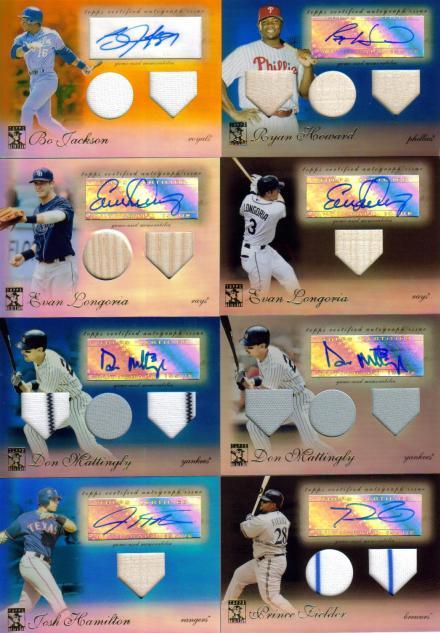
Then you factor in that this is still chock full of sticker autos and meaningless and needless swatches, and it makes you wonder who green lighted this turd of a product? It costs more than a half case of Topps or Bowman Chrome for one god damn box! I am completely shocked. Hell, you could pay 45 a pack and come away with a Josh Hamilton bat relic. That, and I am not even sure that these old timer jerseys are actually game used. Remember when there was that shortage of Mickey Mantle swatches? Well, he’s back in Tribute, and you know what that means. Probably some exhibition game, post-retirement, with nothing but a few jogs down the base paths.
I am dead serious, if this is what Topps is going to use its exlusive license for, I will be waiting to see what the other companies can come up with. I sincerely hope that a full season of Triple Shits and Tribute is not what is in store.
*Looks at Calendar and sees Topps Sterling is coming soon*
Fuck. Me.
This post is brought to you by the Golden Rule of Topps, where if its over 100 bucks a box, dont buy it.

Worst of the Worst 2004-2009 #4 – 2007 Upper Deck SP Chriogrpahy

Over the last five years, there have been quite a few products that havent lived up to billing. Whether its shorted hits, bad design, or lack of content in a box, there were more than I can count. Here is my countdown of the worst of the worst, and I will go into a little of what makes them so bad. Of course, for some, the shittiness extends beyond mere words, but ill at least try to capture it with each post.

Here is number four, enjoy.

When it comes to the worst of the worst, 2007 seems to have been a banner year for Upper Deck, with number four being SP Chirography. This set was bad for more than just design, and that is why it is on this list. Its rare that you see a product that epically fails in multiple areas, and Chirography is definitely in that category. It was also a late release, much like SP Signature Edition this year, but unlike Signature Edition, there were not many people willing to buy it.

The First major issue with this set was the design, leaving many collectors with a bad taste in their mouths. Because many of the other sets in 2007 were looking much better than normal, to have a bland set like Chirography was a complete killer for this product. Each pack may have contained an autograph, but the autographs looked the same 90% of the time. In fact, the only difference in the auto design from the base design was just a plain old sticker slapped on with some foil numbers. That’s it. Sure there were some auto subsets, but the design was actually ten times worse, especially a few of them that had more text on the front than most card backs usually have.

In addition to the horrible design, the title of the set was incredibly off putting. No one knew how to say it, and it always weirded me out when I saw some 12 year old on video, busting one pack, and calling it “Ichiro-ography.” Honestly, the title isnt that big of a deal normally, but when more than half of the people have to pull out a dictionary to say “I want a pack of Chi-rog-raphy,” it’s a bad marketing move. I guess that’s why most people just said, “Ill take SP Authentic instead.”

Speaking of people only being able to bust one pack at a time, we have come to the main reason why this product sucked so hard: PRICE. If you are thinking that a crappy product like this would cost 100 bucks a box, you are dead fucking wrong. A box of Chirography cost in upwards of 250 dollars upon release, with many boxes delivering less than 10 dollars in value. Im guessing the cost of putting 8 autos in a box was the reason for the high cost, but honestly, three Antonio Pittman autos and a few Tony Hunts are not going to get you where you need to be. Its almost like buying 8 boxes of 2009 SP signature edition, and hoping that you pull a 300 dollar card.

I know I know, some of you are probably wondering why SP Signature Edition didn’t make it to this spot instead, and its because it only costed 40 bucks a box. This costed at least 6 times that amount for what you would normally get in a box. When you combine a horrid format with a bad design, you beat out a sticker dump product that most people knew about prior to release.

Funny enough, when I first spoke with Upper Deck in the original interview, I brought up the shittiness of this awful product. Even THEY thought it was donkey poop, and apologized. Since when has that ever happened in this industry? I think that alone says something about how bad this product is.

If you would think it could not get worse from here, I would tell you to bring a barf bag from now on.


Worst of the Worst 2004-2009 #5 – 2007 Upper Deck Ultimate Collection

Over the last five years, there have been quite a few products that havent lived up to billing. Whether its shorted hits, bad design, or lack of content in a box, there were more than I can count. Today I want to start my countdown of the worst of the worst, and go into a little of what makes them so bad. Of course, for some, the shittiness extends beyond mere words, but ill at least try to capture it with each post. Ill do one per day, five total, and it will also allow for each of you to get your comments in.

Ill start with the fifth worst product of the last five years, 2007 Upper Deck Ultimate Collection. If you arent familiar with how bad this set really was, consider yourself lucky. Really, when you look at what Ultimate Collection brings to the table each year, it has really gotten fairly stale and over priced ever since memorabilia cards lost their overall value. 2007 was supposed to be the beginning of a new product configuration, and instead all we got was one of the biggest design and content cop outs in history.

First, this product was doomed from the beginning because of all of the added signatures that would be needed for it to be completed. Upper Deck touted throughout the card year that Ultimate would have much more added content, which got people talking that the packs could actually be bought at their intended $100 MSRP and still be worth it. Unfortunately, they were dead wrong. The packs contained a couple extra hits, though most of them turned out to be less than adequate players featured on horrible looking cards.

Instead of going through and designing extra subsets with better looking designs, Upper Deck instead decided to reuse the same template for the cards in each and every one. Outside of the normal draw, the rookie signatures, this product was filled with cookie cutter-ed crap meant to fill the other packs in the box. Each of the non-rookie autographs (3 per box) were cheap sticker autos on this template under different names. Many times, collectors who bought multiple boxes would get the same guy over and over again, but with a different title on the card. Players like Adrian Peterson were included in these subsets, but that type of pull was so rare that many just gave up on buying boxes, with many giving up on buying cases. It was so bad, that UD switched the format once again, this time coming out with better looking cards, but in a much different formatting style. Thanks to the abomination in 2007, Ultimate Collection was almost axed in 2008, even after the format change. Its kind of like Batman and Robin’s effect on the career of the people in the movie.

Here is a few pics of the different cards from the set, notice the similarities. There are other autos, but most were a Panini-like busy mess like this. Then when you think a box of this cost almost 400 dollars in some shops upon release, it becomes clear why this is one of the worst products of the last five years.

Contenders is Live, Disappointing

Well, 2009 Contenders has hit eBay, and that means that we finally get to see how bad this could possibly be. For those of you who have not followed along, Panini has touted through the whole thing that this set will feature on card autos, but then we find out that only a portion of the tickets are on card. The rest of the cards are stickers, and from what I have seen on facebook from the on card stuff, I think I actually prefer the stickers. The rest of the autos are bubbly and barely seen on the over crowded card, and I cannot believe that people are trying to get in on this product right at the beginning.

These new tickets feature a design that is worse than 2008’s visual abortion, something I didn’t think was possible, and the autographs are mildly visible to hardly visible. I have no idea why you would even try on card autos on a foilboard surface, as the reflective coating will highlight every miserable defect of the bubbly signature. They also switched to a horizontal orientation that did nothing but give them a huge space to write 2009 ROOKIE in humoungous letters. I always like when a painted player is featured on a card, but why would you cover up part of the artwork with a font that takes away from the general design? That doesn’t make sense. Plus, if you really want to do well, how about just ditching the foilboard all together and giving us a card that doesn’t blind us in the sunlight.

Contenders has always been the Bowman prospect set of football due to the fact that there are so many rookie autos, and this year is no different. The problem is that with 200 products that all have the same number of rookies on the checklist, the novelty isnt there anymore. The good thing is, they have made an effort to adding value to each case by promising a few top rookie autos per case and one on card auto per box, but when the cards look the way they do, the value just doesn’t matter as much. Contenders has gone from one of the top rookie autos of the year to another mid end whatever, and I can pretty much say that it is a direct result of the design of the cards and the refusal to adapt to the needs of the colletors.

I will give Panini their due for not rehashing the design, and for trying to up the on card content, but when your cards go from nice in 1998-2007 to awful, those smiles turn to scowls. Ive put together a retrospective here, and you can see what I mean when I say the design has tanked.

Take a look (CLICK TO ENLARGE):

How Not To Do A Cut Autograph

For some reason, over the last year, cut autographs have gone from awesome pull to fucking ridiculous pieces of shit. When I mean fucking ridiculous pieces of shit, I mean that some of them dont break five dollars. Its not necessarily due to lack of rarity, but that is definitely a factor. I think its just as much a testament to the awful and disgusting designs that have overtaken the cut auto market.

Bad

This is a cut auto out Panini’s recent release of 2009 Limited. In previous years, Limited cuts have looked like this, this and even this. Not necessarily that bad, right? Then we have this:

No more picture, looks like a soccer ball, done for the sake of doing it. At least there is a team logo and the colors are based on the team’s. Since Panini puts fucking rainbow foil on everything, this card was not spared, and good lord is it bad. Unfortunately, this is the best of recent cards, and yes, it gets worse.

Awful

Upper Deck is usually thought of as the innovator and perfector of the cut auto. Their Legendary Cuts baseball product has always been a collector favorite. Recently in UD Black, all of that history went out the window so quickly that my head spun as I was projectile vomiting. Now, with newly painted walls, feast your eyes on this abomination:

No picture, odd looking hand numbering, and a weirdly shaped window that does nothing to help the cause. Just awful. For a set that looked as good as black did, there is no reason to include cards like this. I think this is the quintessential card to show that companies are now using cuts as a way to lure collectors in while delivering very little. Sad.

Fucking Horrid

Triple Threads is one of my least favorite products of all time, without question. However, even I could not believe my eyes when I saw this next card. It takes the whole cut autograph concept and just sets it aflame. Its so bad that you may want to take any children out of the room before continuing.

I dont know where to start. First off, the card is printed on bright blue neon foil. Im sure Vince Lombardi would have been proud. Second, those “relics” are from seats of the old Packers’ stadium, and I am not sure why this card even needed “relics” in the first place. Fucking stupid. Lastly, we have the crown jewel, the cut itself, and I cant even find a way in my mind to get the card the way it turned out. Obviously this is a check, but they mangled it so badly that you cant even call this his autograph anymore.

Seriously, if this is what we are forced to endure with cuts over the next few years, I want them gone. This has gotten to a point of parody, and I am not pleased that this is the direction things are headed. At least pay the money to put a picture on there, make the cards rarer, and dont use them in every fucking set. All three companies are such horrible offenders of this crime, that hopefully there is still time to make it back to the way things used to be. Wow.