Fake Pujols Triple Threads Autos Are Bad News


Reader CT sent me this thread over on Collectors Universe that brings about a troubling situation with Topps Triple Threads. When you look at these cards, its pretty simple to see that something is up with Pujols’ sticker. Im guessing that either the seller has removed the real stickers and just used the trick from before to fake the autos, or Topps is being had, and just didnt care to run QC on the stickers that Pujols “signed.”

Regardless if these stickers are real or fake, the problem remains. Stickers do nothing but cause problems, and there are a ton of horrible people out there who will take advantage.
Here is a real one:
Here are the fakes:


Product Review: 2009 Bowman Chrome Football

Im not going to do a regular review here because Bowman Chrome’s format is so similar to Bowman DP and Topps Chrome. However, there are a few great parts of the set, and a few bad parts.

The Good

I like the design they chose this year for Bowman Chrome, it fits well. The design also lends itself quite well to the parallels that Chrome is known for, and they dont have to frankenstein the card for the autographs like last year. I think that if we are going to have to endure as many base sets that are turned into chrome as we do, this is a good trade off.
I am a big fan of the parallel structure in chrome, and I think it works well when you can bust a box and do well even if you pull a shitty auto. Bowman chrome is that and more, as the low numbered refractors ALWAYS sell well. Of course, you also have the superfractor chase, which definitely doesnt hurt the product’s goals.
Lastly, the photography for some of the players in Chrome is 10 times as good as in Topps Chrome. Although they moved away from game style shots that I love, they made it so you cant see the empty LA Coliseum behind them. Also, having the holo-sticker on the ball for the Sanchez Topps Chrome card was pretty bush league.
The Bad

The rookie jersey auto parallels are some of the worst ideas in chrome history, both Topps and Bowman alike. The swatches cover up more than half of the player and continue to be a useless addition to a product known for keeping it real. Topps was horrible at designing these cards last year, and this year is no different. Bowman Sterling, Topps Chrome, and now Bowman Chrome, all put the swatches in horrible places, yet, Bowman seems to be the worst placement all around.
Also, im not sure why they went with the ribbing on the background of the card. I liked it much better when it was a flat chrome, no need to fix something that aint broken.
Lastly, the autograph cards in the set do not make it obvious enough that they are autograph cards. They are now printing “Topps Certified Auto” on the cards, which is good, but an amateur would still be stupid enough not to miss it on a fake. I think they need different ways of doing it.
Overall
I think Bowman Chrome is good but forgettable. It may be the way to go in Baseball, but Football continues to be Topps Chrome territory. Its not a horrible product, and looks to be a fun and cheap rip, so I may actually go buy a box or two. Maybe ill get lucky.
Rating =

2009 Product Leaderboard (SO FAR)

1. Topps Chrome (4/5 GELLMANS)
2(t). Bowman Chrome (3/5 GELLMANS)
2(t). Donruss Certified (3/5 GELLMANS)
2(t). Upper Deck Football (3/5 GELLMANS)
2(t). UD Philadelphia (3/5 GELLMANS)
2(t). Topps Football (3/5 GELLMANS)
2(t). UD Icons (3/5 GELLMANS)
2(t). UD Heroes (3/5 GELLMANS)
2(t). UD Draft Edition (3/5 GELLMANS)
9(t). Upper Deck SP Threads (2/5 GELLMANS)
9(t). Upper Deck SPX (2/5 GELLMANS)
9(t). Playoff Absolute Memorabilia (2/5 GELLMANS)
9(t). Bowman Sterling Football (2/5 GELLMANS)
9(t). Donruss Threads (2/5 GELLMANS)
9(t). Donruss Classics (2/5 GELLMANS)
9(t). Donruss Elite (2/5 GELLMANS)
9(t). Playoff Prestige (2/5 GELLMANS)
9(t). Bowman Draft Picks (2/5 GELLMANS)
18. Score Inscriptions (1/5 GELLMANS)
19. Leaf Rookies and Stars (0/5 GELLMANS – NR)

Triple Threads and What It Says About Us

To me, triple threads is that dreaded shit after a night of Mexican food. You know its coming, you prepare yourself for the pain, but in the end, it gets you all the same. This year is no different, and really, its says a lot about what Topps thinks about the collecting base. What I mean, is that by structuring the set the way that they have, it shows how little confidence Topps has in how people view each part of the card. Instead of focusing on putting together a top notch design, they thought that jam packing needless junk and gimmicks were more important than a good looking set. From the reaction I have seen, it worked.

The most talked about part of the product is always the “OMG SIKX MOJOS!” that supposedly litter this set. They have about a thousand different 1/1s, each one more ridiculous than the next. Before this year, it was only limited to single and bifold cards, but Topps felt that two entire cards were NOT enough for the junk they had in store, thus leading to the first tri-folds. Stupidly, the tri-fold cards feature little more than a border to encompass the jumbo patches of the card, and that’s pretty much all they have to offer. Topps has basically implied that collectors only want the biggest possible patches with the most colors, and that putting a good looking card together is meaningless. This means there is only a dime-sized player pic, no autograph, and zero concept. What you have to replace that is just the biggest, gaudiest, most ridiculous looking patches that I have ever seen. Never before have I thought to myself how shitty a whole Marlin patch looks when its next to two other similar patches. Its almost like Topps said, “Well, these cards are going to look like crap, make sure there are whole patches on there to shut them up. They are like babies with shiny or glittery things, this will be like crack to them.”

Moving on, the design is almost identical with previous years. There has been ZERO update to the concept of what normal people will get in each pack. You get a tri relic card with some shit spelled out in confusing die cut windows, and an auto tri relic of some guy with some shit spelled out in confusing die cut windows. Aside from the checklist being complete poop, and aside from the fact that there are very few baseball players who can carry a high end set, there isn’t anything in this set that hasn’t been done before. They also went with a stupid partial medieval theme this year with scrolls and shields and crap like that. I say partial because the other cards have a completely clashing identity of linear boxes and junk. Of course, none of this means anything to the people who buy Triple Threads, mainly because they only care about how many windows are on the card. No matter that there is barely a player picture, or a cohesive thought to bring the card together, all they want is relic. Relic, relic and more relic. I say relic, because Topps doesn’t always use game pieces for this set, instead using old timer game jerseys, event jerseys, and practice jerseys. Again, none of this matters because the people who buy this junk have no concept of what should matter.

When you move away from the horrid relic cards, you see that there is still no on card autographs for this set. Even though Topps has the resources to do it, they care more about stocking their storeroom when they meet with a player rather than doing something for you the collector. Not only that, but the stickers bring your focus on the card because they are cut into the fucking design. Each auto card has a cut out spot for the sticker, instead of disguising it like it should be. Why do I want a card that blatantly shows everyone that the prized auto is just a label stuck on by someone in China? That makes no sense to me.

Triple Threads is also single handedly responsible for the parallel hell that so many of us hate. Each of the 300 or so cards has at least 10 parallels, including 5 1/1s – FOR EACH CARD. That’s 4 printing plates and a regular platinum parallel. Seriously, how does anyone think this is okay? Its worse than Panini, and I cringe each time some idiot screams “MOJOOOOOOOO!” when he pulls a Adam Lind 1/1 triple relic printing plate that he can sell for five dollars. Give me a fucking break.

Lastly, the price point continues to be a complete joke. For 170+ dollars, all you get is one autograph and one crappy one color jersey card. If you are lucky you can pull one of the hundreds of worthless players on the checklist, who have up to four cards each in some cases. Then, there is a one per case triple auto that has three players that are drawn out of a hat, and sells for ten bucks, or a 1/1 card that may or may not make you have a seizure from looking at it. The fact is, 95% of the time, you are going to pull less than 20 dollars worth of cards from your box, and even if you pull a 1/1 “REDICOLOUS MOJO” card, its going to look like poop.

I cant say enough bad things about Triple Threads and Topps Sterling, because they are like the Michael Bay movies of the card collecting world. There is a lot of needless action, but when standing alone on a concept, everything falls apart. Right, Transformers 2? Triple Threads is like that, and its an insult to my intelligence that it is always shoved down our throats for 3 sports each fucking year. In fact, my golden rule of Topps was created around this product. In the future, I would hope that collectors realize that supporting Michael Bay Threads means that more of it will come, just like every goddamn needless sequel in Hollywood. Please don’t give them that satisfaction.

First Look: 2009 Topps Unique Football


(CLICK TO ENLARGE)

When this stuff was first put out for baseball, I was definitely turned off by the horrible concept. Now that they have brought it to football with a few tweaks, its not as bad. The Brady card looks much better than its baseball counterpart, and the Namath doesnt look as awful as the tag card that was previewed a while ago on Wax Heaven. Im guessing its because the backgrounds look more finished, and the idea of what is trying to be presented looks more flushed out. However, the Mannings dual is typical Topps, and the Peterson and Roethlisberger look awful.

My thoughts are still that the namesake of this product doesnt really apply to the content, and that is going to be the problem. Its not really any different than what we get out of a lot of other products, so to call it “Unique” is a gross misnomer.
As long as it stays as a mid end set and doesnt stretch cost past the 100 dollar mark, it could be successful, mainly depending on whether or not the other cards are as boring as the baseball ones. With Topps, nothing is set until the product hits shelves.
EDIT: Just got word this product is going to run 140-180 a box. Holy fuck. Yeah, im out.

Product Review: 2009 Bowman Sterling Football

Over the last few years, there hasn’t been a high end set created quite like Bowman Sterling. Trying to equal the success of the prospector’s baseball favorite, Topps tried to create a similar set for football. The problem is that prospecting is very tough to market in football because all of the players are usually on the field from the beginning. This year, the previews were promising for a design that looked much better than it had in previous years. After seeing the finished product, I am less than enthusiastic about what was produced.

Design/Creativity

I have never been a fan of Bowman Sterling because I don’t think it offers much to the people who buy it. My feelings on the design are very similar as well, as this year’s just looks as distracting as ever. You know those ruler designs you did in elementary school where you drew two axis and connected dots to form a cool looking star like thing? Yeah, Topps used those as part of the background. Normally, it wouldn’t be any more distracting than a normal element, but they have added a different grain of refractor to them so that they reflect differently than the normal rainbow foil. It makes the card so hard to look at that someone at the shop last night said he had a headache just from opening the packs.

Secondly, the photography they used in this set is completely awful. For some of the cards, they didn’t even use actual shots, they just blew up their player pics from NFL.com. Rather than accomplishing their goal of providing a good look, it looks like they are putting mugshots on the cards. Most of the players didn’t quite know what to do for those pics, and therefore most look bored or angry. Not a good look for a close up trading card.

The entire set is printed on ridiculous rainbow foil or mirror foil board that somehow makes the cheaper chrome set look like it is a more focused execution of the technology. They even added colors to the parallels, which further detract from everything on the card.

There is one good thing, and that is the fact that they incorporated cards for the rookie material auto cards where the players have their helmet on. Although there are some of them that are still helmet off and goofy, a few are done the correct way.

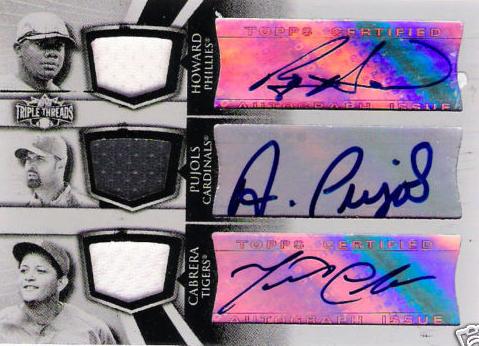
The golden dual autographs arent that bad despite the incredible gaudiness of the cards. Although the bordered stickers are weird looking, the overall presentation of the cards are the best of the set. Of course, that isnt saying much for this.

Rating =

Autograph Cards

The single autograph wouldn’t be that bad if they were printed without all the busy lines and added crap on the sides. Of course, since this is a Topps product that costs more than 100 dollars, they look pretty bad from most of the ones that I saw pulled. This product offers much less in their normal autos that Chrome does at less than a quarter of the price, which truly says something about the concept of this set.

More importantly, the focus of this set, the rookie material autographs look worse than they have in a long time. Ditching the horizontal orientation that gave them room for a huge foil sticker and a swatch, they instead packed every element into a vertical card. The result is a player that is almost being attacked by the swatch, as it looks to be creeping up their chests to eat their faces. The swatches obscure most of the player picture in some cases, thus making me question why it was even necessary, a la the Chrome auto patches with the same problem.

Another bad part of this is that Topps sometimes uses this type of situation as a sticker dump, meaning that non-star rookies from last year could be making an appearance. We already saw on youtube that players like Devin Thomas are put in this set, and those non-rookie jersey materials cards are rarer than case hits. How would you feel if you pulled that?

Lastly, there is no reason to release a product that costs THIS much with the stickers. Unlike Panini, Topps has the resources to get on card signatures, but doesn’t pursue it. I cannot understand why that would be the case, nor why the stickers are highlighted with a border in the design. I thought the point of a sticker was to hide the fact that it wasn’t on card, not make it a focus.

Rating =

Relic Cards

Although there are rookie jersey cards, the veteran jerseys are pretty much throwaways in this set. There are multiples per pack, and they become as boring while breaking as the overall concept of Bowman Sterling altogether. All it does is add unnecessary cost to the product, as its pretty obvious that Topps has had a tough time figuring out what a box would contain.

The rookie jerseys are expected and are basically just another card that you flip through to get to your scrub auto numbered to 15 billion. The pics are similar or identical to the auto parallels, and that is not a complement to any of them. Big disappointment.

Rating =

Value To The Collector

Of any of the sets that hit the market during the year, this is the worst possible one to buy a box of, hands fucking down. Boxes cost over 200 dollars, and you get 10 autos that are worth less than the rainbow board they are printed on, a bunch of plain swatch jersey cards, and one or two premiere rookie autos that never hold their value. I am completely serious that you need to have electro shock therapy if you are going to buy any of this. I cannot think of a bigger waste of money. Its that bad.

Even though the cards come out of a high end product, they very rarely equal the value of a card that comes out of a comparable priced set. Personally I think its because the cards are stickers and always look like crap, but Im also starting to believe its because people are getting sick of high end Topps product that offer nothing for the people that buy them.

Rating =

Overall Impressions

This set is complete crap. Poorly conceived, poorly designed, poorly executed. Go buy 5 boxes of chrome instead of buying this. Im serious. Remember the golden rule of Topps and you’ll be fine.

Average Rat
ing =

2009 Product Leaderboard (SO FAR)

1. Topps Chrome (4/5 GELLMANS)
2(t). Upper Deck Football (3/5 GELLMANS)
2(t). UD Philadelphia (3/5 GELLMANS)
2(t). Topps Football (3/5 GELLMANS)
2(t). UD Icons (3/5 GELLMANS)
2(t). UD Heroes (3/5 GELLMANS)
2(t). UD Draft Edition (3/5 GELLMANS)
8(t). Bowman Sterling Football (2/5 GELLMANS)
8(t). Donruss Threads (2/5 GELLMANS)
8(t). Donruss Classics (2/5 GELLMANS)
8(t). Donruss Elite (2/5 GELLMANS)
8(t). Playoff Prestige (2/5 GELLMANS)
8(t). Bowman Draft Picks (2/5 GELLMANS)
14. Score Inscriptions (1/5 GELLMANS)
15. Leaf Rookies and Stars (0/5 GELLMANS – NR)