
I have been a fan of playbook since it was released back at the beginning of 2011, and has evolved into a set that really has the potential to deliver some great looking cards. I want to say that last year was easily the best year of the run, with a focus on adding some really nice looking non-rookie autograph content
. Now that I see the preview for 2014 im not sure I like this version.
Here are some of the really cool cards from previous years:
2012 Playbook Andrew Luck Auto Patch Booklet
2012 Playbook Russell Wilson Auto Patch Booklet
2013 Playbook Peyton Manning Nike Logo Patch Booklet 1/1
2011 Playbook Aaron Rodgers Auto SSP
Immediately the darker borders added to the Playbook cards take away from the nice presentation from previous years and the white borders. Secondly, Panini returns to their ungodly obsession with the goofy and lame studio shots that are inset behind the action photo on the front. Not only does this add an unneeded element of horribly odd photography, but it takes away something that was much better last year. Overall a complete downgrade. Even though the studio shots have been present before, they were seemingly hidden more by lighter design work. The move to different borders highlights them more.
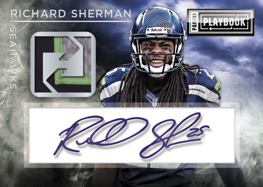
This down grade is completely overshadowed by the absolutely horrendous design work on the Richard Sherman auto relic, which might be the ugliest card we have seen from Panini all year. The base autos were already a complete and utter eye sore last year, but this is worse. I dont understand who thinks its a good idea to obscure half the layout with this box for the autograph, even if it may turn out to be acetate. It looks awful. In the past, Playbook has a knack for great looking cards combined with terrible ones
. This year is no different.
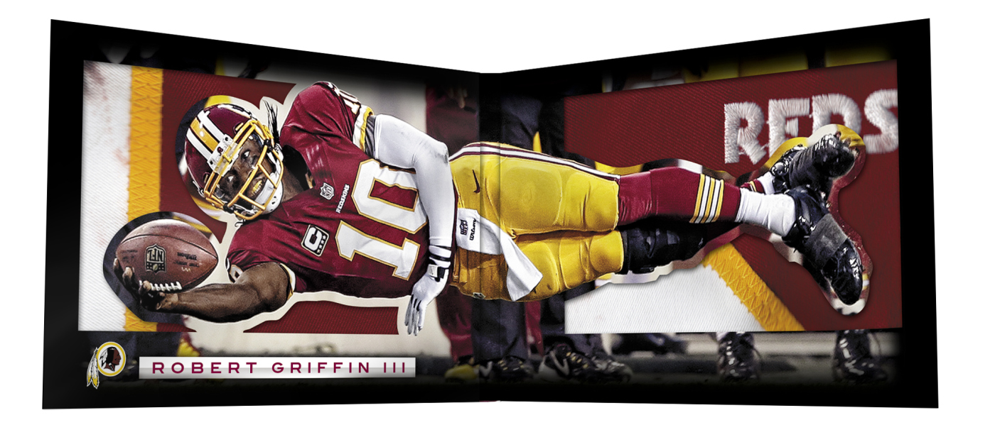
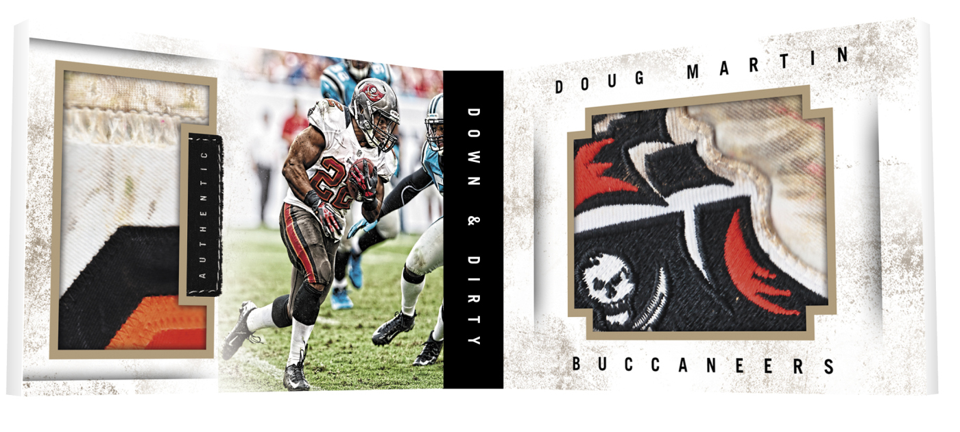
In terms of the good elements of this preview, the Down and Dirty relics return. Much like they did in their debut last year, look awesome. Coupled with the full scale style lunging Endzone card, these two should be more of a focus for the set. Instead they will be a tiny element to the product. The RGIII card is truly impressive, all joking about recent injuries aside.
When it comes down to it, Panini consistently makes poor choices when it comes to the look of their cards, and its looking like an easier and easier choice to just avoid their products completely in the future. I understand that some people do end up liking their stuff, but I cant help but feel like maybe those people just like the focus Panini puts on their marketing strategy and not the actual cards themselves.


I thought the cards looked great and I think you are being way to harsh on Panini here.
Why not applaud them for taking some risks with design. The RGIII “layout” card is not only cool looking, it’s different than anything I’ve seen before. Same can be said of the vertical book in the preview. Even the helmet off background pics add a unique element to the cards.
In a hobby where set after set of the same card with different colors is churned out, why not give props when a brand thinks outside the box?