For the majority of the time I have spent writing this site, I have waged a war on Triple Threads that knows no hotter fire. Although Football has improved in terms of design and concept over the years somewhat, Baseball has remained as horrifically bad as ever
. Now that we see what 2015 is bringing, there is no doubt in my mind that this is the one Baseball set that needs a complete overhaul.
Here are some of the best of the worst from over the years, just for shits and giggles. These are so bad they are hilarious:
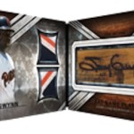
2008 Triple Threads Jorge Posada 36 Piece Relic Booklet – Deserves a 36 facepalm salute
2013 Triple Threads Casey Kelly Auto Relic – well who else would you be?
2014 Triple Threads Chris Archer Triple Relic – Horrible play on words
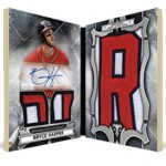
2014 Triple Threads Bryce Harper Auto Relic – ????
2014 Triple Threads Billy Butler Auto Relic – Something my dad would say
2013 Triple Threads Chase Headley Triple Relic – Really? I mean REALLY?
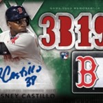
2012 Triple Threads Carlos Santana Triple Relic – Just a terrible play on his name. TERRIBLE.
Triple Threads has always been for the type of collector that values nothing but the name on the card, and the content of the relic that card contains. They dont care about the ugly design(s), they dont care about tired theme, and they are not people I would associate myself with. I have a generalized profile of these types of collectors in my mind, and though I know its bad, I cant help but despise what they reinforce with the manufacturers as acceptable card production methods.
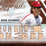
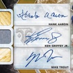
Obviously, Triple Threads has always been as much about those god awful sayings they die cut into the cards, as it is about anything else. The sayings have been around for so long that they are literally scraping the bottom of the bottom of the barrel each passing year
. Where Triple Threads was progressing towards more on card autographs, it seems to have stopped, once again going back to stickers to complement the awful looking design.
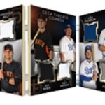
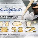
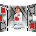
Although I do give Topps credit for using the silhouette style in their trifold relic booklets, instead of horrendous looking junk like this, everything else is pretty much exactly the same. It has been identical every year for the last 10 years, no joke. The only difference is in the players that are featured, and even then its not much different. They may have come up with these deca-threads books, which feature 10 relics, but I just dont see the appeal that it has. This is like the follow up to their 36 piece booklet
, which was so terrible looking, they could be deemed the worst of the run.
Adding more single color swatches to a card SHOULD not help in this day and age, even if they might be patches. The card itself may look okay, but this is where the concept just doesnt work for me. I just dont care about a 10 player swatch booklet. I would much rather they focus their efforts somewhere else.
Topps Baseball has definitely created some interesting products over the years, but this is not one of them. I just hope that someday the production team will give more license to tweak baseball the way they have in football, and see what they can do. Until then, my fire breathing hatred will continue.