Panini keeps trotting out products that have literally bombed every year they have been around. Like Spectra, sets like Playbook have almost never been successful in any way, with 2014 likely being the worst year of the entire run. For whatever delusional reason they have in their head, Playbook is back for another year, despite all the issues it has had in the past.
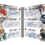
Now, in 2012 and 2013, I actually thought it was an interesting and cool product, if not only because there was plenty of other sets that Panini was offering that had true on card content:
2012 Playbook Andrew Luck Auto Patch Booklet RC
2013 Playbook Adrian Peterson Auto Patch Booklet
2013 Playbook Peyton Manning Nike Logo Booklet Patch
2014 Playbook Colin Kaepernick NFL Logo Shield Booklet
The design of the booklets was always pretty cool, using the silhouette style technology to showcase the rookies and vets. All of that basically went away in 2014, and the product was at half of dealer cost almost immediately. I mean, who doesnt love buying a box of cards when the auto hit is a hideous orange parallel from one of the worst sets of all time
?
The biggest laugh of 2015 has to be that Panini already put out Clear Vision, which is basically a set of those horrible cards from 2014 Playbook. The signed acetate scrap game is large in both of these sets, and I just dont see the appeal when its done the way Panini is doing it. It also presents ANOTHER set without true hard signed rookie content. I dont know what the fuck is going on in Texas, but it seems like they have given up on getting actual cards signed by the rookie class. By the time this comes out, we will have had Bowman, Inception, Topps Flagship, Platinum, Finest, Hi Tek and more from Topps, all of which feature great looking on card rookie autographs
. Nothing from Panini. Great job guys. Slow clap for the people on the short bus.
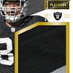
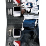
From the way the previews look for the main box hits, they may be introducing a new shape of booklet, which actually doesnt look all that horrible, except for the way the player is inexplicably down so far on the right side of the card. I dont think the faded player shot is as necessary when it makes the design look that unbalanced.
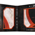
The down and dirty cards are back, which is one of the only consistently awesome part of this set over the last few years. However they are so freaking tough to pull its almost a non factor. I also liked them a lot more in white, but then it would just be the same design as the previous years.
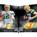
As for the jumbo logo, I think they had a unique opportunity to create a booklet that had silhouettes on both sides similar to the Game of Inches cards that were so cool before, and yet, here we are with half a Funchess instead of bunches of Funchess (Sorry, had to do it). Just looks weird, like he has half a body. Missed a big splash with these cards as a result.
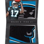
When you see the base cards for this products are booklets, all I could think was that this was an unnecessary cost to add to a product that already has an unnecessary existence. There are so many decisions like this that Panini makes on a regular basis that makes me question how much they actually know about football cards. More importantly, when you see what Panini does in Basketball, both in terms of content and on card autographs, it really makes Football seem even trashier than it already is for Panini.
What a fucking disgrace.