
Spectra might be the worst formatted product that Panini makes, save maybe Absolute football. It was so bad in 2014 in both design and format, that distributors had to literally use it as a bargaining chip ultimatum for allocations of Immaculate Basketball. Just to have access to Immaculate allocations, you had to take on cases of Spectra FB. It was fucking horrendous. If that happens with a product, it should automatically be considered for removal from the calendar
.
Leave it to Panini to want to bring it back again. I literally laughed when I saw they were going to trot this shit out again for 2015. I thought to myself, they had better find a better design than the visual abortion from last year. Then I looked at the cards. My jaw dropped. Here is the gallery, just so I can show you how big of a turd this is going to be.
Here is the train wreck that was 2014 Spectra:
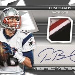
2014 Spectra Teddy Bridgewater Horizontal Auto Relic Blue – Worst looking design, quite possibly of the year
2014 Spectra Kelvin Benjmain Gold Auto Relic
2014 Spectra John Elway Sticker Auto Red
2014 Spectra Tony Romo Leading Men Auto Relic – Leading men? What is this, a chick flick?
At least, above all else, Panini had on card autographs for Spectra in 2014. This year, those are gone. What makes this even more hilarious is that they are going to get color matching ink for the stickers, as if Neon was a color that people wanted to see on trading card signatures. Maybe I should pick up a few boxes before popping some pills and heading to a rave. That’s about the vibe I am getting off this crap.
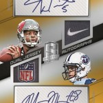
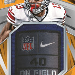
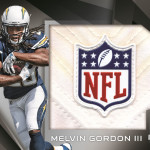
Even if Panini decides to take down the price tag from around 300 (not making that up) to a more reasonable price, it wouldnt matter. This has to be one of the ugliest looking sets I have seen in a long time, and this is coming from someone who just watched them solicit 2015 Certified. They have opted to put giant boxes around all the stickers that obscure the design, something that should NEVER be done. The overall look, with the crazy neon colors mentioned above, could not be more ridiculous looking. The dual autograph, dont even get me started. You know why Panini puts so many logo patches in their cards? They need incentive to buy them considering how vomit inducing their designs are.
Topps rightfully axed Bowman Sterling this year, because even they couldnt justify putting out a set that offered literally nothing special for as much money as Sterling cost. Panini? Obviously not as willing to admit defeat on their failures. Dont get me wrong, this was a MISERABLE failure, all 3 years. I will give them credit for on card non-rookie autos in 2013
, but the price and pack format was terrible then too. Switching to 1 pack for 300 last year was a complete joke.
I just dont even know what to say anymore that hasnt already been said. Im pretty sure I will be done buying new cards once 2016 rolls around, and this shit show is the only game in town. Kill me now.
That damn Topps Paradigm design just won’t die, will it? It’s there… hiding in the ridiculous boxes for sticker autos amongst the horrendous diagonal bars…
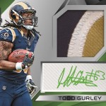
In what world does that Gurley sig exist? I haven’t seen one variation that isn’t “T.G.”, but apparently he’s holding back for the Panini sets.
Gurley’s early autos for Leaf (Metal & Ultimate) have his full Auto. Everything else has been that awful “T.G.”.