Im very happy that we are already starting to see some action on previewing upcoming 2016 sets. Museum Collection has been a collector favorite over the last few years, mainly because of how nice many of the cards have looked. It has been a product that has made the jump to football as well, and I am a fan of both versions for sure.
That being said, this is one of those sets that has a good side and a bad side in a VERY definitive fashion. Here is the good side:
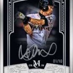
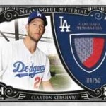
2015 Museum Collection Clayton Kershaw Framed Auto
2014 Museum Collection Sandy Koufax Gold Framed Auto
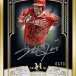
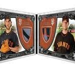
2014 Museum Collection Bryce Harper / Mike Trout Dual Auto
2014 Museum Collection Jason Heyward Bat Nameplate 1/1
Here is the bad side:
2015 Museum Collection Ken Griffey Jr Jumbo Relic Auto
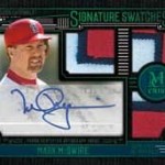
2014 Museum Collection Bryce Harper Triple Relic Auto
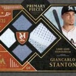
2014 Museum Collection Freddie Freeman Jumbo Logo Patch 1/1
Because a box costs as much as it does, the content needs to be premium. Premium in a way that presents an opportunity for the collector to walk away feeling like they have something awesome looking, even if they get skunked. Obviously, there will be 11 boxes that DONT have a framed card in it, and that means Topps has to deliver. This is where Museum has had some success, but also some major failure as well.
As we see with 2016, the Framed cards again look really nice, even though they look a bit different with the white embellishments to the design. The on card autographs with the black and white photos and silver signatures look nice too. They did really well with these last year, thanks to some big names on the checklist. My main issue is that the rest of the set looks relatively awful. So bad that I would avoid buying this product out of fear that I end up with one of the sticker autos as my main hit. You usually end up with 1 on card per box, but that doesnt always mean that its going to be something good. That leaves the relic auto for you to have as your box hit, and they are not good looking cards at all.
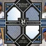
So many of the cards in this preview look crowded. The entire preview is claustrophobic in a lot of ways, especially when you see some of the way they incorporated relics into the design. That McCutchen Logo makes me hyperventilate its so packed in there.
Similarly, the boxy look on the autograph relics gets incredibly crowded, especially when the third relic is added in. In past years, this has also been the case, and I HATE HATE HATE that 'L' shaped presentation that looks like a tetris piece. The saving grace in previous years has been that the rest of the design is super clean, where this is far from it. Borders bring in the usable space to close to nothing, made even more apparent by the close up pic of the player.
Here is the thing. I love the look of the on card autos, but those depend on checklists more than ever. Now that Topps has made a commitment to getting more and more on card autos in their products, people are looking for better player quality, and unique content to match. This means that just having on card autos isnt enough to maintain value, regardless of how nice the cards look.
People will go nuts for the framed autos, as they always do. I think that Museum has become a premium product where where people only chase one rare set. That is not a recipe most would like to see. I hope we see that there are some surprises that give us a bit more to chase.