
When Exquisite was first released in 2003-2004 for Basketball, it was the dawn of a new era in the hobby. Many would argue that the creation of the first Super High End product spelled the end of sustainability for both shops and the industry
, but I see it as the reason people like me still are a part of the hobby. Topps Five Star has always been one of my favorite products, and like Immaculate, it is built on the foundation constructed by Exquisite's domination in the hobby
.
Here are some of the cards in which Immaculate is copied from:
2007 Exquisite Marshawn Lynch Rookie Patch Auto
2008 Exquisite Kevin Durant Noble Nameplates Auto Patch
2009 Exquisite Kevin Love Limited Logos Auto Jumbo Patch
2009 Exquisite Matthew Stafford / Mark Sanchez Dual NFL Logo Auto 1/1
2009 Exquisite Harvin / Crabtree / Nicks / Thomas Quad Logo Auto 1/1
Today, Panini previewed another batch of their Exquisite based product in 2014 Immaculate football, a sister product to the previous releases in Basketball and Baseball. I have seen a lot of comments on twitter praising Panini’s design team for the look of the set, but also criticism for its striking resemblance to Exquisite’s previous releases. Its hard to deny that when you can see the resemblance so easily
.
That being said, Exquisite produced some of the best looking sets in the history of this era of cards, and the value of those cards remains relatively untouched, even after years of unlicensed releases. Patterning a product after this formula is NOT a bad idea at all, even though it might be questionable in the "taking credit" department
.
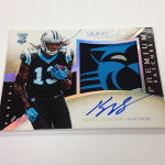
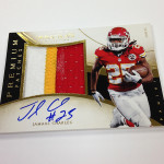
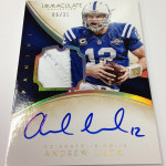
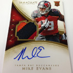
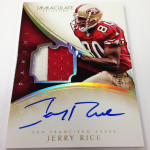
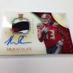
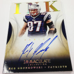
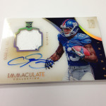
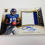
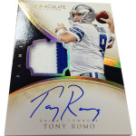
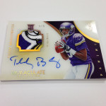
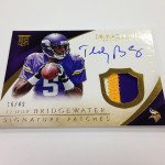
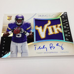
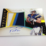
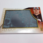
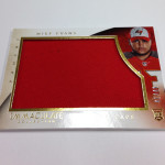
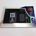
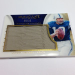
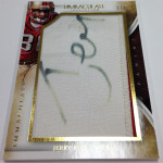
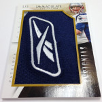
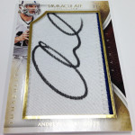
I love the way the set looks, something I mentioned a few times when it was released in Basketball in 2013 and 2014. The swooping lines and high end gold presentation makes a mark, and really pops in a lot of different ways. Using acetate as a vehicle also looks really cool in a lot of the patch autographs
, which are structured almost exactly like Exquisite’s cards of the past, down to the shape of the swatch
.
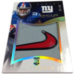
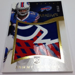
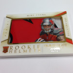
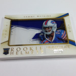
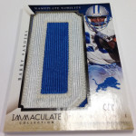
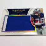
The design of the relic cards for each of the Immaculate releases remain a completely WEAK point for Panini in almost every way, especially when you see how terrible the design is for the oversized jumbo patch. For whatever reason, Panini seems to think its better to build a card that is more about swatch size than actual look
, something which I cannot stand. Even worse, when this same approach was used for one of your most inferior brands
, not a good idea to bring it to a set like this.
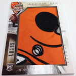
The worst of the relic cards are easily the horrendous hat patch cards, which feature a stupid looking goofy ass picture, and a relic from a hat that the rookies wore for a few seconds at the photo shoot. Its a lame idea, and an even worse execution. I continue to be baffled with Panini's ungodly obsession with posed pictures on trading cards.
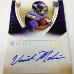
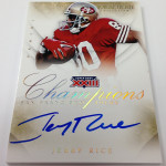
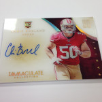
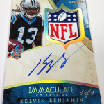
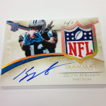
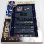
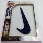
On the other hand, the autograph cards look so good, that it almost doesnt matter how bad the relics are designed. The Immaculate Moments and the Champions autos are going to be very popular cards, as are the jumbo patch autographs, which look exactly like the ever-popular limited logo cards from Exquisite.
This is going to be a barn burner folks, and I cannot wait to see what’s in store.


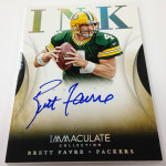


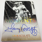

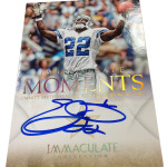
Imitation is the sincerest form of flattery. From the design to the name of the “Immaculate Moments” set (see SP Authentic’s ‘Authentic Moments’) this has Upper Deck written all over it.
Pingback: Around the Carding Blogosphere for February 13, 2015 : The Baseball Card Store