
There are only a few things that get the majority of the hobby up and on their feet. The release of the Topps Series One design for the next year is ALWAYS one of them. Coupling that with the release of previews for 2017 Topps Dynasty Baseball is about as hearty a punch of fun as we get these days. Considering that both look exceptionally great, its cool to see what everyone else seems to think.
2017 Topps Dynasty
I thought last year was boring. I didnt even buy any of the singles, and I think it was a missed opportunity to take the brand to a new level with Derek Jeter’s recently added autographs.
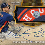
To me, Dynasty is the best high end baseball product Topps makes. It has the best checklist, the best looking cards, and is one of the most interesting case breaks to watch. Some argue the set content is too skinny to be a real force, but I completely disagree. It offers the most premium cards of the year, even with Transcendent in the mix.
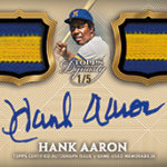
Check out these beauties:
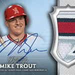
2015 Topps Dynasty Mike Trout Auto Patch
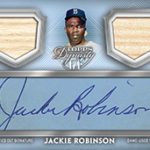
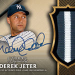
2016 Topps Dynasty Derek Jeter Auto Patch 2/5
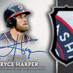
2014 Topps Dynasty Bryce Harper Auto Patch
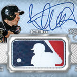
The 2017 design is everything I had hoped for last year, and its going to be enormous with Judge and Bellinger in the mix. We also see more variety in the designs, and the introduction of Triple Threads style MLB logo autos as 1/1s.
I have to believe this will be a limited product as it always is, and the demand for the crazy Judge patch autos will have to be a factor in buying cases worth of this product, and Im curious to see how that will work. We have seen Judge relics in 2017 Inception, but outside of that, not much.

2018 Topps Series One
I thought this year’s design was a bit weak. I just didnt like the criss cross line look for the nameplate, and the way parallels were done were a bit odd to me. Its far from the worst design Topps has done, but its not the best.
Looking at the 2018 template, I am enthralled with the way Topps has modernized the look of this set. Opting to go with another borderless design and full bleed photos is right up my alley, and the wave like digital nameplate looks sleek and cool. Its hard to picture 2018 being as big as 2017, but there are always surprises.
We still do not have a full preview of the way parallels will work, or any of the inserts, but you can imagine that is coming soon.
I think as we begin to close out the year for 2017 and start to see Topps moving on from a record year, its going to be intriguing to see how they look to manage their designs in 2018. They can either move on from Judge but keep a progressive outlook, or avoid the risk of putting sets out that might not jive with an ultra traditional collecting crowd. Both of these previews definitely strike chord with me, and I hope there is more to come.