After seeing the preview for Donruss Certified, I could not believe how much of a cop out Panini had gone with in terms of the design. They had basically taken the 2008 design (which wasn’t good to begin with) and updated it with minor tweaks. Now that I am seeing the finished product, it has improved over the sell sheet, but still has the look and feel of an inferior 2008 product.
Design/Creativity
There are parts of this set that are vastly improved over the previous years, and others that are lower or exacly the same. For that reason, I cant give Panini that much credit. There are so many similar cards between 2008 and 2009, that it takes away from the general feel of the set. If you look back at the 2008 set, it was full of junk, floating swatch windows, stupid looking subsets, millions of parallels. This year, many of the floating windows are gone, but the Parallels are still there, and the subsets still look pretty bad. Panini, as if anyone expected anything less, chose foilboard again for their production, which led to a number of warped, chipped and damaged cards in the boxes I got to see.
The highlight of this set is the Fabric of the Game single cards, which are definitely cool looking. They feature team color elements, and the diecuts arent bad. One of the diecuts, the team name logos, looks ridiculously cool mainly because they went with the spelled out name rather than the helmet decal cutout. It looks much better that way, and really completes the design. The others, especially the autos look MUCH better than last year, and you can see why this is the most collected part of the product each year.


The other focus of many collectors are the Freshman Fabric cards, which pretty much look like carbon copies of 2008, unfortunately. On the triples and quads, I am still confused as to why they put the windows where they did, as it looks like there is an Asteroids type swatch window squadron that is attacking the player at the top. The biggest improvements are the dual swatch autos, which went from horrible looking jersey/football cards, to cool looking dual jerseys. Im completely serious when I say that last year’s Mirror Reds may have been the worst looking cards of the year behind Topps Lettermen. This year, they don’t break any part of the borders with the swatch windows, and they actually look like they were designed correctly. They are still sticker autos, but for the first time in a long time, they look better than SPX.
As for the rest of the set, there is a lot of crap to accompany the good parts. The souveneir stamps are back, and continue to be one of the dumbest ideas in any card product for the year. It would be one thing if the stamps were actually collectible, and were put in HOFer cards to match the years, but when you do stamps from fucking stamps.com, there is a big fucking problem. On top of all of that, the autos NEVER fit very well onto the cards, and yet, year after year, the cards are back. The design is not updated, ever, and the cards are just boring motherfucking poop.
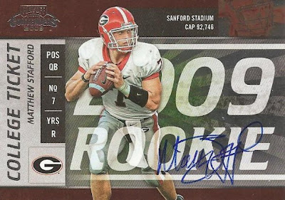
Another huge problem is the base set, and those subsets that are derived from it. I have no idea why, but every single player’s head is chopped off. I guess it was to make the players look larger than the cards themselves, but instead it looks like 40% of the whole product was cut wrong. You have a whole fucking base card, get the whole goddamn head in there.
The other subsets arent much better, as every card has about 20 parallels, jersey, auto and other, and really it just gets overwhelming and useless. Panini is continuing to think that subsets with parallels are the answer to everything, when really they just add fluff to a set that could use some actual meat.
Rating = 
Autograph Cards
The autograph cards in this set range from great to shitty and lots in between. There is no consistency, and when one card looks amazing, there are others that look like a five year old put them together.
I really like the autographed Fabric of the Game cards, as even with a sticker, they look cool. The cards don’t look horribly unbalanced, and the layout is pretty much correct. The team color design and the layout of all the different swatches works really well, and its not on FOIL! YES!


As said above, the base freshman fabric dual jersey autos are great, but they are the only good version of the cards, as well as being the only updated version of the cards. The others, as shown a few weeks ago, look exactly the same. If you are going to copy an old card, you have to make sure it was good to begin with. The 2008 versions were awful, and yet we get no new version. Too bad.
When you get to the Immortal Signature cards, you have some of the most packed designs I have seen in a long time. They make the jumbo swatch auto RPM cards from absolute look empty. Not only do they have a swatch, a sticker and a giant player with half a head, but they also have IMMORTALS scrawled across the whole thing. It just looks disgusting.
Overall, it’s the first Panini set that looks like it is improving in terms of creating auto cards, but they are a LOOOONNNNGGG way from producing on the level of Topps and Upper Deck.
Rating =
Relic Cards
There are a few good relic cards and a few bad relic cards in this set, but considering that every single card in the set has a jersey parallel, it gets to be too much.
First are the Freshman Fabric cards that are only jerseys. One is a high numbered swatch or patch, the other is the 1/1 mirror black logo. Both look good for a no-auto swatch card, and I am liking the logo cards in the context of the Frosh Fab design. The big jersey cards look SO much better than the 2008 version, and I credit it solely to the way the window is cut. At least for this design, the player doesn’t have to be huge to look good, and they don’t look covered up like they did in absolute’s crapfest.
The single fabric of the game jersey cards are great, and live up to the general feel of the previous years of the product. As I said before the team name logo cards are beyond cool, and even the single swatches don’t look awful.
Moving on to the dual and up v
ersions of the fabric of the game cards, they look as awful as the other Panini cards this year. They are busy, loud, and just look like total crap. They tried to go in the completely wrong direction, and the cards look like modernized Zubaz pants as a result. In all truthfulness, the plain swatch card has become completely obsolete, and when you see a card like these, it just screams that Panini has no fucking clue what is going on.
As for the subset jersey cards like the base parallel, Immortals, and Certified potential, they are all amost stereotypical. You could put these cards in front of me with a mock up line up with UD and Topps cards and I wouldn’t even have to breathe before telling you they were Panini’s. They are a complete snooze, and the new way Panini is cutting their plain swatches is getting fucking annoying. Enough with this shit already.
Rating =
Value To The Collector
Im not really sure what direction to go with this product. The product features some cards that will be extremely valuable and highly collected, but also a good portion of stuff that will just blur together with the rest of their releases from 2008 and 2009.
I think that anything that has a logo on it will sell, as evidenced by the Mirror Blacks of previous years, but outside of the low numbered parallels, it’s a complete crap shoot. The good thing is that a box will probably not run you more than 75 bucks after the first few weeks, and from what it looks like, they have pretty good value in them with more than 1 auto in most cases.
>
The problem with everything Panini, including Certified, is that the formula is stale and over done. Boxes filled with worthless and poorly designed swatches among sticker autos that have no place. For that reason, this product will fall, and that could affect value in the long run.
Rating =
Overall Impressions
Certified is, in my opinion, the best Panini release so far, but that isnt saying much. Panini is obviously focusing on basketball, and from that, the football side of things is continuing to suffer. There was no heart in this product, instead being a rehash of a sub-par release from 2008. There are slight improvements, but overall, like most Panini products in 2009, it falls continually short on fronts that they always have problems with.
As of now, it’s pretty sad to see that so many of my favorite products have tanked in terms of design and feel, thus solidifying that I am going to save my money for perennial good buys like Chrome, SPA, and others.
Average Rating =
2009 Product Leaderboard (SO FAR)
1. Topps Chrome (4/5 GELLMANS)
2(t). Donruss Certified (3/5 GELLMANS)
2(t). Upper Deck Football (3/5 GELLMANS)
2(t). UD Philadelphia (3/5 GELLMANS)
2(t). Topps Football (3/5 GELLMANS)
2(t). UD Icons (3/5 GELLMANS)
2(t). UD Heroes (3/5 GELLMANS)
2(t). UD Draft Edition (3/5 GELLMANS)
9(t). Upper Deck SPX (2/5 GELLMANS)
9(t). Playoff Absolute Memorabilia (2/5 GELLMANS)
9(t). Bowman Sterling Football (2/5 GELLMANS)
9(t). Donruss Threads (2/5 GELLMANS)
9(t). Donruss Classics (2/5 GELLMANS)
9(t). Donruss Elite (2/5 GELLMANS)
9(t). Playoff Prestige (2/5 GELLMANS)
9(t). Bowman Draft Picks (2/5 GELLMANS)
17. Score Inscriptions (1/5 GELLMANS)
18. Leaf Rookies and Stars (0/5 GELLMANS – NR)