On the Radar: 2015 Topps Strata Baseball

I am a huge fan of everything Strata. From its inception in football back in 2012, to the eventual transition to Baseball as a high end hit in Topps Series 1 and 2, it has consistently been a concept that works extremely well. Now that it is becoming its own standalone product for baseball, there are a few things at play that make this set even more interesting than it was in its previous incarnations.

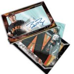
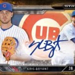
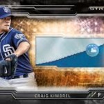
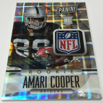
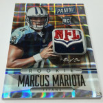
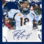
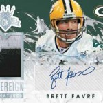
Strata’s cards have always been great looking, including a huge improvement on shadowbox technology that has permeated all sorts of facets of the hobby after its creation in 2009 SPX. Although Baseball wont have all the elements from its sister NFL product, its worth checking out some of these awesome examples:

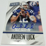
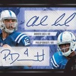
2012 Strata Andrew Luck Clear Cut Auto Patch BGS 9.5

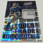
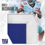
2014 Strata Odell Beckham Strata Signature /50

2014 Strata Sammy Watkins Strata Signature Patch Auto

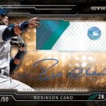
Funny enough, despite all the hobby circle jerk around acetate lately, the main draw for this product is actually not the designs or the cards themselves. Instead, the big news is around provenance associated with the relics that this set utilizes to create the cards. For a long time, collector questions over swatch authenticity have contributed to a decrease in confidence and value. To combat this sentiment, for the first time ever, all swatches in Strata Baseball will be MLB authenticated. This includes a label on every swatch that can be tracked through the MLB authentication database. According to the sell sheet, in addition to tagging each relic, each swatch will be able to be tracked to a specific game. This is huge for a few reasons, even though game dated swatches have been available in prior products with little added value.

MLB authentication offers a third party confirmation that many collectors will consider to be absolute in its authenticity. Even though there are individuals who have more questions that are created by the inclusion of tagged relics, 99% of the people who open Strata will not hesitate to assign certainty. Previously, all game matched swatches have not had this third party involvement, relegating collectors to trust the company's guarantee. Obviously, this still presents more trust that needs to be applied, and trust is always in short supply. As a whole, collectors will be more likely to trust a “disinterested” third party, even more so if that party is the league’s program. Im very curious to see if Strata’s popularity will be influenced solely by this tagging.

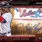
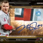
I am pretty disappointed that the clear cut auto relics are not included in this set, and also that the Strata signatures dont all seem to have relics in them. This takes away two elements of the set that have made it so attractive to me in Football, and I was really hoping that they would make the trip across the sports. The cards that replaced them are cool, dont get me wrong, but its just not the same. If they are trying to build a separate brand identity in baseball, I dont think that is a bad idea. However, I would have liked to see more of the traditional elements ported over with the set. Its not the same Museum collection without the framed autos, and its not the same Strata without Clear Cuts. At least the rivet cards are included, and as we learned in football, the Rivet cards are bad ass.

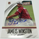
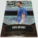
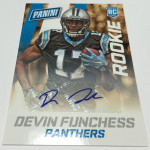
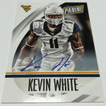
The biggest victory of the product has to be the price, which looks to be very low in cost compared to what is being offered in the new elements. This should end up being below the 80 dollar mark in MSRP if the sell sheet cost holds up – something that means you can buy boxes without breaking the bank. All the autographs are on card, and the new relic authentication adds some great intrigue to an already popular product.

With Football on its way out for Topps in 2016, this might be the only way the Strata format carries on. Really unfortunate that is the case, but im glad this is looking like a great addition to the baseball calendar.

The 2015 National Collector’s Convention Show Preview

If you have never experienced a National Convention, you are missing out. You are missing out on a gathering of collectors that happens only a few times a year, and this is definitely the only of those events with this type of fanfare. The convention is always important because of attendance, announcements and giveaways, but there are also other things at work that will definitely make this worthwhile for anyone interested in attending.

Each year, the convention is comprised of a few groups of people. First are the collectors, who will travel from around the world to Chicago, which will house thousands of exhibitors looking to connect with new customers and sell their wares. Every type of collector will show up, whether they are modern hit chasers or vintage pre-war set collectors.

The second group is the card manufacturers, who will all be there to meet their customers and give a bunch of stuff away. In recent years, the only reasons some manufacturers attend are just to be seen and make it rain wrapper redemptions, offering little in terms of actual experiences with their customers. Topps is one of the only companies that offers a formal Q and A, but all the companies have reps on the floor during the whole show if you have something to say.

agdiecuts-300x200

The third group of people are the exhibitors, who sell everything from packs and boxes to game used memorabilia. I would advise against buying sealed wax from anyone but the usual suspects, as trust is always a huge issue with low volume sales. Blowout, Atlanta Sports Cards, DA Cardworld, and all the big players will have huge setups, and if you are going to buy, that’s where I would go. All should have special deals for the show, and will likely have the best prices.

One thing about the national is that most of the people who set up ALSO sell their stuff on ebay, which means there really arent many cards that you cant already find (likely cheaper) online. They have to pay for their space at the show, so that means overhead and higher prices. You can also buy the wrapper redemption cards you actually want, instead paying all that money for boxes of product you would never buy in the first place:

2014 Panini National Convention Kris Bryant Auto

2014 Panini National Convention Johnny Manziel Auto Patch

2014 Topps National Convention Mike Trout Ginter Mini

2014 Upper Deck National Convention LeBron James Auto /8

This includes the packs themselves, including the gold ones from the Panini VIP party:

Lot of 10 Gold Panini VIP Redemption Packs

The one thing I would actually consider buying at the show is memorabilia – especially signed and game used. Those types of things can be had for some GREAT prices, and if you question a signature authenticity – PSA, JSA and the other auth companies are on hand to take a look. Make sure you get a receipt to prove any issues if one surfaces.

There will literally be tables and tables full of bats, helmets, balls, plaques, figures and artwork, all of which will literally blow your mind. Want a vintage bobblehead? Someone will likely be selling hundreds at negotiable prices. Want a signed ball from Babe Ruth? Im sure you can track one down.

Group breaks will also be a huge draw for people at the event, with the show organizers realizing how much product really flows through these individuals. They will have an area at the show again, and it is likely that they will be breaking non-stop for every single minute of the convention. If you want to jump in on one, all the big sites will be there.

As a collector, its important to go and experience everything that show has to offer, whether its the massive amounts of giveaways that will be happening, or the opportunity to catch up with your buddies who have only existed as a username prior to the show. Its a way to connect with cards in a way that isnt available online or in a shop, and to also be a part of the hobby’s fabric that is slowly thinning at the edges.

Speaking of giveaways, they will be all over the show floor, and some will be worth your time to check out. There should be a running monologue in your head about the true motives behind each giveaway, and if you read my posts about Father’s Day and Black Friday, you now know why Panini’s booth features hundreds of thousands redemption packs to bribe people into buying their boxes at the show. Dealers bring specific Panini overstock to the floor solely for the giveaways, and there is A LOT of Panini overstock these days. So much so that it can choke the distros without these types of events in place.

You have to make the giveaway worth people’s time if you expect them to voluntarily open Spectra Football:

Trust me, Panini doesnt love you enough to give away free shit without scratching their own back too. Its why there are specific products that are required to get packs. They want you to buy the stuff that no one can move at the show, so that their true customers can clear shelves of all those terrible sets that Panini puts out. Sure, the redemption packs have some nice cards in them, but from personal experience, you have to get CRAZY lucky to pull anything worth while.

The main rule is simple. If you wouldnt normally buy the box, dont buy it to get the wrapper redemption either.

Here is the underlying point of this post and its one you should take very seriously. If you are reading this blog, you are likely a part of the online community. Use this time to hang out – set up meetings with your contacts from Twitter and the boards, and use the show as your own cardboard vacation. Most people go to the national only to spend time there, so the free time after hours will be plentiful. Try to get involved in the group activities that will be taking place, and dont be afraid to join up with a group. There are lots of people who would love another person to keep things fun.

None of my friends collect cards, and not many understand why I do. The feeling when you are sitting at a table full of people that all get you the way you understand yourself, its an unequaled sense of belonging. Can you get that at your local shop? Of course. Can you get that online? Yes. In the same dose as the national convention? Nope. And that’s why you need to go.

Although Chicago is usually a show location that I will attend each time, the recent addition to our family prevents a vacation this year. I wish I could be there with the gang this year, but its just not in the cards. Have fun, and if anyone gets some cool Vikings or Twins stuff in their redemption packs – shoot me a message.

On the Radar: 2015 Panini Gridiron Kings Football

When I saw that Panini was bringing this on for 2015, I was VERY excited. The baseball product released earlier in the year was a great looking set, with a focus on cards that look like sports art. I thought this was going to be an opportunity for us to get on card autographs on licensed cards that look similar to the baseball version. When I opened the sell sheet, all I could think was how much of a fucking let down the preview turned out to be.

Gridiron Kings has been a force for many years, which is why I am so upset. It was actually responsible for some of the first higher end autographs in Football, and though it has been stickers for the last few times, there is no excuses why it continues to be:

1999 Donruss Gridiron Kings Walter Payton Auto

2000 Donruss Gridiron Kings Sammy Baugh Auto

2009 Threads Gridiron Kings LeSean McCoy Auto

2011 Threads Gridiron Kings Santonio Holmes Auto Patch

Here is what Baseball looked like earlier this year:

2015 Diamond Kings Kris Bryant Auto Dual Relic

2015 Diamond Kings Jose Abreu Auto Patch /5

2015 Diamond Kings Miguel Cabrera Dual Relic Auto /10

Let me start off by saying we have not had a set from Panini previewed YET that has on card rookie autos. Its a sticker parade, and I am disgusted by how many sets they think they can trot out in front of collectors that end up being trash filled with cards they SHOULD have gotten signed at the rookie premiere. The funniest thing is that this isnt even the worst part of the product, and that should scare the shit out of people.

With how awesome the "Kings" brand has been over the multiple decades, this set is a design travesty. Although it features backgrounds that look artsy, the composition of the cards takes a big shit on any design prowess shown at all. Big white boxes for the stickers are EVERYWHERE, including my favorite “big white box against a light background” as we see with the Favre autograph. The Luck/Dorsett dual auto may be the ugliest card previewed this year, which is saying something considering what they just previewed with 2015 Certified.

Even the main box hit, showcased in the Jameis Winston patch auto is so odd and unbalanced, that it doesnt even look like its worth talking about. This is one of the first times Panini has taken an action shot, which I have been looking for, and actually cropped it so much it looks like their stupid ass posed shots like we see AGAIN with the Mariota. Panini’s obsession with these types of cards is unhealthy, and leads to some UGLY fucking cards. Ugly cards lead to many things, but one of those things is this set eventually selling below dealer cost.

I hope they pull their heads out of their asses, or they are going to walk into 2016’s exclusive with a collector base that resents them for kicking out competition that VASTLY out performs them in every way, shape, and form.

Diving Deeper into 2015 Allen and Ginter’s High End Elements

The best part about Ginter, which I believe is responsible for so much of the brand loyalty, is how there is something for everyone. Large sets for set collectors, lots of parallels for player collectors, and some huge high end hits for the thrill seekers. Some of the hits are so impressive that they are unparalleled by any other set available during the year. Ginter has a cult following and rabid collectors who will pay big for what they want. Here is a break down of some of the bigger elements.

Ichiro Content

To this point, Ichiro has been the one surefire HOFer that Topps was never able to get under their umbrella. He has signed for Upper Deck, Leaf and others, but never Topps, until now. His autographs being added LIVE to Ginter is a huge get for this product, and the prices reflect that collectability. Ichiro might be the first Japanese import player that qualifies for both Halls of Fame, and he international appeal makes his cards hugely expensive.

Check out the prices on these bad boys:

2015 Allen & Ginter Ichiro Suzuki Mariners Framed Autograph

2015 Allen & Ginter Ichiro Suzuki Marlins Framed Autograph

2015 Allen & Ginter Ichiro Suzuki Yankees Framed Autograph

Rocky Content

Even though Hulk Hogan’s recent racial tirade will decrease some value in his autograph, the whole motif is amazing. Stallone as Rocky might be one of the coolest non-sport autographs in the history of the set, and I know that if I had the money, I would be all over these. Stallone’s autograph isnt THAT rare, but when its presented like this, along side Lundgren and Hogan, things get a bit more interesting.

Here are the top ones:

2015 Allen & Ginter Stallone as Rocky Red Ink Framed Autograph

2015 Allen & Ginter Stallone as Rocky Blue Ink Framed Autograph

2015 Allen & Ginter Lundgren As Ivan Drago Framed Autograph

NBA Rookie Autographs

There have been crossover autographs in Ginter before, and they have always been popular among the Ginter enthusiasts. This year, Topps was able to get a few of the first round draft picks, including March Madness standouts and top picks. Considering how many Rookies sign exclusive deals with Panini, this is something that definitely intrigues me. These have sold well for non-licensed rookie cards, but they are also some of the first autographs of the new players.

Here are some examples:

2015 Allen & Ginter Sam Dekker Framed Auto

2015 Allen & Ginter Justise WInslow Red Ink Framed Auto

Metal Minis

Topps has done printing on metal for Ginter before, and they have come back again this year with some very interesting uses of a material that is tough to use well. These cards are done in a way that makes them very chase worthy for player and team collectors, and they are extremely limited in the process. Although there are also wood printed 1/1s, these are 10 times as cool to me.

You can see these are actual metal:

2015 Allen & Ginter Joc Pederson Metal Mini RC /3

2015 Allen & Ginter Yasiel Puig Metal Mini RC /3

Giant Patch Box Loaders

I have always been on the lookout for these cards, as I think they are something that really doesnt exist other places. Card manufacturers rarely like to go big, as large scale cards rarely have the same impact as normal scale. Because these can feature almost a whole nameplate, and are not always redemptions, its a different story with these. They are very cool display pieces for those people who have their collections set up.

2015 Allen & Ginter Max Scherzer Giant Boxloader Patch 1/1

10th Anniversary Buyback Framed Mini Autos /10

I love buyback content in products with a ton of history. Ginter is definitely one of those products. The checklist is pretty strong as well, and these cards are only limited to 10 copies. I wish one of my guys that I collect was in this set, as it would be one of my top chases for the set. Great looking stuff with on card autos.

2015 Allen & Ginter David Wright Auto Framed Mini Buyback

2015 Allen & Ginter Adam Jones Auto Framed Mini Buyback

Ginter always sets a bar for retro sets that will come out during the year, and I have rarely seen any set come close. Content like this is a big reason for that.

Pet Peeves: My Thoughts on the Easy Ways to Ruin a Card Design

I get it. When you are designing cards that have a small space available to display the content, it can be really tough to do every design the right way. There are always examples of awesome technology that can spruce things up, but fresh ideas are few and far between. One of the main reasons I abhor most of what Panini does is because of the way they design cards. To me, its not always about WHO is on the front of the card, but rather how that card looks as a primary driver of want. For many collectors, its the opposite, as design is always secondary to the player, patch, or autograph on the front of a card. Sometimes, its all of those things before design. Well, here are my pet peeves in a nutshell, which represent the easiest way to ruin a card design in my opinion.

Posed Player Photos / Non-action shots

Historically, Baseball cards were created with few examples of someone in action. Im sure it had to do with available photos, getting people out to the games to take pictures, and even more importantly, the cost of obtaining licensing to use existing ones. Posed photos, im sure, were much easier to deal with.

This situation led collectors to covet the posed photos for Baseball, because most of the time, it represented the cards of their youth. As a result, when football cards became a big part of the hobby, it was not a surprise that they were modeled after Baseball.

That being said, there is no bigger pet peeve of mine than a card company choosing photos of players who arent in the act of playing. Whether its on the sideline with their helmet off, or what I call the "Panini Special" which is a glamour shot of a rookie in some stupid pose, its all horrid.

Here are some horrible examples:

2014 Panini Black Gold Blake Bortles Quad Patch

2010 Limited Sam Bradford Initial Steps Auto Patch

2014 Contenders Odell Beckham Auto Ticket Variation

2014 National Treasures Jimmy Garoppolo Hats Off Auto Patch

For Baseball, a player’s brand and likeness includes their face, so its less of an intrusive and vulnerable state for the card to depict them in that method. With football, the player’s brand is faceless, more represented by the uniform and heavy equipment they wear. Its rare that a player’s likeness includes the way they look off the field. Most of the time, as a result, the players dont know HOW to take pictures like this. They end up looking disinterested or just goofy. Every Panini set previewed so far, has some element of posed player photos. Barf.

Football is also a huge opportunity to utilize some of the most dynamic photography in sports. With the advent of digital SLR cameras, there is even more action available, and yet, some of the manufacturers STILL choose other ways to showcase a player. Its an immediate disqualifier to me, and I will not buy a football card that uses posed shots. I want combat. I want action. I want dynamic scenes that highlight why I watch. Not Johnny Manziel doing red carpet poses (yes that happened).

Vertical Cards With Swatches and Autographs

I think the greatest measure of a card designer is someone that can take a vertical card, add a swatch and an autograph and make it look good. It is so rare, that Im almost convinced its a cardboard unicorn. Many have tried, and the super majority of the cards are such abject failures, its not even worth continuing to go that direction.

These are just bad:

2014 Black Gold Odell Beckham Jumbo Patch Auto

2014 Limited Mike Evans Jumbo Patch

2012 Absolute Robert Griffin III Jumbo Patch Auto

With a vertical orientation, you almost have take on a design that looks like each element is stacked neatly on top of each other. More importantly, because the bodies of the players are usually too big to add to the card with a swatch and an autograph, its almost required to cover up the subject of the card. They are usually relegated to being the size of a penny, or in a worst case scenario – absent from the front of the card all together. Im not kidding when I say that Panini has made cards without the player on the front.

To me, I collect cards for the players themselves. Without the player in a prominent position in the card layout, I dont see a reason I need to own it. Player photos should be the prime consideration on every card, and vertical cards of this type cant deliver on that promise without some sort of interesting configuration. I think its terrible that the swatches take more of a pronounced appearance than the players in a lot of these cases, and even more terrible that people think they look good.

Defined areas for autographs without consideration for the design of the card

There is one effect in card design that is under utilized in many card sets that I despise. I have called it the “ghost fade,” where the background elements of the card are faded out (but still visible) so that the player can sign the card. Some companies use this every chance they get, others like Panini, likely forgot the effect exists.

Instead of a ghost fade area for the autograph, they will obscure the flow and design of the card to have a defined area for autographs – both sticker and on card. These defined areas can be separated by lines, or in some of the worst examples, without warning. I have seen some cards where the player is literally sliced off at the knees or waist. Its hilarious!

The best of the best come from examples where the design will feature a giant box that is seemingly pasted over the card's layout that is meant to house the sticker. It is the worst way to showcase an autograph, as the box does nothing but disrupt the look in every way shape and form.

In some recent sets, Panini has used acetate scraps in place of sticker autographs, which only exacerbate this situation, as the card actually has to have a hole cut out. I dont know who thought this was a good idea? Its not.

Crazy Patterns on the Card Stock

This all stems from the late 1990s, where card companies were slave to the trends of the market. The foil patterned card stock was hugely popular on gaudy inserts, as it was a new way to make the boring old regular cardboard look more valuable. Kids love shiny shit, and the card companies wanted to take advantage.

Then as cards like the Superfractor grew in its reputation, it became more and more common for patterned card stock to be a way to build a parallel structure. There have been some crazy attempts to replicate the success of the Superfractor, and all of them seem to be centered around branding a card around the distracting pattern of the stock.

To me, it just takes away from everything. At least with the ones Topps makes, players and certain design elements are opaque. It prevents the design from showing through over their images. In other circumstances for Panini and the others, players are semi transparent. This leads to the pattern showing through over their faces and images. Its a great way to give someone a headache.

There are times where I see someone looking at a clearly ugly card and getting excited over the way it looks. I wish I had the eyes that let me experience a card that way, regardless of the way it looks. I cannot understand how or why some design decisions are made the way they are, and as Panini takes on more and more of the exclusives within the industry, there may no longer be choices that allow us to avoid the designs we hate. Variety breeds competition, and exclusive licenses do not help that. We should all hope that something changes soon, or the choices may be gone forever.