Topps Continues To Suck Horribly At High End

I cannot believe I am seeing people bust boxes of Topps Tribute. It could be one of the most yawn worthy products I have seen since the last time it came out. Yes, I know, people love the original because it was one of the first products to really go after the market for older player swatch and signature cards. As of now, in todays market, this concept has been done to fucking death, and there is no longer a reason to even think about crap like this at over 200 a box.

Here is a break of 14 boxes of this poop. 14 boxes! For that price you might as well buy something that actually delivers more than just the same cards over and over again. Look at his hits, you either get 1, 2, or 3 swatches of one color material, or if you are lucky, AN AUTO! Wow. Im sold. Buy me 15 boxes.
Yes, this product has Mickey Mantle, Jackie Robinson, and Babe Ruth, but who fucking cares when the cards make Triple Threads look subtle? I mean, having bright fucking rainbow foilboard is one thing, but this is ridiculous!
Then you factor in that this is still chock full of sticker autos and meaningless and needless swatches, and it makes you wonder who green lighted this turd of a product? It costs more than a half case of Topps or Bowman Chrome for one god damn box! I am completely shocked. Hell, you could pay 45 a pack and come away with a Josh Hamilton bat relic. That, and I am not even sure that these old timer jerseys are actually game used. Remember when there was that shortage of Mickey Mantle swatches? Well, he’s back in Tribute, and you know what that means. Probably some exhibition game, post-retirement, with nothing but a few jogs down the base paths.
I am dead serious, if this is what Topps is going to use its exlusive license for, I will be waiting to see what the other companies can come up with. I sincerely hope that a full season of Triple Shits and Tribute is not what is in store.
*Looks at Calendar and sees Topps Sterling is coming soon*
Fuck. Me.
This post is brought to you by the Golden Rule of Topps, where if its over 100 bucks a box, dont buy it.

I Miss Cards Like This…

I have mentioned a few times that innovation is the one thing that has fallen by the wayside as the industry has plowed forward. These cards from 2005 Exquisite were only produced once and I think are some of the coolest ideas for a card in a long, long time. They feature signed, game used pieces of shoulder pads and helmets, and they are VERY rare. The idea of using signed equipment had never been done before and has yet to be repeated, much to my dismay. The checklist was also pretty good to boot, but the concept was the best of all. The problem was that these were some of the most difficult and expensive cards to produce in the history of the modern era, which left this idea on the cutting room floor for 2006.

A notice to Topps and Panini: these cards feature HUGE windows for the signature equipment, yet still have enough room for a full size player picture and a nice and simple design. If only these would start coming back, I would be first in line.


I Hate Printing Plates. So Much.

I have always criticized the use of printing plates in a high end product. They are ugly, they are worthless to many people, and most of all, they are still considered to be 1/1s that really arent 1/1s. Basically if you are producing a base product, and you want to include printing plates for shits and giggles, fine. But if you expect me to spend more than 100 dollars a box for this piece of shit that you call a case hit, you gotta be fucking kidding me.

We all are very familiar with the culture of the 1/1, as everyone in the hobby craves them like the Heroin dragon. They will do anything for a shot at a one of a kind card of any player, let alone their favorites. The problem is that many times, the Printing Plates are inserted in place of true and worthy 1/1s, and that leaves me with a very bitter taste in my mouth.
There is also another dimension to the plates, as the auto ones can usually never contain a hard signed signature. 99% of the time, they are sticker autos on an ugly plate, and that is just a complete cop out. Hell, Upper Deck puts them into Exquisite and the Cup, and that is pretty much the most inexcusable of all. Why would anyone fucking care about a used piece of thin scrap metal with a reverse negative of a player they cant identify for 500 plus per pack? Thats just plain stupid.
Lastly, I just hate seeing stale ideas run rampant akin to levels of Lavelle Hawkins autos in SP Signature Edition. Printing Plates are a very stale idea, and yet they are present in just about every single product. There are even products that frame the plates inside bordered cards in an effort to make them look better. Then you have a product like Triple Threads, who actually designates them as the top pulls of the product. Why? As if the design wasnt bad enough, now we have to get cards with all the elements of a normal hit, but a priting plate front. How terrible can that get? Obviously pretty bad.
If printing plates went away, the only people who would care are those people so desperate to pull a 1/1, that they run around the store screaming “MOJO!!!!!!!!!!!” at the top of their lungs when they pull one. To that, many of the informed collectors out there know that some of the best cards of any player are not 1/1s, and I agree with that 100%. Although my Mauer, Harvin, and Peterson collections are full of cards, none of them are one of a kind. Some of them are low numbered, but I dont care if I have the only card in existence. I just want one that looks cool. Printing plates have never been that, and never will be.

More 2009 Triple Threads Cards Are Live, Worse Than Expected – UPDATED

Looks like the Triple Threads visual abortion that is the 24 piece relic is back, and worse than ever. Aside from being one of the worst concepts since the sticker auto on a letter patch, this card looks WORSE than it did last year. Just when you think the impossible couldnt happen, it comes up and slaps you right in the knob.
No player picture? Check.
Confusingly spelled out diecut windows? Check.
Overly excessive “game-used” relics STUFFED into the card? Check.
Fugly design and fold out orientation? Check.
Is a Joe Collector salivating over this card? Check.
Wow, thats five for five. Unbelievable.
Here is last year’s diarrhea for reference.
EDIT: Here is one more card that I am just mortified by. Why in god’s name would anyone want a card that spells out “PRIME” in diecut windows? At least last year, the cards had “RC” with prime diecut in the shield part of the cut out. It was still horrible, but this takes it to a whole new level.
Secondly, which would you rather have: The card above (foil board, die cut prime patch window, sticker auto, millions of parallels), or the card below (foil board, die cut prime patch window, sticker auto, millions of parallels)? Both feature almost identical elements, but in this case, I actually think Panini did well with what they had. At least the focal point isnt some big die cut “I.” The bottom card also features a full player picture and the concept fits with the rest of the card’s content. Just shows how important design is with a card.

Triple Threads and What It Says About Us

To me, triple threads is that dreaded shit after a night of Mexican food. You know its coming, you prepare yourself for the pain, but in the end, it gets you all the same. This year is no different, and really, its says a lot about what Topps thinks about the collecting base. What I mean, is that by structuring the set the way that they have, it shows how little confidence Topps has in how people view each part of the card. Instead of focusing on putting together a top notch design, they thought that jam packing needless junk and gimmicks were more important than a good looking set. From the reaction I have seen, it worked.

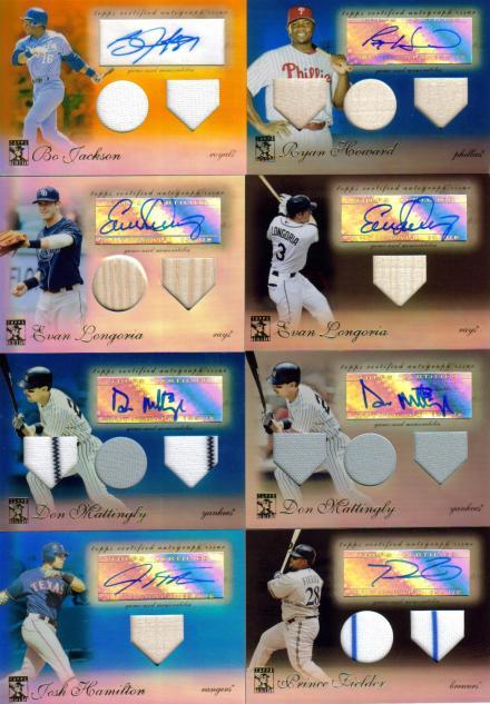
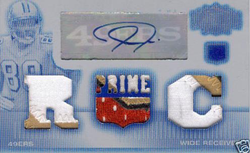
The most talked about part of the product is always the “OMG SIKX MOJOS!” that supposedly litter this set. They have about a thousand different 1/1s, each one more ridiculous than the next. Before this year, it was only limited to single and bifold cards, but Topps felt that two entire cards were NOT enough for the junk they had in store, thus leading to the first tri-folds. Stupidly, the tri-fold cards feature little more than a border to encompass the jumbo patches of the card, and that’s pretty much all they have to offer. Topps has basically implied that collectors only want the biggest possible patches with the most colors, and that putting a good looking card together is meaningless. This means there is only a dime-sized player pic, no autograph, and zero concept. What you have to replace that is just the biggest, gaudiest, most ridiculous looking patches that I have ever seen. Never before have I thought to myself how shitty a whole Marlin patch looks when its next to two other similar patches. Its almost like Topps said, “Well, these cards are going to look like crap, make sure there are whole patches on there to shut them up. They are like babies with shiny or glittery things, this will be like crack to them.”

Moving on, the design is almost identical with previous years. There has been ZERO update to the concept of what normal people will get in each pack. You get a tri relic card with some shit spelled out in confusing die cut windows, and an auto tri relic of some guy with some shit spelled out in confusing die cut windows. Aside from the checklist being complete poop, and aside from the fact that there are very few baseball players who can carry a high end set, there isn’t anything in this set that hasn’t been done before. They also went with a stupid partial medieval theme this year with scrolls and shields and crap like that. I say partial because the other cards have a completely clashing identity of linear boxes and junk. Of course, none of this means anything to the people who buy Triple Threads, mainly because they only care about how many windows are on the card. No matter that there is barely a player picture, or a cohesive thought to bring the card together, all they want is relic. Relic, relic and more relic. I say relic, because Topps doesn’t always use game pieces for this set, instead using old timer game jerseys, event jerseys, and practice jerseys. Again, none of this matters because the people who buy this junk have no concept of what should matter.

When you move away from the horrid relic cards, you see that there is still no on card autographs for this set. Even though Topps has the resources to do it, they care more about stocking their storeroom when they meet with a player rather than doing something for you the collector. Not only that, but the stickers bring your focus on the card because they are cut into the fucking design. Each auto card has a cut out spot for the sticker, instead of disguising it like it should be. Why do I want a card that blatantly shows everyone that the prized auto is just a label stuck on by someone in China? That makes no sense to me.

Triple Threads is also single handedly responsible for the parallel hell that so many of us hate. Each of the 300 or so cards has at least 10 parallels, including 5 1/1s – FOR EACH CARD. That’s 4 printing plates and a regular platinum parallel. Seriously, how does anyone think this is okay? Its worse than Panini, and I cringe each time some idiot screams “MOJOOOOOOOO!” when he pulls a Adam Lind 1/1 triple relic printing plate that he can sell for five dollars. Give me a fucking break.

Lastly, the price point continues to be a complete joke. For 170+ dollars, all you get is one autograph and one crappy one color jersey card. If you are lucky you can pull one of the hundreds of worthless players on the checklist, who have up to four cards each in some cases. Then, there is a one per case triple auto that has three players that are drawn out of a hat, and sells for ten bucks, or a 1/1 card that may or may not make you have a seizure from looking at it. The fact is, 95% of the time, you are going to pull less than 20 dollars worth of cards from your box, and even if you pull a 1/1 “REDICOLOUS MOJO” card, its going to look like poop.

I cant say enough bad things about Triple Threads and Topps Sterling, because they are like the Michael Bay movies of the card collecting world. There is a lot of needless action, but when standing alone on a concept, everything falls apart. Right, Transformers 2? Triple Threads is like that, and its an insult to my intelligence that it is always shoved down our throats for 3 sports each fucking year. In fact, my golden rule of Topps was created around this product. In the future, I would hope that collectors realize that supporting Michael Bay Threads means that more of it will come, just like every goddamn needless sequel in Hollywood. Please don’t give them that satisfaction.