On the Radar: 2015 Topps Definitive Collection

Let me start out by saying I am upset that Five Star is likely gone. Let me finish that thought by saying this new set looks fucking awesome.

Today, we got a good look at what Topps is planning for what looks like their final set of the year, and I am literally floored by what the sell sheet is showing this product is all about. Although this should cost a bit more than Five Star, the product looks to encompass a lot of what Five Star was all about, plus a bunch. I have said over the years that Five Star is one of my favorite sets of the year, if not only because it remains the only affordable product with all on card autographs.

Although enormously under appreciated, I have never been disappointed by a set that offers what Five Star offers. I will surely be sad to see it go:

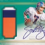
2012 Topps Five Star Ryan Tannehill Logo Patch Auto 1/1

2010 Five Star John Elway Quotables Inscription Auto /10

2011 Five Star Peyton Manning Auto Inscription

2014 Topps Five Star Tom Brady Auto SSP

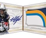
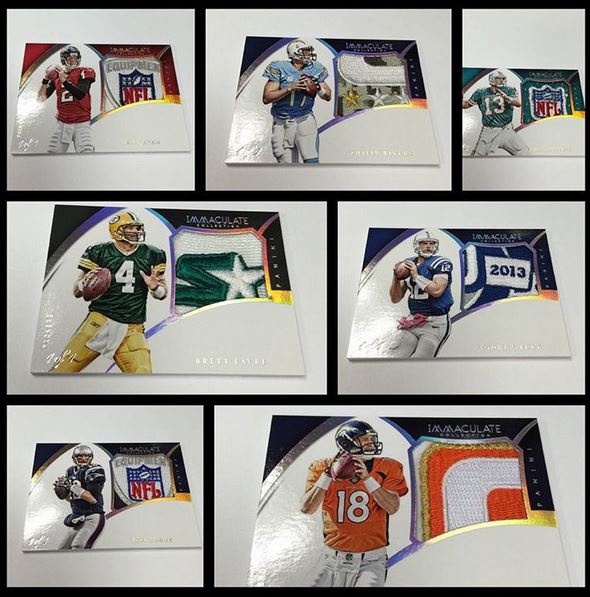
Definitive Collection, as a possible replacement, looks tremendous in just about every way. The Rookie auto patch cards, which use a silhouette type approach are some of the best looking cards I think Topps has done in a long, long time. Cutting the player into the swatch window adds an element of action to the card’s look, something that makes these cards absolutely awesome. This is something Panini has done well over the years, but Topps is finally looking to add some die cut content in a product like this.

The jumbo patch autos look to be taking a very similar elegant approach, with a simplistic yet stunning look, which provides a jumbo patch auto along side the on card autograph. These look very similar to the National Treasures cards of the same type, but I like the look a lot better with the added foil embellishments, and possible leather bound backs according to the sell sheet.

Definitive looks to also be bringing framed elements into the product on the Winston preview, something I absolutely live for with its inspiration in Museum Collection. The framed cards are some of the best examples of a cool technology that exists, something that Panini has even copied for its basketball sets.

Overall, each design looks better than the last, something that I wish Topps had more years to develop under their current NFLPA and NFLP licenses. I think that as a whole, this is easily the best best set that Topps has put together, at least on paper, and at 750-800 dollars a box, it better be. Where Panini tends to fail is that Football cannot support a product like Flawless, despite what current prices show on the wax market. Singles will never add up to a 1500 dollar box price, but something at this price point will sell like hot cakes for the content it delivers. Its sad that National Treasures will win the value wars by default, even though I would be SHOCKED if they could generate anything that looks as good as the jumbo auto rookie patches look for this product. Panini just doesnt operate at this level, and Topps has shown that they are the FAAAAAAR superior company in just about every single opportunity they have.

To think that this is likely Topps’ last go at a top end football product, they are definitely going out with a bang. All around, we will be sad to see them go, and when you look upon a product like Definitive Collection, its pretty fucking clear who should remain a part of this sport.

On the Radar: 2015 Immaculate Football

Even though I absolutely HATE the awful name of this set, its hard to argue that it isnt one worth looking forward to. Immaculate has been a product that people seem to enjoy in all the sports its offered, despite some issues with it being truly a product worth raving about. Last year’s version was quite the surprise, with a lot of non-RC on card content, and some really good looking cards. There were still stickers in the product, which took away from the overall potential, but as a whole it was one of the best sets Panini put out.

Check out some of the stunning cards from 2014:

2014 Immaculate Teddy Bridgewater NFL Logo Auto 1/1

2014 Immaculate Odell Beckham Jr Auto Jumbo Logo Patch 1/1

2014 Immaculate Tom Brady Auto Jumbo Patch /49 – Lots of high profile stickers in this set

2014 Immaculate Andrew Luck Auto Patch /25

This year, Panini has struggled with just about everything that has to do with football. On card content for the rookie class has dropped to almost nothing, and design as a whole has been a complete fucking disaster. They may have just released the worst product of the last 15 years with Spectra football, and that scared in looking ahead to sets that will anchor their calendar. Luckily for us, the Football team decided to yield to a much more talented Basketball team, copying the first cards previewed verbatim.

These cards look pretty tremendous, as they did in Basketball, and if we are lucky, they will copy a lot of the other great elements as well. Basketball, as a whole, tends to find ways to put out good looking designs much more frequently than Football, and it shows with products that have origins there. Of course, we are likely in for more of those disgusting signed scraps of black construction paper, but we can hope that the stupidity of previous sets is minimized by a product jam packed with other great stuff. Topps has already previewed a new product called “Definitive Collection” which looks to be something that could rival National Treasures as their final set under the current NFLPA license. Immaculate will likely be out by then, as will Flawless, and only then will we be able to see how everything measures up.

Last year, Flawless offered ZERO of the cards from this preview, with very few really stunning cards that couldnt be found anywhere else. In what I consider to be a HORRIBLE decision, Immaculate is where those cards were used, despite Flawless costing 1500 a box. Immaculate offers the content that should be available in a top shelf price tagged product like Flawless, and yet, here we are again. Obviously, when Panini solicits the full product, we will have more to judge as to the potential merit of the set.

1

On the Radar: First Look at the 2015 Contenders Ticket Design

I have said on numerous occasions that Contenders is probably the set that Panini is most associated with. Its easily one of the most rabid loyal fan bases that Panini has been able to maintain, and its history is responsible for some of the most iconic cards of the modern era. That being said, outside of those iconic cards, the brand has been poor to mediocre at best in the way it looks, and I fail to see why people love it as much as they do.

Here are the worst of the worst designs:

2011 Contenders Cam Newton Auto Ticket

2009 Contenders Matthew Stafford Auto Ticket

2008 Contenders Joe Flacco Auto Ticket RC

2014 Contenders Teddy Bridgewater Posed Photo Variation Cracked Ice

When I saw the post for the new Contenders ticket for 2015, I tempered my expectations to very low. In my opinion, the last time Panini created a good looking ticket design on their own was in 2013, and before that, you have to go back to 2010. It has been a long road of shitty looks for the product, including the worst ever in 2011, and a horrible take in 2014. Contenders is rarely good looking, and that scared me for 2015.

Luckily, the design is actually great. They look to have gone back to a normal style ticket design, which almost looks similar to 2013 in a way. The vertical card fits in nicely with previous successful years of the product, and this time there isnt an autograph the players will have to sign going up the side. Its pretty simple looking, and SIMPLE IS FUCKING GREAT.

We have yet to see the rest of the set, for which Panini could resume being their normal selves, bringing the standard ugliness for the remaining unseen cards. At least as a whole, the Ticket should do a great job anchoring the product, leading to my happiness once again with a product I have had major problems with. Kudos to them.

COAR-MDU8AArgZH

What Makes 2015 Panini Spectra Football So Bad?

Today marks the release of a product I put on my list for the worst products of the new millennium. Spectra is so bad, that it sucks on more levels than just design, or price or content. It sucks on all of them. Other bad Panini products like Certified or Clear Vision suck on multiple levels too, but nothing of this type of suckage. This product blows so hard, that it makes the duds of previous years look like winners. That is not a good way to get into the market with a product on the highest price tier. Here is a breakdown.

Box Price

Since its inception, Spectra has been a whopper at close to 300 per box. In 2013, there was a lot of on card content, and the design wasnt horrible. Last year, there was a lot of on card content, but the design was god awful. This year, the autographs are all stickers, and the design is legendary in how fucking horrible it is. When you have a product that costs above the normal expectations, there has to MANY things that make the set worth buying. Whether its a combination of great looking cards, on card autographs or even great looking relic cards, something has to justify the price tag and exceed what people expect. Spectra not only does not exceed, but it doesnt even meet the basic expectations we have for low end. That is a disaster waiting to happen.

Card Design

This is where Spectra takes terrible to a whole new level. When you see the first design, you think to yourself that there is no way things could get worse. Then you see the next and the next, and it all goes downhill from there. The cards are plagued by giant boxes behind the sticker autographs, odd swatch placement, and terrible design composition. The dual auto patch cards are by far the worst, with Panini choosing that the heads of the player are really the only part they feel like showing. There is not a single good looking chrome stock card in the entire set.

Spectra’s cards seem to showcase a general lack of brand separation from the rest of what Panini has put out this year as well. When you look at the way the cards look, the similarities in the structure of the design is pretty easy to spot. It would be one thing if the design they replicated was good to begin with, but its not even close to that level.

Product Content

I cant even find the right adjective to describe how the cards look with the neon pens used to sign the stickers and what I have started calling "seizure stock" due to its likelihood of inducing seizures when viewing it. The crazy patterns used on the card stock have been used in other sets before, so Im not saying that it hasnt been bad until now. It has been. The seizure stock has never been used in this way in a high end set that I can remember. Coupling the nauseating look with rookies who signed their stickers in neon colored pen onld makes things more disgusting, and that isnt really giving the correct gravity to the terrible look.

Panini also chose to steal the card stock design from Topps' wildly popular Superfractors, which just looks like a dick move. Dont get me wrong, things get ripped off all the time. Hell, Panini even ripped off an entire Upper Deck product back in 2013 – name and all. It happens. The issue is that Superfractors kind of have Topps’ brand name written all over it. Stealing the look only makes it look like your team doesnt have the creativity to come up with a similarly valuable parallel structure. When you see what Panini typically has to offer, I guess that isnt a surprise though.

The biggest complaint is that just a few weeks ago, Panini released 2015 Certified, which offered a jumbo patch auto with a sticker for 1/3rd the price of this shit. Both products have been panned online, but the difference in price showcases how few elements of unique content are available in this. Although on card autographs of some Top HOFers are included, the use of Seizure Stock, combined with general rarity makes it almost a moot point.

Panini should be ashamed of themselves with this product. I sincerely feel that way. With every product release, there are certain people I look to as a barometer for how it will perform. Every time something comes out, one of those people seems to think there is some redeeming factor worth looking at. This time, none of them do. I may be biased towards Panini the same way Fox News is biased towards democrats, but even the more objective individuals think this is a bloodbath. Pretty telling.


2015 Topps Football: What Works and What Doesnt Work

Now that 2015 Topps Football has been on the market for almost a week, I think its worth taking a look at some of the ups and downs of the product. Topps did a really good job of adding some extra elements to the set this year, and they also missed the boat on a few different parts of the product as well. Here are some thoughts.

On Card Rookie Content

Topps has done a good job with these programs over the last few years, and 2015 is no different. The cards look really good with few exceptions, and as a whole, the Rookie Premiere autos look better than they ever have. Some of the on card autos are generating some high end prices compared to previous years, especially the multi-signed cards done during the photo shoot. I absolutely think these cards are the best of the entire product, and that might be a huge understatement. Considering we will be, AT MINIMUM, 11 products into Panini’s calendar before they have any potential at a large on card rookie program, Topps is kicking their ass.

Examples:

2015 Topps Mariota/Winston/Gurley/Cooper Quad Rookie Premiere Auto

2015 Topps Melvin Gordon 1987 Super Rookie Auto /25

2015 Topps Ameer Abdullah Rookie Premiere Auto

2015 Topps Devin Smith 1976 Retro Auto

Verdict: Touchdown

On Card Rookie Content SP List

Despite looking incredible as a whole, the SP list is rightfully generating some complaints. In previous years of Topps Football, the SP list really didnt apply in quantities from the on card programs, but in 2015 its everywhere. The best rookies are all out of 25, with even some second tier guys being SPed significantly. Although this increases value on the secondary market CONSIDERABLY, its not something wax breakers are happy with.

Examples:

2015 Topps Jameis Winston 1963 Mini Auto /25

2015 Topps TJ Yeldon Rookie Premiere Auto /75

2015 Topps Devante Parker 1976 Retro Auto /25

Verdict: Punt

60th Anniversary Auto Set

If you are going to make a set like this, it had better be on card, or at the very least look really fucking awesome along the way. Although this retro set is stickers, the choices for sets that they used for the players works incredibly well. The checklist is also crazy strong, including some of the top signers in the game. I usually dont get excited about stickers for non-RC guys, but this is a set I really, really like. Its worth noting that in 2015 Topps Chrome mini, the sell sheet says they will be on card. Now that’s a blockbuster.

Check these out:

2015 Topps John Elway 60th Anniversary Auto /15

2015 Topps Dan Marino 60th Anniversary Auto /15

2015 Topps Odell Beckham 60th Anniversary Auto /35

Verdict: Touchdown

Veteran and Retired Base Autos

I love that Topps started adding base autos for non-RCs back in 2013, and I am happy that the checklist is strong. However, I cant get over the box around the sticker. The cards would have looked so much better without that frame, and it could have created some of the better base autos ever inserted in a set of this kind. Instead I just feel like the design cheapened the cards, which I know is more my pet peeve than anything.

Examples:

2015 Topps Odell Beckham SSP Variation Auto

2015 Topps Roger Staubach SSP Variation Auto

Verdict: Interception

Rookie Base Autos 

These look the way the veteran base autos should look. In 2011, Topps first started adding cards like this to the set, and they were insanely popular along the way. Of course, they were also SO MUCH rarer than they are today, and as a result, much more valuable. The 2015 ones look good, but because they are so common, they tend to be a lot less valuable. I still like them a lot, and I would collect them if the Vikings had a rookie I was collecting.

Examples:

2015 Topps Todd Gurley Auto SP Variation

2015 Topps Breshad Perriman Auto SP Variation

Verdict: First Down

SSP Photo Variations

I dont collect base cards very often. If something isnt autographed, it needs to be something of value to be in my collection. When these first started showing up back in the beginning of the decade, I really liked the concept, and started collecting my guys. Even though the rarity has definitely decreased over the last few years, I still love to pick up the Vikings who have variations. The addition of HOF players to the set for certain cards in the set is a wonderful idea, and the pictures looked great. The issue is that with 40 rookies plus a bunch of vets, I believe the SSP count was over 100. That’s just too much. It gets flooded at that point. Either way, they are still cool.

Examples:

2015 Topps Richard Sherman Holding Turkey SP Variation

2015 Topps Brett Favre Retired Player SP Variation

Verdict: First Down

Topps Huddle Set

You are probably wondering what I am talking about, and its because this set doesnt exist. In both Topps Series 2 Baseball and Topps Apex Soccer, as well as Topps Update Baseball coming out soon, the corresponding Topps Digital app has a program included. In Series 2, Bunt had pack inserts that provided access to free coins in the game, as well as digital card redemptions for powerful rare cards. Both were very successful. Huddle, likely due to lack of an NFL license at the moment, was not included in Football. Although the logistics may be muddy, its a huge miss, and something that should have been done some how, some way.

Verdict: Interception

Overall, I am sad that Topps wont likely have a set in this capacity come 2016, but this does serve as cool way to end the product square on their 60th anniversary. It has its peaks and valleys, but overall, its a great set.