Pet Peeves: My Thoughts on the Easy Ways to Ruin a Card Design

I get it. When you are designing cards that have a small space available to display the content, it can be really tough to do every design the right way. There are always examples of awesome technology that can spruce things up, but fresh ideas are few and far between. One of the main reasons I abhor most of what Panini does is because of the way they design cards. To me, its not always about WHO is on the front of the card, but rather how that card looks as a primary driver of want. For many collectors, its the opposite, as design is always secondary to the player, patch, or autograph on the front of a card. Sometimes, its all of those things before design. Well, here are my pet peeves in a nutshell, which represent the easiest way to ruin a card design in my opinion.

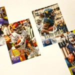
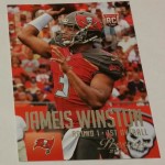
Posed Player Photos / Non-action shots

Historically, Baseball cards were created with few examples of someone in action. Im sure it had to do with available photos, getting people out to the games to take pictures, and even more importantly, the cost of obtaining licensing to use existing ones. Posed photos, im sure, were much easier to deal with.

This situation led collectors to covet the posed photos for Baseball, because most of the time, it represented the cards of their youth. As a result, when football cards became a big part of the hobby, it was not a surprise that they were modeled after Baseball.

That being said, there is no bigger pet peeve of mine than a card company choosing photos of players who arent in the act of playing. Whether its on the sideline with their helmet off, or what I call the "Panini Special" which is a glamour shot of a rookie in some stupid pose, its all horrid.

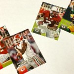
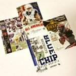
Here are some horrible examples:

2014 Panini Black Gold Blake Bortles Quad Patch

2010 Limited Sam Bradford Initial Steps Auto Patch

2014 Contenders Odell Beckham Auto Ticket Variation

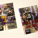
2014 National Treasures Jimmy Garoppolo Hats Off Auto Patch

For Baseball, a player’s brand and likeness includes their face, so its less of an intrusive and vulnerable state for the card to depict them in that method. With football, the player’s brand is faceless, more represented by the uniform and heavy equipment they wear. Its rare that a player’s likeness includes the way they look off the field. Most of the time, as a result, the players dont know HOW to take pictures like this. They end up looking disinterested or just goofy. Every Panini set previewed so far, has some element of posed player photos. Barf.

Football is also a huge opportunity to utilize some of the most dynamic photography in sports. With the advent of digital SLR cameras, there is even more action available, and yet, some of the manufacturers STILL choose other ways to showcase a player. Its an immediate disqualifier to me, and I will not buy a football card that uses posed shots. I want combat. I want action. I want dynamic scenes that highlight why I watch. Not Johnny Manziel doing red carpet poses (yes that happened).

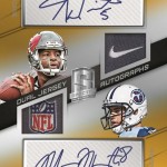
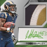
Vertical Cards With Swatches and Autographs

I think the greatest measure of a card designer is someone that can take a vertical card, add a swatch and an autograph and make it look good. It is so rare, that Im almost convinced its a cardboard unicorn. Many have tried, and the super majority of the cards are such abject failures, its not even worth continuing to go that direction.
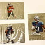
These are just bad:

2014 Black Gold Odell Beckham Jumbo Patch Auto

2014 Limited Mike Evans Jumbo Patch

2012 Absolute Robert Griffin III Jumbo Patch Auto

With a vertical orientation, you almost have take on a design that looks like each element is stacked neatly on top of each other. More importantly, because the bodies of the players are usually too big to add to the card with a swatch and an autograph, its almost required to cover up the subject of the card. They are usually relegated to being the size of a penny, or in a worst case scenario – absent from the front of the card all together. Im not kidding when I say that Panini has made cards without the player on the front.

To me, I collect cards for the players themselves. Without the player in a prominent position in the card layout, I dont see a reason I need to own it. Player photos should be the prime consideration on every card, and vertical cards of this type cant deliver on that promise without some sort of interesting configuration. I think its terrible that the swatches take more of a pronounced appearance than the players in a lot of these cases, and even more terrible that people think they look good.

Defined areas for autographs without consideration for the design of the card

There is one effect in card design that is under utilized in many card sets that I despise. I have called it the “ghost fade,” where the background elements of the card are faded out (but still visible) so that the player can sign the card. Some companies use this every chance they get, others like Panini, likely forgot the effect exists.

Instead of a ghost fade area for the autograph, they will obscure the flow and design of the card to have a defined area for autographs – both sticker and on card. These defined areas can be separated by lines, or in some of the worst examples, without warning. I have seen some cards where the player is literally sliced off at the knees or waist. Its hilarious!

The best of the best come from examples where the design will feature a giant box that is seemingly pasted over the card's layout that is meant to house the sticker. It is the worst way to showcase an autograph, as the box does nothing but disrupt the look in every way shape and form.

In some recent sets, Panini has used acetate scraps in place of sticker autographs, which only exacerbate this situation, as the card actually has to have a hole cut out. I dont know who thought this was a good idea? Its not.

Crazy Patterns on the Card Stock

This all stems from the late 1990s, where card companies were slave to the trends of the market. The foil patterned card stock was hugely popular on gaudy inserts, as it was a new way to make the boring old regular cardboard look more valuable. Kids love shiny shit, and the card companies wanted to take advantage.

Then as cards like the Superfractor grew in its reputation, it became more and more common for patterned card stock to be a way to build a parallel structure. There have been some crazy attempts to replicate the success of the Superfractor, and all of them seem to be centered around branding a card around the distracting pattern of the stock.

To me, it just takes away from everything. At least with the ones Topps makes, players and certain design elements are opaque. It prevents the design from showing through over their images. In other circumstances for Panini and the others, players are semi transparent. This leads to the pattern showing through over their faces and images. Its a great way to give someone a headache.

There are times where I see someone looking at a clearly ugly card and getting excited over the way it looks. I wish I had the eyes that let me experience a card that way, regardless of the way it looks. I cannot understand how or why some design decisions are made the way they are, and as Panini takes on more and more of the exclusives within the industry, there may no longer be choices that allow us to avoid the designs we hate. Variety breeds competition, and exclusive licenses do not help that. We should all hope that something changes soon, or the choices may be gone forever.

SCU Go-Live Report: 2015 Allen & Ginter 10th Anniversary Edition

I remember back in 2006 when Ginter was first released, it actually was a pretty bi-polar reaction to the set. There were a LOT of people who loved the content of the product, combining the typical baseball stuff with other non-sport material similar to the original pre-war Allen and Ginter cards. It gained a cult following over the next few years, with hit chasers and set collectors alike buying into the product in a big way. Now, for its 10th edition, the formula remains relatively the same. Much like it was back in its inception, its still one of Topps’ most popular sets. It has inspired copy cats in every corner of the hobby, which only speaks to its influence.

Here are some of the big hits up so far:

2015 Allen & Ginter Aaron Paul Framed Autograph

2015 Allen & Ginter Val Kilmer Framed Autograph

2015 Allen & Ginter Adam Jones 2009 Mini Buyback Auto /10

2015 Allen & Ginter Danica Patrick 10th Anniversary Framed Autograph

For 2015’s set, there is a huge focus on delivering the normal things that Ginter is all about, combined with a huge buyback program that runs through the whole product. The base set contains the normal mix of sport and non-sport subjects, ranging from the usual Mike Trout to the unusual “Incredibeard.” This is what makes Ginter so attractive for everyone who loves it – the set literally offers something for everyone.

In terms of high end content, there are on card autographs galore – much like every year. There are also highly valuable non-hits in the set, which has always been something that has been a struggle for many manufacturers. Because so many people build Ginter sets, there are a lot of people who will pay through the nose for rare parallels of the base and minis.

As for the buyback cards, there are a lot of interesting uses of the program, ranging from the common base cards with a special stamp, to framed buyback minis, all the way to framed mini buyback autographs. The buyback autographs are a cool idea to incorporate, especially if the checklist ends up being strong. The rest of the buyback content is pretty low end, similar to the stamped “originals” in 2015 Topps products like Series 1, Heritage and Archives. Sometimes there will be an interesting card, other times, its pretty much stamped junk.

I am always interested in the non-sport checklist, which has reached a level of infamy in the hobby with its growing creativity. The Rocky commemorative cards are awesome, especially with Stallone and Lundgren signing cards as their characters from the movie. I mean, who doesnt love Carl Weathers as Apollo Creed? The Stallone autos should sell for a shit ton, and there will be a number of people who will want to get one of each. Expect huge prices.

There is one other element that should be discussed with this year’s Ginter, which is the inclusion of Ichiro Suzuki, including signed content. Ichiro’s international appeal and resume are undeniably a huge draw, which will only get more valuable over time. He is undoubtedly a 1st ballot HOFer, and will likely be the first Japanese player of this generation to be inducted. Although I would have liked only Mariners content in the set, there are cards from all the teams he has played for.

Ginter’s release will always be a hobby event as long as it exists, and I hope that Topps continues to figure out interesting ways to keep it fresh. I think its only a matter of time before their other licenses like Star Wars start to creep in, and I cannot wait for that to happen. This set will always have a place, and it will always be fun.

Early Go-Live Report: 2015 Clear Vision Football

Im going to preface this review by saying that Clear Vision Football isnt set to come out until 7/24, which is this week. However, my shop in San Antonio was given a sneak peak of the product by Panini, and the cards from that break have started to show up on eBay. As expected, the results are not pretty.

Check out this garbage:

2015 Clear Vision Marcus Mariota Jumbo Acetate Auto /25

2015 Clear Vision Amari Cooper Acetate Relic Auto /35

2015 Clear Vision Johnny Manziel Acetate C-THRU /50

2015 Clear Vision Bryce Petty Jumbo Acetate Auto /50 – Case hit everyone!

Clear Vision looks to be a type of experimental product that only makes sense in the warped mind of the Panini brass. Instead of experimenting with cool technology and interesting design work, Panini wanted to see how much content they could remove from a box before people wouldnt buy it.

A box of Clear Vision is set to retail at around 60 bucks per box. For that 60 bucks, you get a bunch of acetate cards and one hit. That hit, 8 out of 9 times will be a non-autograph. For that 9th time, you will get an autograph that has around a 40-50% chance at being a top tier guy. The remaining autographs are still good, but not great. For the 8 boxes that are not autographs, the majority of them will be shitty relic cards, some of which include some pretty laughable names.

To put this in perspective, this is like opening packs of Absolute Football. Well, its like opening packs of absolute football that cost 20 dollars more, and have autographs less than 50% of what is available in the four pack format. Worth noting that Absolute was one of the lowest selling products of the year. Unlike Absolute, to pull an autograph from Clear Vision, you could end up spending 480 dollars and still not get lucky. You could end up with boxes full of this junk.

What Panini is banking on, is that their other cards in the product will make up for it, and that the people buying it and buying it in bulk are going to ignore that they are being taken to the cleaners in the process. Yes, you can spend 240 bucks, get four boxes (which is where I draw the line between diving in head first and just sampling what the product is all about), and end up with relics that will not sell for the .99 cents plus 2.50 shipping come three weeks after release. Yes, Panini actually built a product that wont be able to be broken unless you get it on day one – or in this case, a few weeks early.

Its worth mentioning that the initial prices for Clear Vision singles are high – but this is for a few cases broken so far ahead of release. I think its kind of funny that someone paid what they paid for Tony Romo – when you can buy an on card auto patch from a better looking product for much less. As well all know things get crazy for previews. When something is exclusive, holy shit, collectors will go nuts trying to be the first and fastest person to get their hands on the cards they want. We are so obsessed with posting mailday threads on Blowout that we will pay through the nose to get the cards.

Clear Vision “boasts on card autographs“, but they are only telling half of the truth. On card to me, is the player having the card and signing it. Panini had them sign acetate sheets, which are then inserted into the cards at a later date.

For all those rookie cards, Panini took so much time getting these acetate inserts signed at the 2015 Rookie Premiere, that they avoided actually getting hard signed autographs for their main sets. This could lead to a few situations, including a metric shit ton of sticker autographs for rookies in Panini products this year, and potential redemptions down the road.

What we are left with is a product where half of the card is obscured by a window needed hold the acetate window, and done in a way that looks really odd and unbalanced. Some of these cards are actually a bite on a design from Topps Triple Threads, of all places, believe it or not. Shocking, I know that Panini would copy something and blow it out of proportion.

The transparency cards from Triple Threads were done in a horizontal way, where you didnt have to slice the player off at the waste like Panini is doing here. Regardless, these cards sold terribly, and never really were a hit with collectors. People just dont see value in these types of sticker replacements – even when Topps does a better job incorporating the acetate into the look of the card. They also didnt use goofy ass posed head shots as a background.

Panini has struggled mightily with this over the last few years and it continues to baffle me why people continue to support the sets at release, only to abandon them once better looking stuff is released from other companies. There is a reason why Panini’s stuff tanks as it ages, which is only more in the cards for a product that offers such a huge deficit in content.

There are people who cite “Well, I would rather get a big auto per case, than a bunch of extra rookies that no one cares about.” I completely and wholeheartedly reject this. This mentality requires multiple purchases of boxes, up until the point of buying until you hit the autograph. We are slowly losing people who have the desire and the means to do this – especially when it usually costs less just to buy the card you want. Secondly, if content outside of the autograph were more special, instead of just another bloated excuse to use acetate, maybe things would be a bit different. Panini does not provide that in this product AT ALL, save one design.

I personally believe that adding more autographs per box adds a perceived value that doesnt exist in the other content. Chrome can put out a one autograph per box set, because it has built years and years of legacy around the value of low numbered refractors. Clear vision has none of that brand loyalty.

Lastly, slotting autographs at one per case, should free up a ton of money to spend on other aspects of the set. Relic content should be insane. Technology should be better. Everything can take a step up. Panini chose to use the money to print every card on acetate (which is expensive and superfluous) and pack it out in needless plastic boxes (same). Its worth mentioning that adding additional content of top signers may have overtook all the money saved by removing scrubs, but we will never know.

Everything about this product pisses me off. It shouldnt. I shouldnt feel disgust and rage over a product, I should be able to just choose something else to collect. The problem is, I see this type of product development and I am constantly reminded that next year, there likely wont be a choice. I wont have the option to get the personal enjoyment of that choice. Panini has stolen that joy from me. Panini is cultivating a environment that builds product to end up below dealer cost. They arent even shy about it. Hey local shop – you know that collector that just walked away with the auto from the case? Now you have to sell the rest of the boxes knowing they are likely going to be crappy jerseys. Have fun! By the way, we will be asking you to take on more cases of this when you want to order a product that actually sells well.

Panini is a virus. I have no reason to think that pending exclusive wont end up in a spectacular flaming wreck, mangled on the side of the highway. Multiple casualties likely.

On the Radar: 2015 Spectra Football

Spectra might be the worst formatted product that Panini makes, save maybe Absolute football. It was so bad in 2014 in both design and format, that distributors had to literally use it as a bargaining chip ultimatum for allocations of Immaculate Basketball. Just to have access to Immaculate allocations, you had to take on cases of Spectra FB. It was fucking horrendous. If that happens with a product, it should automatically be considered for removal from the calendar.

Leave it to Panini to want to bring it back again. I literally laughed when I saw they were going to trot this shit out again for 2015. I thought to myself, they had better find a better design than the visual abortion from last year. Then I looked at the cards. My jaw dropped. Here is the gallery, just so I can show you how big of a turd this is going to be.

Here is the train wreck that was 2014 Spectra:

2014 Spectra Teddy Bridgewater Horizontal Auto Relic Blue – Worst looking design, quite possibly of the year

2014 Spectra Kelvin Benjmain Gold Auto Relic

2014 Spectra John Elway Sticker Auto Red

2014 Spectra Tony Romo Leading Men Auto Relic – Leading men? What is this, a chick flick?

At least, above all else, Panini had on card autographs for Spectra in 2014. This year, those are gone. What makes this even more hilarious is that they are going to get color matching ink for the stickers, as if Neon was a color that people wanted to see on trading card signatures. Maybe I should pick up a few boxes before popping some pills and heading to a rave. That’s about the vibe I am getting off this crap.

Even if Panini decides to take down the price tag from around 300 (not making that up) to a more reasonable price, it wouldnt matter. This has to be one of the ugliest looking sets I have seen in a long time, and this is coming from someone who just watched them solicit 2015 Certified. They have opted to put giant boxes around all the stickers that obscure the design, something that should NEVER be done. The overall look, with the crazy neon colors mentioned above, could not be more ridiculous looking. The dual autograph, dont even get me started. You know why Panini puts so many logo patches in their cards? They need incentive to buy them considering how vomit inducing their designs are.

Topps rightfully axed Bowman Sterling this year, because even they couldnt justify putting out a set that offered literally nothing special for as much money as Sterling cost. Panini? Obviously not as willing to admit defeat on their failures. Dont get me wrong, this was a MISERABLE failure, all 3 years. I will give them credit for on card non-rookie autos in 2013, but the price and pack format was terrible then too. Switching to 1 pack for 300 last year was a complete joke.

I just dont even know what to say anymore that hasnt already been said. Im pretty sure I will be done buying new cards once 2016 rolls around, and this shit show is the only game in town. Kill me now.

More Panini Previews with 2015 Prestige

Panini previewed its second product this week, after earlier posting a bunch of pics from Clear Vision. 2015 Prestige started coming off the line yesterday, being the first Panini set of the year that many collectors have a history with.

In case you forgot, last year’s Prestige was easily one of the worst looking products of the year, as Panini inexplicably combined airbrushed pre-draft shots with content obtained at the rookie premiere.

It ended up being a prime staple on all the closeout sales:

2014 Prestige Odell Beckham RC Auto

2014 Prestige Johnny Manziel RC Auto

Wait, doesnt that look exactly like the diarrhea that was Hot Rookies? WHY YES! It does!

2014 Hot Rookies Odell Beckham RC Auto

2014 Hot Rookies Johnny Manziel RC Auto

If you are wondering how someone could have fresh pro-uniform content available AND STILL opt to use airbrushed pre-draft shots that look horrendous, you are not alone. These are the types of decisions that Panini is infamous for making, and though this year’s set is a million times better looking than 2014, all on card content from previous years is gone. Its like you cant have your cake and eat it to with them, as 2012, 2013 and 2014 all had multiple sets with hard signed rookie autographs.

For everyone who is unfamiliar – since 2011, getting cards hard signed at the premiere has almost become the focus of the event. Although Topps and Upper Deck had gotten cards signed in previous years, most of them were completed DURING the weekend to be signed. With Inception, it was one of the first times that a company had brought a pre-fabricated set. In 2012, Panini followed suit and brought a ton of stuff to match their competition. It has been the standard up until this year, where Panini decided that sheets of stickers and acetate windows were more important – leaving Prestige with its fourth set of the year with all sticker content.

The rookie base design this year actually isnt bad at all. I dont mind it one bit, and even with the standard GIANT text that Panini has incorporated into every set, its a good looking base set with some nice full bleed photos. On the veteran side, this isnt the same situation, as Panini has crowded some really nice action shots with needless amounts of text.

Autographs arent terrible looking either, but there isnt any confirmation that there will be pro-uniform sticker autos as has been the case in previous years. One can only long for the days of 2012 Prestige, which still remains my favorite set Panini has done with the brand.

As for the inserts, saying they are busy and cluttered doesnt even begin to describe how bad they really are. Panini has had a history of making really obnoxious design decisions, like the giant text mentioned above, and this product is packed to the brim. On the micro etched cards, the name plates obscure WAY too much of the surface area. Text is everywhere, and completely disorganized. It looks awful and rushed.

Here is the bottom line. Without the on card stuff, I really find no reason to dive headfirst into this product, as the boxes will be below dealer cost by mid year. Panini is banking on the fact that you are bored with airbrushed and college stuff, and wants you to ignore some great products from Leaf that have recently been released. I would advise against that. Nice cards from Prestige come very infrequently, and its close to impossible to walk away with top rookie content unless you hit the jackpot.

Wait as long as possible for the good sets to start coming out, and you will not walk away as disappointed.