
When Topps announced Supreme in 2010, I was skeptical of its ability to be a long term success in the hobby due to its “Triple Threads Lite” style configuration, Topps proved me wrong, with the creation of some of the best looking cards of the year
. Supreme looked high end at 80 bucks a box, and now that we are getting previews for 2012, the legacy continues.
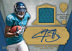
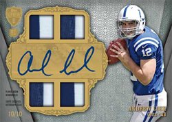
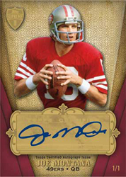
First, let me preface this by saying that its difficult to create a sticker product and have the same type of approach that would be necessary for an on-card product. Using the boxes in this fashion isnt as good as on card, but the design definitely looks ornate. I think there are certain situations where stickers can work, and from what Topps has shown so far, this looks great. I was a big fan of the different rookie auto configurations last year, as there were multiple looks to each subject’s cards
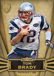
. With 2012, they look to be bringing many of them back and improving the overall visual appeal to boot. Using the gold background elements instead of the white is much better, and the attention to background details makes a lot of difference.
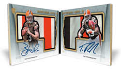
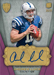
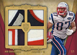
That’s not the only story, as the book dual patch auto card may be one of the coolest looking previews I have seen since Strata was previewed a few months ago. Diecutting a player over a patch is by far one of the best innovations over recent seasons, and the way these cards look show that creativity expanded to booklet proportions. It also seems as though these will be on card, which makes it that much better, and I cannot wait to see what the Luck/Griffin ends up going for. Considering how expensive these cards will be, I hope there are higher numbered and more affordable parallels for the serfs who cannot drop the coin on a big one.
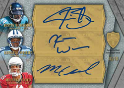
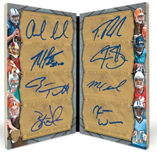
In terms of cards from this preview that werent as successful, I still think Topps has not found a happy medium with Multi-signed cards. Every single triple, quad and the like, all look so ridiculously terrible, that I dont even bother seeking them out. Where other companies have found ways to make it work, Topps still insists on a vertically oriented card, with TINY player pictures all on one side. That is a bad thing. There are some really nice triples and quads out there, and I hope the design team takes notice.
Lastly, it looks as if Supreme is getting a bit of a format change, introducing a second hit into the box. This, in my opinion was the biggest drawback to the product, as there was no guarantee that your hit wouldn’t be a scrub auto or a worthless jersey card. Although this is still a gamble for the content and price, its getting better now.
Ill definitely be picking up some singles, as this is one of those products that is balanced with Rookie and Veteran/HOF content.
Here are the pics:
Last year I pulled the Cam Newton 5/5 4 piece jersey rookie auto. I wonder if I’ll have that kind of “LUCK” again?