
With Panini I have a strategy that seems to have worked very much in my favor over the last few years:
Expect the worst and be pleasantly surprised when things turn out better.
Most of the time, it doesnt, but for parts of Elite Football this year, it did. Some of the cards are about as bad as they ever have been, while others have turned out to be pretty nice. At least for Panini they have every reason to perform more appropriately, as I have not seen that Prestige did all that well, and also because they are continually lapped over and over again by the competition on design and theme. Upper Deck and Topps are just better at designing cards than Panini, and its not even close, but Elite COULD have been a lot worse. I guess that is high praise? It wasnt as bad as I thought it was going to be? Whatever.
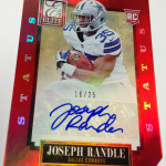
The Base Design
For some reason, I think the base cards turned out nicely. The design is simple, and doesnt have any GIANT logos or text on it, which means that the player photos take center stage. Although the autos are foil, and the cards really arent anything super special, they are nice. Im okay with nice, as long as the previous years werent some crazy awesome display of creativity. 2012 was okay, but like this year, it wasnt anything spectacular. This is fine.
Last year:
This year:
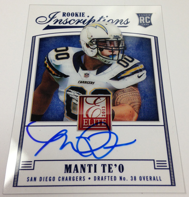
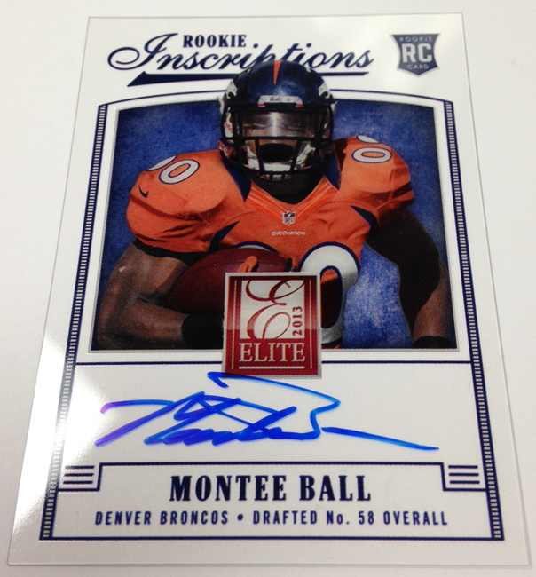
The Elite Inscriptions
Last year, these were my favorite cards in the product. I thought they were well done and had a focus on delivering a simple card with a big signature. For 2013, all that went to hell, with poorly photoshopped player pictures for the FOURTH time (yes, these photos have already been used once in Score, and three times in Prestige). Not only that, but the Elite logo is enormous in the middle of the card, taking away from every other focal point. Its horrible.
Last Year:
2012 Elite Inscriptions Design
2012 Elite Inscriptions Design #2
This Year:
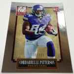
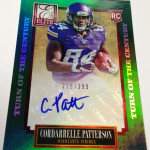
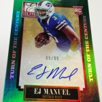
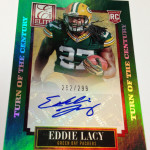
The Hard Hats
These cards are just as good as they were last year, only this time they upgraded the pics on the premiere players with the new shots. I was honestly expecting ANOTHER example of the photos mentioned above, but they made a good choice in using the actual shots from the shoot. Much better than last year.
Last Year:
2012 Elite Hard Hats RC Design
2012 Elite Hard Hats RC AUTO Design
This Year:

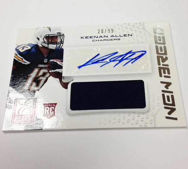
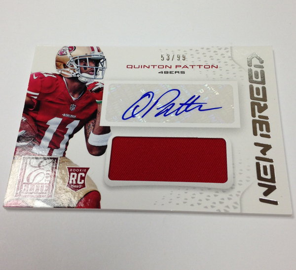
The New Breed Jersey Autos
These were one of the best designed cards for Panini last year, with a stunning example of jumbo swatches, full pictures and a great look. This year, they ALMOST had it. Instead they got completely and inexcusably lazy, by adding a giant white box behind the stickers that covers up part of the player’s picture. You might also notice that Panini chose a white background for these cards, which begs a very important question. If a white box is normally (and wrongly) used to highlight an autograph on a card with a dark background, why is it necessary on a white background? The answer is that I have no fucking clue and Panini should be ashamed of their blatant disregard for normal design concepts.
Last Year:
2012 Elite New Breed Auto Jumbo Jersey Design
This Year:
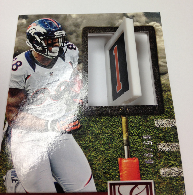
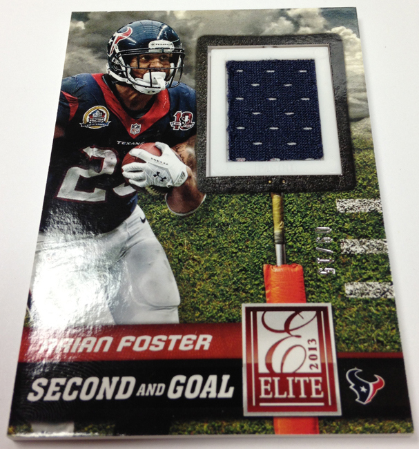
The Down and Distance Spinner Cards
I will give it to Panini, this isnt a bad idea. Its novel. The problem is, the theme of the set has to be one of the most boring concepts in all of cards. You are creating a subset to commemorate downs and distance for a first down? Really? ZZZZZZZZZ, what a snoozefest. Its the equivalent of celebrating a strike count in baseball, or a free throw in basketball. Its BORING.
Last Year:
2013 Elite Down and Distance Design
This Year:
Like I said, the cards could have been a lot worse. The problem is, that is the best thing I have to say about these cards.
I guess I dont really notice them on topps cards and maybe thats the point but the borders, logos etc on panini cards are a lot bigger and more obtrusive than they need to be or should be.
The biggest thing on the card should be the player photo not letters or numbers.. In the inscription cards the player photo isnt even half of the card….
The hard hat shown could be made better by moving the player photo to the left edge of the card bringing out more of the helmet, dropping the RC logo and the words HARD HATS and shrinking the elite logo and putting the auto on the bottom of the card…