
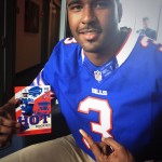
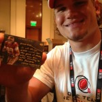
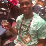
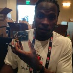
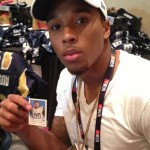
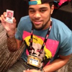
Rookie Premiere weekend is upon us, and I could not be more excited. Both Topps and Panini are wearing out their phone batteries taking pictures of the events, and collectors are getting view like they have never seen with the different cards the players are signing. This is easily my favorite non-game event, as we get to see the players in their pro gear for the first time, and for the most part things are shaping up very nicely.
Topps
So far, I think Topps is the winner of the best looking cards and most coverage for collectors to see. They have literally taken pics of everything, from cards to players to the event themselves. Although it presents a part of the rookie premiere some collectors may be unfamiliar and unhappy with, their coverage is well worth it.
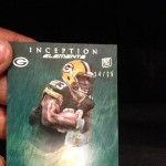
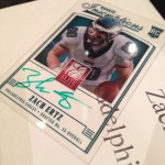
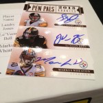
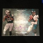
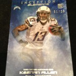
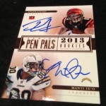
As expected, Inception is the star of the show – as it has been for the last few years. Players freaking love seeing themselves mocked up in pro jerseys on these cards, and the painted sports art style of the set is unparalleled this early on in the season
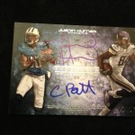
. For the first time, Inception Elements and INSCRIPTION CARDS(!!!) are going to be added! The Element cards look to feature a different style background focusing on the players’ team colors, and we are finally going to get early inscriptions, which is something I have asked for in Inception a long time ago. They look awesome. The Dual autographs look better than they ever have, as I have frequently asked the Topps design team to use the side by side approach instead of the stacked we usually see.
The hand stamp cards are back for another season, which I think is a very cool idea to bring an extra type of autograph to the party. The design isnt as clean as it was last year, but man, they still look great. These cards were incredibly popular over the products they were offered in for 2012
, and I wouldnt expect any less this time around.
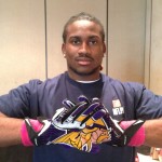
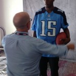
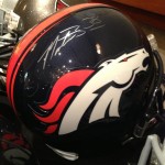
I was a little disappointed to see the tall boys are back for another year, as I think they were interesting as a one time thing back last year. I was of the understanding that the 1957 throwback minis were going to replace them, but I guess both will be used. I am not a fan of the studio style, helmet off photography, as I think action shots are much more dynamic. Its not always possible to do that, as we are going to see with the rookie premiere autographs
, but that is just my opinion.
Topps should get the “with the times” award for using the Vine app to post movies with sound, something that has not been done by a company at this stage of the event. Usually we get the videos once they hit the field tomorrow, but this is a great behind the scenes adventure for people who arent as familiar.
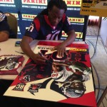
Panini
Panini wasnt as big a contributor at this point, but I assume that will change as the weekend moves on. As for the card designs, and completed signings, I am really disappointed. I really think that they hit it out of the park last year, and this year they have taken a major step backwards. Not only did they fail to capture a lot of the player jersey number assignments that Topps was able to get, but the overall fixation on the ugly “Hot Rookie” cards from score is unhealthy.
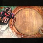
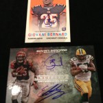
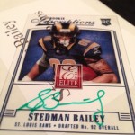
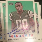
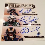
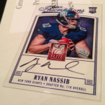
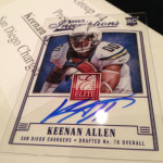
The most prominent cards they get signed are the Elite inscription autos on the clear acetate stock. In 2012, these were some of my favorite Panini cards of the year, even overshadowing Topps’ examples in a lot of ways. This year, with a switch to a vertical orientation, the design is not up to par. They have a giant Elite logo smack dab in the middle of the card, which is bigger than the player’s heads in a lot of cases. That is unacceptable. These also may be the first cards to have a BIG CLEAR BOX instead of the usual big white box we see on their other cards
. As a result, the player has very little space to sign, which never works out well
.
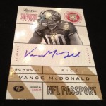
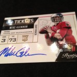
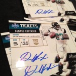
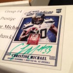
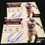
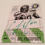
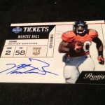
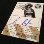
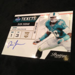
The Prestige on card autos are cool in the case of the Draft tickets, and horrifically ugly in the case of the Passport cards. Over the last few years, Panini has had this ridiculous fixation with two types of cards. The first being the stupid and lame idea of “Orientation,” and the second being Passports and Identification cards
. Both are terrible ideas, and the design on these 2013 cards sure doesnt help. They actually werent terrible last year
.
Lastly, the person responsible for retouching the player uniforms on Panini cards doesnt seem to have the same skill as Topps, as I think there are a lot more reasons to hate the work than like it. Its always been a major weakness for them. I hope this improves as the year goes on.
Wrap Up
I said before that the rookie premiere can be quite polarizing. Event used jerseys worn for a matter of seconds and put into cards as swatches isnt a subject that many people are familiar with until they see these pictures. Honestly, the Mark Ingram pictures from 2011 still hold a lot of water in this hobby, when in reality, they shouldnt. The premiere has been done the way it has been done for over a decade, and it wont change as long as collectors still value swatch inclusion and content over anything else. Although a hobby built on event worn swatches is something that FRUSTRATES THE HELL out of me, it is of our own volition. This is us. This is what we want, because we speak with our wallets.
That being said, I like the premiere. The premiere HAS TO HAPPEN. Reason being is that without it, we would get redemptions and combine pictures for months into the season. I will trade the fact that event used swatches exist for the fact that I get wonderful autograph and photograph content all year long. Im okay with that trade off. You should be too, as the benefits of having the premiere far outweigh the negatives.

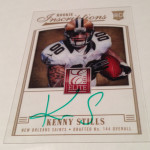
“Hot Rookie”. What is this, Benchwarmers?
C’mon Panini! That Elite card was going to look so good until you dropped the huge red logo right in the middle.
Love topps, but I hate inceptions style, I’m surprised you like it since you usually don’t like tacky product….. And the 00 jerseys s#ck, but that’s not the card companies fault
Ive always liked that painted style filter that they use, and for a pre-season product, its awesome with the on card stuff. Not for everyone.
Aaah….the annual slobberfest over rookies, 95% of who will be afterthoughts a year from now. Is there anything more predictably boring?
Who’s Cam Newton again?????