
Over the last few years, I have been pretty excited about Certified when it is released on the sell sheet, but end up disappointed when its live. There are always little things that Panini has done to make the aesthetics less than appealing, like adding the big white box on the autographs. For the first time yesterday, I saw a Certified set in final production that I was DEFINITELY impressed with. So impressed that I am actually excited for the product to hit shelves.
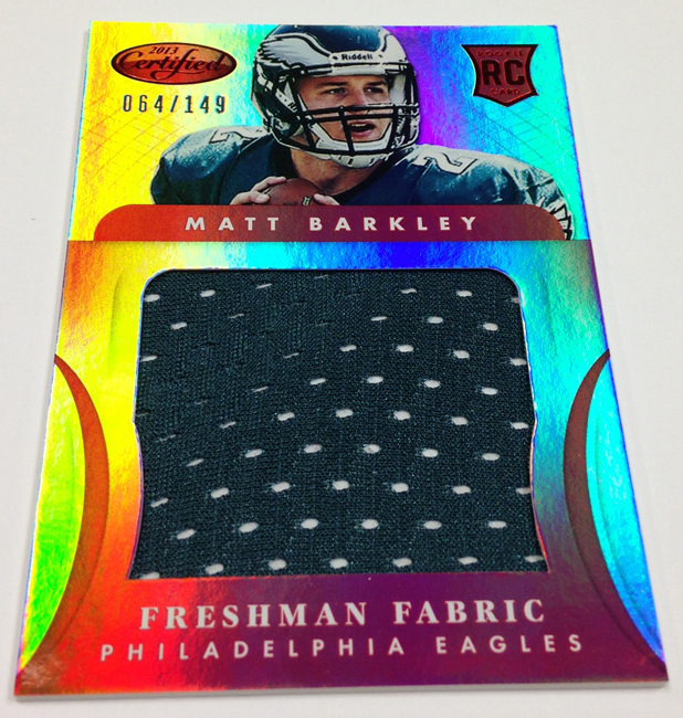
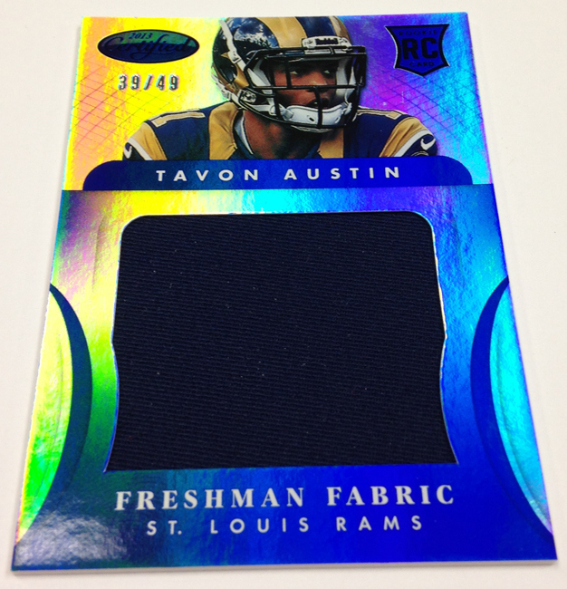
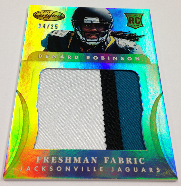
Freshman Fabric Cards
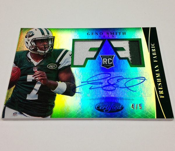

When I saw the design on the sell sheet, I fell in love. The stylistic elements of the swatch window diecuts look awesome, and that rarely happens in situations like this. Over the past years, Panini has always forced ugly parallels into the different mirror refractors, and I am SOOOOO glad this year that they are not doing it that way. Although they are stickers instead of on card like 2011
, they still look really nice. I absolutely love these cards. Its a great thing to see the box hits turn out better than they have, possibly ever – especially when you see that Certified is responsible for some of the ugliest cards in history:
2006 Freshman Fabric Triple Patch Auto – hooray for background resembling female reproductive organs!
2008 Freshman Fabric Joe Flacco Dual Patch Auto – so, so bad.
2009 Freshman Fabric LeSean McCoy Quad Patch Auto
Freshman Fabric Jumbos
I am not a fan of the jumbo swatches, which I fail to see a need for in any year of this set. They always end up looking awkward and hideous, and this year is no different with the dreaded vertical orientation. It forces the player picture to be squeezed into the top of the card, and it never, eeeeeever looks good. Take a look at how bad these cards have been over the last few years:
2008 Certified DeSean Jackson Jumbo Swatch
2010 Certified Rob Gronkowski Jumbo Patch Mirror Gold – YAY! Creepy picture alert.
Fabric of the Game
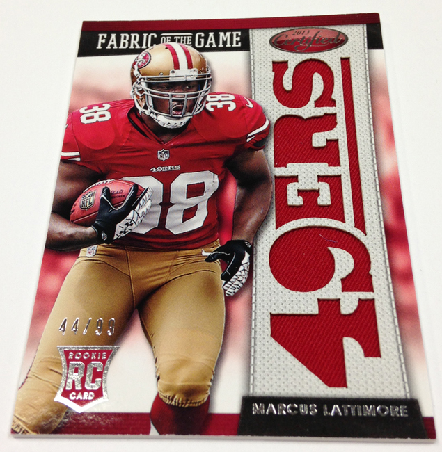
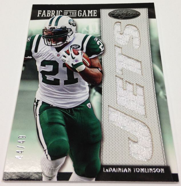
These were easily the worst cards of 2012, and this year they look so much better. Im glad they continued the word logo die cuts, and they finally understood NOT to box the player into the side of the card
. Instead they let them penetrate the different design areas of the composition, which always adds a level of dynamic action to the appeal. Hey, at least they are better than they have been.
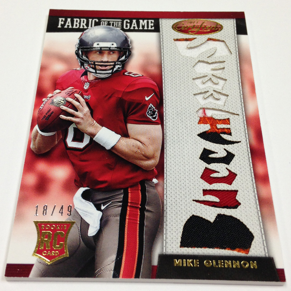
Fabric of the Game Autos
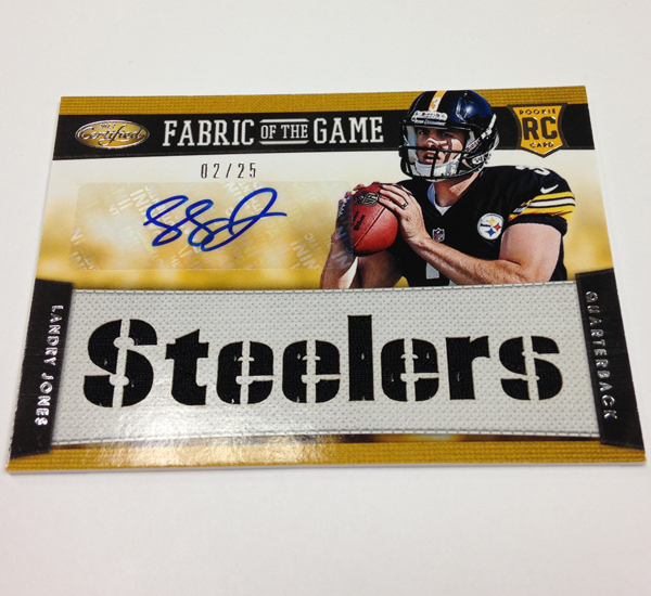
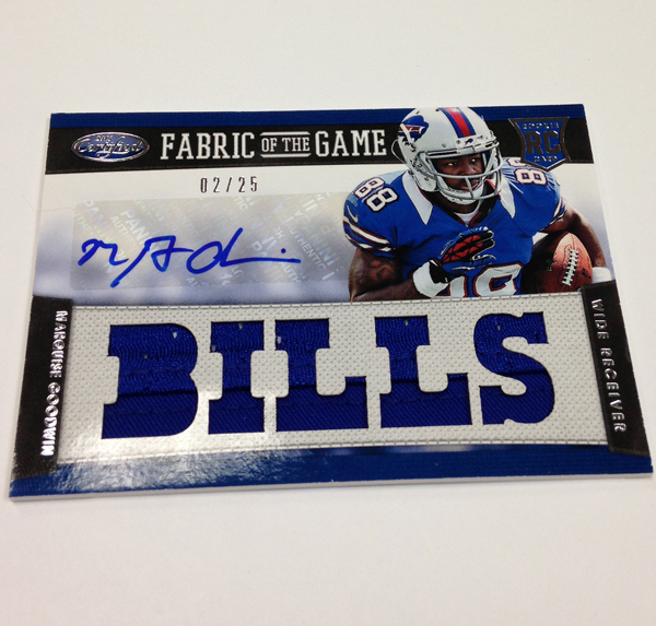
As bad as the non-autos were last year, these were right along side them. Just awful in so many ways with the triple threads style presentation. Its back again this year, but I dont hate it as much as I used to. I still think it could be done much better if the player werent trapped at the top, but its better than nothing.
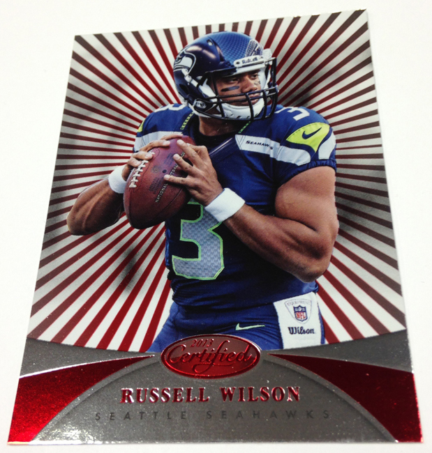
New Generation and Vet Autos

This year, for the first time, we are getting the rookies at the photo shoot on base autographs, instead of just scrubs. This is a very good thing, as it used to mean that getting a new generation card was the end of your chances of getting a good box. There are always exceptions that happen later in the season
, but new generation is scrubs at the time of release. Those cards were the bane of my existence in the few times I have opened Certified, and its not a bad thing that they are going to add better players to the mix.
The vet autographs are nice as well, as I really like the base design this year. Although they have these crazy ridiculous lollipop stripe parallels, the design for these cards isnt bad.

Again, I am definitely going to be opening some Certified next week, and I think that this preview solidified a sell sheet more than I have ever seen Panini do in the past. Nice work all around.