
Yesterday I talked about the new Topps Football design, and today I want to go over the rest of the now public sell sheet. There is some AWESOME new content, and I think this might be one of the best years Topps has put out in a long time. Although it wont have the rookie player value tent poles that make it into the product it was last year, the content looks awesome.
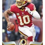
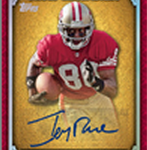
My favorite part of this preview is something I have been calling for over the last few years. If you have been reading this site, you know how much I wanted veteran autographs on the Topps base cards, even to the point of me telling them directly to do it. Looks like they were listening, as for the first time ever, there will be autographed parallels for the veterans in the set! The base Topps design is one of the most worked on cards of the year, and I think that adding autographed parallels gives player collectors something to chase. I cant say enough good things.
My second favorite is easily the 1986 throwback auto, which is something Topps led with in 2012 Topps packs. The 1984 design used last year was easily one of my favorite cards of the product
, and I wish Topps would do this more often. They look to be using a 1959 design similar to the Tall Boys from last year that were so popular, and I think this a REALLY good two sets to use. Iconic indeed.
Moving onto the “Truly Legendary” set, I get a very Five Star type vibe off the insert, which is a great thing for a lower end product to have. This simple yet stunning design with the foil layering is really nicely done, and looks very similar to the 2010 design used in Five Star.
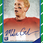
The rookie premiere autograph design from last year was very good, maybe one of the best in years. For 2013, the design is one of my favorites of all time, even more than the 2007 design that had so many fakes
.
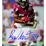
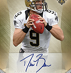
I also really like the veteran autograph insert design, which is very similar to this design from last year with more focus on team colors. Its something that casebreakers will have to deal with more than once per box, and I think this design is pretty strong.
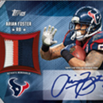
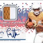
The veteran auto jersey design is also pretty cool, but I am not having that white box behind the sticker. Its yet to be seen if that is just there to SHOW this is a sticker, or if that will actually be part of the card. I would much rather them ghost the edges so its more of a lightened area, because the box looks so unnatural in any design. NOT a fan. I loved the design for these cards in 2012, and this COULD be that much better without the box. Again, we havent seen the final yet.
Lastly, the manufactured patches previewed in this sell sheet are pretty cool additions to the set, as they add content without raising the box cost. Some of them can sell for a bunch of money as we see, and I think that these should definitely be a nice addition.
To say I am excited for 2013 Topps is an understatement, as it is proving to be one awesome looking product.


They’re getting there…. slowly but surely. I’m still holding out for a legitimate “Rookie Card Reprint Certified Auto” insert set like in 2001. There are SOOOO many that were missed. The best part is, it wouldn’t even matter if they had to work on assembling the set over a couple years, ensuring ON CARD autos as they’d be reprints for insertion whenever they can get all the cards returned. I freaking want Darrell Green, Deion Sanders, Emmitt Smith, Troy Aikman, Steve Young, Ronnie Lott, Brett Favre and others. The current sticker garbage that is out doesn’t cut it. C’mon, Topps…. PLEASE!!