
When Prizm was first released in 2012, I almost had an allergic reaction to the way it looked. Just awful in so many ways. When you thought it couldnt get any worse, it did by a lot in 2013 and more in 2014. I always have called it Chrome Zero, because calling it Diet Chrome puts shame on a soda brand that I actually love. Now that the nice sell sheet is turning into real cards, the time has come for me to say something I really didnt think I was ever going to say.
I like 2015 Prizm Football. Most of the previews look great. Still some major flaws, but so much better than any other version.
You may ask why I am saying that it looks great, and that is a very valid question. It has to do with a few things that all speak to my pet peeves in card design, all present in 2012-14, and gone in 2015. Its not close to Chrome yet, mainly because of a few AWFUL parallels and sticker autos still in play, but its getting a shit ton better than the dumpster fire it was in previous years.
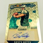
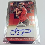
Sticker Layout
Every year to date, Prizm has had a separated area for the sticker. Whether its a GIANT white box that makes me want to bathe my eyes, or a silver box, or whatever it was in 2014, its all been horrendous. This year, the ghost fade is in play, and it looks like a chrome card should. HALLELUJAH! As mentioned above, if they get on card autos next year with a similar look, im on board.
Previous years Prizm autos are hilarious to look at:
Verdict: Improved!
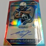
Player Photos
Unlike 14 and 13, there is a lot of photo on the cards. Not only that, but the photos are pulled out in zoom, and the player is shown more in the environment they are playing in. Although there was some of this in 12 and 13, the border, nameplate and typeface were intrusive. This year, the photos are unimpeded. As far as I can tell up front, Im not seeing any posed glamour shot type variations, although they could still exist like last year
. I am praying to the card gods that they dont.
Verdict: Improved!
Borders
This was especially bad in 2014, when the whole fucking card acted as a border. The player was set against a background, with the colors changing with parallels. This year, the true border is back, and it looks great. The hippie-fractor tie dye cards dont look half as ridiculous as they have previously, mainly because less of it is seen.
Verdict: Improved!
New Die Cut Cards
Prizm has ALWAYS gone waaaaaaaaaaaaaay overboard with the die cuts. Last year I said that just because you can use the die cutter, doesnt mean you SHOULD use the die cutter
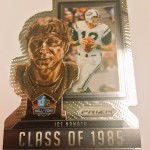
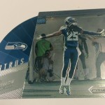
. This year, it looks to be similar to last year, even though we really havent seen the full slate of inserts. Many of the die cuts seem have been created just so they exist, without much of a thought into making the card look unique or special. I mean, a helmet cut out? Havent seen THAT one before, amirite? The Sherman “Intros” card would have been perfectly reasonable to not be a die cut, and adding the die cut makes no discernible difference to the appeal of the card. In fact, keeping it whole might have offered more space for the design. I think the HOF Namath really doesnt do much for me either, its just kind of like they didnt know what to do with it, so they added the die cuts to make the card more interesting. Nothing screams “played out” more than just doing something because you need filler. At least I can hope this batch of visual diarrhea wont come back
.
Verdict: Still Bad!
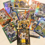
New Parallel Patterns
This is where the subjectivity comes back into play, because for some fucking reason, Spectra seems to sell on the open market despite the hideous parallel patters and disgusting usage of neon pens. The tire mark pattern is back for prizm, and they went and jacked the Superfractor Pattern again from Topps. Completely unnecessary, and distracting as a whole. That tire track patterned stock needs to be gathered up, burned, and then the ashes need to be jettisoned into space. That way, no one can take them and try to reconstruct any semblance of this stock ever again
. Just NO. Also worth discussing that the Superfractor pattern is /5, which wont confuse a single person at all. Just leave that one in the graveyard when Topps is out of football please. The black pulsar dot pattern stock used for the 1/1s looks perfectly fine. At least the Panini-fractors are one and done. Good god those were shit.
Verdict: Kill it with fire!
Overall, this still feels like a rip off of Chrome, which would have been a terrible thing if Topps wasnt completely out of the game for Football starting next year. At least this year shows that they can produce a Chrome style set without making it look like a bloody crime scene. I hope this continues.
If the 80s and 90s were the ‘Junk Wax Era’, then I’m convinced we’re in the ‘Junk Sticker Auto’ or ‘Junk Jersey’ Eras.