
When Panini comes out with a sell sheet for a new product that has never been done before, I automatically prepare myself for some top notch card design humor. The skill that Panini has displayed to design and execute a new product is about at the level of a toddler learning to walk with falling over. Its painful to watch, but still pretty freaking funny when they stumble and fall over
. This is one of the main reasons why I think I am so frustrated with the new NFL exclusive, as it is clear they will have to create new brands on a regular basis.
Black gold looks to be an homage to both Panini Black (A complete and utter failure of a product), and Gold Standard (A complete and utter failure of a product
). Like me, I bet you are wondering how a combination of this sort could this go anything but hilariously wrong. Well, like me, you are in for a treat, because it is all of that and more.
Feast your eyes on the shitty products that this set is based on:
2011 Gold Standard Demarco Murray Patch Auto – I have no words for how bad this design is.
2011 Gold Standard Bart Starr Auto Gold Leaf Relic – yes Panini thought adding swatches of gold leaf was going to make their cards maintain value. They were wrong.
2013 Panini Black Eddie Lacy Auto RC 1/1 – Wow, so fierce in its ugliness.
2012 Panini Black Andrew Luck Auto Patch RC – Some high quality paint marker work right there!
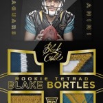
My favorite card in this whole preview is the Blake Bortles quad patch card, that features one of the most comically awkward photos I have ever seen on a trading card. That is saying a lot, considering Panini's affinity for awkward pictures. For whatever reason, Panini still thinks it is a good idea to use studio based photos on their cards instead of action shots
, and this is about as goofy looking as it can be. Blake looks like he is ready to scold his new puppy for pissing on the rug, or have a serious talk with a buddy who has shown that he likes to drink a little too much. Hell, you could argue that he is about to sit his grandkids down for a story time about the game where he threw three picks against Indianapolis. Each potential caption almost writes itself. The fact that Panini believes that this type of photography creates a desire to want to collect a card
, shows that we should all be fucking scared shitless that they are about to take over the NFL license.
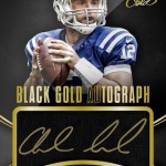
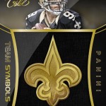
Now, the silhouette cards with acetate signatures are really cool looking – and I am being serious about that. They have a history of doing these types of cards the right way. However, these cards are 1/1s and don’t look to be prominently featured in the product. The cards that will be everywhere in Black gold seem to be the normal hideous turd blossoms that usually bloom in Panini products
. This include cards like the Andrew Luck which feature an ugly giant box for the signature similar to immaculate baseball
. Yes, those cards were so successful at being horrendous, that they decided to bring them over to Football
. Why not, right? Panini thinks collectors wont mind.
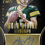
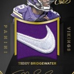
Other cards like the Teddy Bridgewater jumbo patch auto (which should OBVIOUSLY be a horizontal presentation) and the Aaron Rodgers (which features the trademark separated signature area), are straight out of the Panini Rogue’s Gallery of Card Design Failure, and we should all be ready and waiting to receive this foul fart of a product as a result.
Bottom line, people, we are going to have a rough 10 years when Panini takes the helm, so have your airsick bag at your side when getting ready to look at the unveiling we are due to experience soon.
Check out the damage:
For the love. How do these conversations go? !?
Thing 1: Should we cut off half of Manziel’s body?
Thing 2: Heck yes, is there a reason why we shouldn’t?
1: I hope not because I cut the top on the head off of every other card.
2: Great I’ll use those as preview pics. I’ll green screen in some patches.
1: Sweet. Might as well. I’ll go to WalMart and pick up the real patches.
*high five*
*and on the rebound*
Whats with the line running from the lower left corner to upper right and the shading from gray to black? Were all the card photos taken during the course of an eclipse?
Or is that meant to signify the sun setting on my card collecting career?
These cards set the new panini standard of using even less than half a photo of the player. The Rodgers barely shows the entire jersey number but I do realize they need all the room to get their name, the set name, insert name and still leave room for the sticker autos…
Maybe they will make a set called inside the visor(tm) and we will only see the players eyes as viewed thru the facemask think how much room that would leave them for set names….
I know you hate Panini but what has Topps done this year?
I am so done collecting new football. Thanks Panini.
Overall, Topps products are nicer looking than Panini’s and are better value for your dollar for the most part.
I no longer waste my money on Panini solid white jersey cards and free agent rookie auto “hits.”
its amazing how people can open your eyes!!!! panini going down,down down.