
The funny thing about Black Gold is that I believe that Panini really had a lot of good technology at their disposal, and wanted to invest a lot of money into making it work. The problem with 2014’s set was that the design was terrible, the execution was terrible, and the set turned from having potential into a complete disaster, save two subsets. The use of lenticular concepts has legs in this hobby, but 2014 Black Gold was a horrible example
.
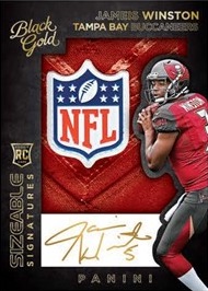
There were two cards in 2014 that were awesome, the sizeable signature rookies and the veteran subset that took on a similar approach. Check these out:
2014 Black Gold Blake Bortles Nike Logo Auto Sizeable Signatures /2
2014 Black Gold Teddy Bridgewater NFL Logo Auto Sizeable Signatures 1/1
2014 Black Gold Terrance Williams Sizeable Signatures Veteran Patch Auto
2014 Black Gold Giovani Bernard Sizeable Signatures Veteran Patch Auto
The base cards were also amazing looking, and deserved more attention, but the rest of the set was so bad most of the good things I would have said got lost in the screaming fits of insanity I had regarding the other cards
.
The non-hard signed parts of the set consisted of hideous signed scraps of black paper, stickers on acetate, and some of the most laughable player photos I have ever seen. Stickers on acetate look to be a running Panini joke as of late
.
This year’s set has done away with the signed scraps of paper. YES! Most of the cards look to be hard signed. Many of the designs do look really cool. That being said, they ruined the one card set that I love.
As you can see, instead of the cool use of the acetate overlay to house the player's autograph, its now a white colored thing. Im not sure if its white acetate or something else, and frankly I dont care. It looks fucking terrible, and I am PISSED. Considering how much I absolutely LOVED these cards last year, this is a raging embarrassment.
The Gold Strike autos look great, and there are other cards in the preview that look really good. The joke worthy hood ornament cards are back for some stupid reason, but hopefully the amazing looking base will overshadow them this year. God those metal logo cards make me want to barf.
As a whole, I went from complete hatred of this set last year, to reasonable tolerance this year, but I will say that the changes to the Sizeable Signatures makes me beyond upset.


That white box is inexplicable. Panini is their own worst enemy when it comes to design. How hard is it to recognize that adding a white box breaks with the theme? In typical Panini fashion they preview some good-looking on card autographs then let you discover the stickers when you open the product.