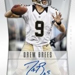
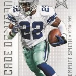
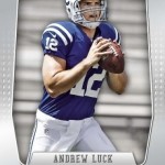
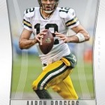
Topps Chrome, often imitated never duplicated. That is an observation I will stand by year after year. Today we got a preview of the horribly named Panini Prizm, which by all descriptions on Panini’s blog, seems to be their version of either Chrome, Finest, or both. Somewhere I remember reading that earlier this year, Panini (not Topps) tried to trademark the Chrome name, but from what this is looking like, it must not have been successful. Although it is still not confirmed, the vibe I get is that this product will be Panini’s “answer” to Topps’ belle of the ball.
Here is what I dont really get. As we have seen with both Chrome and Finest, there are limitations to what a company can and cannot do on the hard stock used for the products. What we have also seen is that Topps has got it down to a science, understanding these shortfalls and exploiting the strengths to make it better than any other set during the year. Their addition of on card autos last year have made it even more of a juggernaut, and as I said a few days ago – the most valuable chase cards of the year. Panini Prizm isnt on this level, so much so that the design is about as boring as it could be. It is so boring, it makes Godfather III seem entertaining. Its almost like Panini said, “ahhh, lets just see what we can do with this.” and just let it fly.
Obviously, it isnt working out, especially on the RGIII autograph card, as the border and autograph window might as well be done on Microsoft Paint. Its one thing to have a clean design, its another thing to have a design that looks amateur. This is one of those sets that they had to have known would be compared to Chrome and Finest, so to have a such a lazy approach to the set is really confusing to me.
Prizm is a knock off from what these previews look like, and not even a good one at that. At least Foakleys still look like sunglasses. This is much worse than even those purses you buy in back alleys in New York. Poor form indeed.


The borders are too big on the base cards as is the name of the product. The team logo and the product name sholud change places..
I like the look of the Emmitt insert.
I think it looks a little like this year’s platinum…
The previews for the basketball product scream early Topps Finest, but look solid. Not impressed with the football version. Could also be that I am exhausted of photos from the rookie photo shoot.
They remade 1996-98 Topps Finest?
I asked Panini on Twitter what local high school does their design team go to. They blocked me on Twitter.
Im not buying this crap!! Thanks for the review!!
gemmint77