Its no secret that I very much dislike Panini’s football and basketball cards with few exceptions. It should also be no secret that I dislike their baseball offerings more than both football and basketball combined. After a number of products this year, their lack of a formal MLBP license has only exacerbated the numerous design and content issues that I feel are their biggest downfall in their sets.
With the recent release of Prime Cuts baseball, and now a leak that National Treasures baseball is on the way, I think it goes without saying that Panini has not tried to make the most of their relationship with the MLBPA. That isnt the problem. The issue is that many of the shop owners I speak with, have all been extremely disappointed with how the products have turned out. Its all about execution. A lot of this falls on Panini’s ability to be creative without a license, and a portion comes from the fact that it is pretty difficult to do anything without one too.
Here are some examples of what I mean, as these look much less than high end:
2012 Prime Cuts David Wright Die Cut Jersey Auto
2012 Prime Cuts Ozzie Smith Hats Off Relic
2012 Prime Cuts Roberto Alomar Relic Card
2012 Prime Cuts Deion Sanders Jumbo Relic Card
2012 Prime Cuts Cal Ripken Jr. Triple Patch Auto
2012 Prime Cuts Andrew McCutcheon Jersey Relic
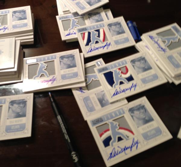
As we see with the National Treasures cards previewed in Dale Murphy’s tweet, the swatch and autograph are more of a focus of the card than the player. This breaks one of my cardinal rules of card design, as the player should ALWAYS remain the focus – unobstructed by any other element of the card. Bottom line. Because Panini has yet to develop their own visually appealing way of doing this without logos, the cards continue to be a train wreck to people who think the way I do.
Obviously, there is a large portion of the hobby who doesnt care, but that also puts a ceiling on success. How much MORE successful could these cards have been if they actually focused on the right elements? Tiny, close up face shots, trapped on the side of the card, do not help anyone. Separating out each element of the card without seamlessly blending them creates a boxy and compartmentalized look.
Sadly for everyone who collects Panini cards, if you dont like the compartmentalized look, Panini is not going to be your favorite for much longer. They continually go back to this well, and I fail to see how it works to their advantage. Football has this problem for them more than any
. Its odd, because every graphic artist aims to blur the lines between background elements of their design, and the subject of their design. I have always understood that this is what’s preferable across the different mediums. Panini has gone completely the other direction, ESPECIALLY in their baseball releases. National Treasures is just the most recent example.
Its one thing to thump the company bible and say that we dont know better, that collectors like me are wrong in the way we feel. Everything is opinion, and opinion is subjective. However, with the tides starting to turn on the way people feel in public forums, I would think the bible thumping needs to cease.

